← All Posts

·4 min read

Why We Don’t Bet Everything on a Single Hero Video And How We Help Brands Like Tempra Win with High-Quality, High-Quantity Content

, and uniform.css sizes any
         main h1 at the page-title scale (.definitive-interior main h1), so
         one landed mid-read at 60px. The cap carries the page class to out-
         specify that rule, and covers the whole family at reading scale. */
      .blog-page .blg-wrap .blg-body h1, .blog-page .blg-wrap .blg-body h2,
      .blog-page .blg-wrap .blg-body h3, .blog-page .blg-wrap .blg-body h4 { margin: 2rem 0 0.75rem; font-family: "Playfair Display", Georgia, serif; font-weight: 400; line-height: 1.3; color: rgb(244 241 235 / 0.95); text-transform: none; letter-spacing: normal; max-width: none; }
      .blog-page .blg-wrap .blg-body h1, .blog-page .blg-wrap .blg-body h2 { font-size: clamp(1.15rem, 1rem + 0.8vw, 1.45rem); }
      .blog-page .blg-wrap .blg-body h3 { font-size: clamp(1.05rem, 0.95rem + 0.55vw, 1.3rem); }
      .blog-page .blg-wrap .blg-body h4 { font-size: clamp(1rem, 0.95rem + 0.3vw, 1.12rem); }
      /* A photo run is not a paragraph - it breaks out past the reading
         measure to ONE width token and packs like the photography archive.
         CSS columns balanced the run into three ragged stacks: a column ran
         long and dangled a photograph below the others, a wide frame overran
         the square its neighbours implied, and a hole opened where the last
         short column stopped. The rows are JUSTIFIED instead - solved at
         build time in galleryize.py, shipped as explicit flex rows.
         A cell's --a is its native aspect. flex-grow:var(--a) over a zero
         basis hands each photo in a row the width a_i x h out of the row's
         free space, so every photo in the row stands at the same height h
         and the last one lands exactly on the right edge - flush left AND
         right, nothing cropped, no measurement on the page. */
      .blg-body { --blg-wide: min(68rem, 92vw); --blg-gap: 0.62rem; }
      .blg-gallery { width: var(--blg-wide); margin: 2rem 0 2.2rem; margin-inline: calc(50% - var(--blg-wide) / 2); display: flex; flex-direction: column; gap: var(--blg-gap); }
      .blg-row { display: flex; column-gap: var(--blg-gap); width: var(--rw, 100%); margin-inline: auto; }
      .blg-nb { display: none; }
      .blg-gallery .blg-cell { flex-grow: var(--a, 1); flex-shrink: 1; flex-basis: 0; min-width: 0; aspect-ratio: var(--a, 1.5); margin: 0; padding: 0; overflow: hidden; border-radius: 0.3rem; background: #0b0d12; cursor: pointer; opacity: 0; transform: translateY(18px); transition: opacity 620ms cubic-bezier(0.22, 0.61, 0.21, 1), transform 740ms cubic-bezier(0.22, 0.61, 0.21, 1); }
      .blg-gallery .blg-cell.is-in { opacity: 1; transform: none; }
      .blg-gallery .blg-cell img { display: block; width: 100%; height: 100%; object-fit: cover; margin: 0; border-radius: 0; opacity: 0.86; transition: transform 760ms cubic-bezier(0.22, 0.61, 0.21, 1), opacity 420ms ease; }
      .blg-gallery .blg-cell:hover img, .blg-gallery .blg-cell:focus-visible img { opacity: 1; transform: scale(1.02); }
      .blg-gallery .blg-cell:focus-visible { outline: 1px solid var(--kls-accent, #fb5607); outline-offset: 2px; }
      /* the run measures itself against the article COLUMN, so the index
         rail simply narrows it - no second width rule for the railed page */
      @supports (container-type: inline-size) {
        .blg-wrap { container-type: inline-size; }
        .blg-body { --blg-wide: min(68rem, 100cqw); }
      }
      /* The phone keeps the grid - 2-up rows out of the same packer at a
         smaller row height, never one full-screen photograph per screen.
         The desktop rows dissolve (display:contents) and the build-time
         narrow breaks drive the lines instead, so one set of photographs
         serves both plans. */
      @media (max-width: 760px) {
        .blg-body { --blg-gap: 0.5rem; }
        .blg-gallery { flex-direction: row; flex-wrap: wrap; column-gap: var(--blg-gap); row-gap: 0; margin-bottom: 1.8rem; }
        .blg-row { display: contents; }
        .blg-nb { display: block; flex: 0 0 100%; height: var(--blg-gap); }
      }
      @media (prefers-reduced-motion: reduce) { .blg-gallery .blg-cell { opacity: 1; transform: none; transition: none; } }
      /* A short line stranded between two photo runs read as a fragment
         someone forgot to delete. It is the author's own beat - so it is set
         as one: centred, given air on both sides, a step up in scale. The
         builder finds it; not a word of it is moved or rewritten. */
      .blg-body .blg-beat { margin: clamp(2.4rem, 5.5vh, 3.6rem) auto; max-width: 34rem; text-align: center; }
      .blg-body .blg-beat p, .blg-body .blg-beat div { margin-left: auto; margin-right: auto; }
      /* Squarespace put white-space:pre-wrap INLINE on these paragraphs, so
         the source indent after each  printed as a real leading space
         and every line after the first sat 3px right of centre. pre-line
         keeps the author's line breaks and drops the indentation; it has to
         out-rank an inline style, hence the !important, and it is scoped to
         the beat alone. No character of the copy changes. */
      .blg-body .blg-beat p { margin-top: 0; margin-bottom: 0.4rem; white-space: pre-line !important; font-family: "Playfair Display", Georgia, serif; font-size: clamp(1.2rem, 1rem + 1vw, 1.65rem); line-height: 1.4; color: rgb(244 241 235 / 0.94); }
      .blg-body .blg-beat p:last-child { margin-bottom: 0; }
      /* end blg-gallery */


    Skip to content


          ← All Posts
          Jul 3, 2025·4 min read
          Why We Don’t Bet Everything on a Single Hero Video And How We Help Brands Like Tempra Win with High-Quality, High-Quantity Content

At Kyle Loftus Studios, we don’t believe in putting all our eggs in one basket — especially when it comes to producing branded content.

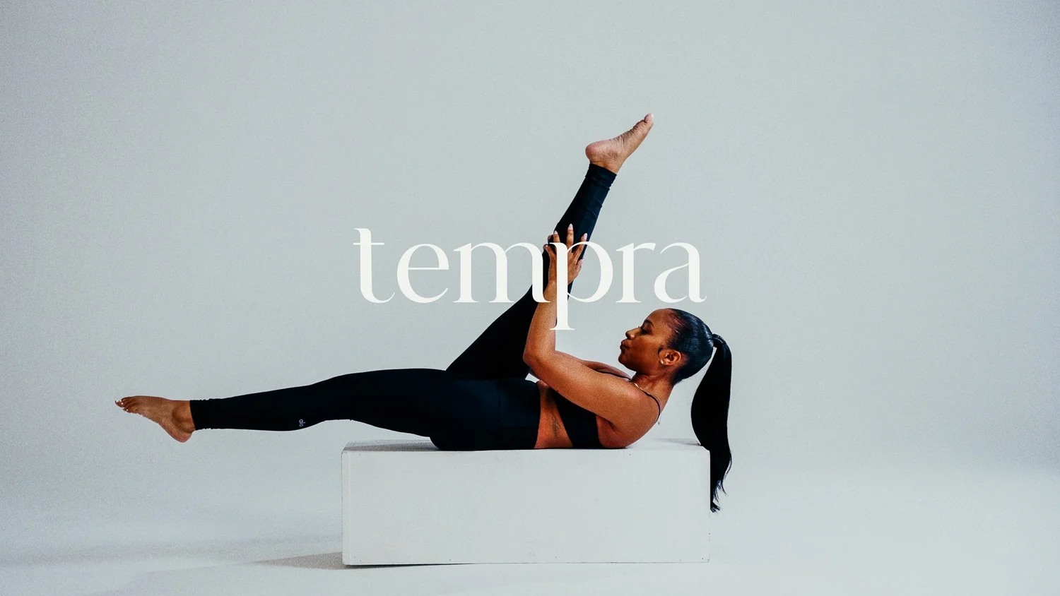
Brands like Tempra come to us for high-end visual assets, but what they stay for is our strategic mindset: a sharp focus on both quality and quantity. In today’s content-driven world, brands can’t afford to gamble on a single hero video and hope it works. Instead, we craft campaigns that deliver a variety of eye-catching, on-brand content pieces designed to connect, convert, and consistently perform.

Fast, Fun, and On-Brand: Why 30 Seconds or less is the Sweet Spot

We specialize in creating short, punchy videos that embody your brand’s voice and clearly communicate the who, what, and why — all in 30 seconds or less. These pieces are tailor-made for modern platforms like Instagram, TikTok, and YouTube Shorts, where attention spans are short and authenticity is king.

With Tempra, we didn’t just create beautiful visuals — we helped them tell micro-stories that were:

  • 🔥 Visually engaging

  • 🎯 Strategically aligned with their brand goals

  • 🧠 Conceptually thoughtful, yet instantly digestible

The result? A campaign that captured multiple audience touchpoints, drove engagement, and made people feel something — all while staying true to Tempra’s ethos.

High-End Content That Performs — Again and Again

Whether we're producing lifestyle photos, vertical videos, or 16:9 web content, our approach is rooted in performance, not guesswork. That means:

  • Developing multiple creative concepts per campaign

  • Delivering assets in a variety of formats and aspect ratios

  • Providing clients with more usable content across more channels

  • Ensuring there’s always a piece of content to match their goals — whether it's product awareness, brand storytelling, or social media virality

We create not just a single story, but a full toolbox of creative assets that are just as versatile as they are visually striking.

High-End Content That Performs — Again and Again

Whether we're producing lifestyle photos, vertical videos, or 16:9 web content, our approach is rooted in performance, not guesswork. That means:

  • Developing multiple creative concepts per campaign

  • Delivering assets in a variety of formats and aspect ratios

  • Providing clients with more usable content across more channels

  • Ensuring there’s always a piece of content to match their goals — whether it's product awareness, brand storytelling, or social media virality

We create not just a single story, but a full toolbox of creative assets that are just as versatile as they are visually striking.

Our Guarantee: Variety, Strategy, and Results

Brands come to us for the visuals, but they stay with us because we think like strategists. Our commitment is to deliver:

  • High-production-value videos and photos

  • Multiple edits tailored for different uses and platforms

  • Creative ideas that are fun, exciting, and deeply aligned with your brand

We don’t just deliver content. We deliver clarity, creativity, and confidence — helping marketing executives, brand owners, and creative directors show up consistently and successfully.

Looking for a Creative Partner Who Delivers More?

If you're a marketing executive, creative director, or founder looking for a fresh take on branded content — one that blends visual storytelling with strategy, performance, and scale — let's talk.

Whether you’re launching a new product, reintroducing your brand, or just need content that breaks through the noise, we’re here to help you make content that works.

📩 Ready to get started?

http://www.kyleloftusstudios.com