← All Posts

·3 min read

Behind the Scenes of Our Multi-Day USG Corporate Event in Orlando, Florida:

, and uniform.css sizes any
         main h1 at the page-title scale (.definitive-interior main h1), so
         one landed mid-read at 60px. The cap carries the page class to out-
         specify that rule, and covers the whole family at reading scale. */
      .blog-page .blg-wrap .blg-body h1, .blog-page .blg-wrap .blg-body h2,
      .blog-page .blg-wrap .blg-body h3, .blog-page .blg-wrap .blg-body h4 { margin: 2rem 0 0.75rem; font-family: "Playfair Display", Georgia, serif; font-weight: 400; line-height: 1.3; color: rgb(244 241 235 / 0.95); text-transform: none; letter-spacing: normal; max-width: none; }
      .blog-page .blg-wrap .blg-body h1, .blog-page .blg-wrap .blg-body h2 { font-size: clamp(1.15rem, 1rem + 0.8vw, 1.45rem); }
      .blog-page .blg-wrap .blg-body h3 { font-size: clamp(1.05rem, 0.95rem + 0.55vw, 1.3rem); }
      .blog-page .blg-wrap .blg-body h4 { font-size: clamp(1rem, 0.95rem + 0.3vw, 1.12rem); }
      /* A photo run is not a paragraph - it breaks out past the reading
         measure to ONE width token and packs like the photography archive.
         CSS columns balanced the run into three ragged stacks: a column ran
         long and dangled a photograph below the others, a wide frame overran
         the square its neighbours implied, and a hole opened where the last
         short column stopped. The rows are JUSTIFIED instead - solved at
         build time in galleryize.py, shipped as explicit flex rows.
         A cell's --a is its native aspect. flex-grow:var(--a) over a zero
         basis hands each photo in a row the width a_i x h out of the row's
         free space, so every photo in the row stands at the same height h
         and the last one lands exactly on the right edge - flush left AND
         right, nothing cropped, no measurement on the page. */
      .blg-body { --blg-wide: min(68rem, 92vw); --blg-gap: 0.62rem; }
      .blg-gallery { width: var(--blg-wide); margin: 2rem 0 2.2rem; margin-inline: calc(50% - var(--blg-wide) / 2); display: flex; flex-direction: column; gap: var(--blg-gap); }
      .blg-row { display: flex; column-gap: var(--blg-gap); width: var(--rw, 100%); margin-inline: auto; }
      .blg-nb { display: none; }
      .blg-gallery .blg-cell { flex-grow: var(--a, 1); flex-shrink: 1; flex-basis: 0; min-width: 0; aspect-ratio: var(--a, 1.5); margin: 0; padding: 0; overflow: hidden; border-radius: 0.3rem; background: #0b0d12; cursor: pointer; opacity: 0; transform: translateY(18px); transition: opacity 620ms cubic-bezier(0.22, 0.61, 0.21, 1), transform 740ms cubic-bezier(0.22, 0.61, 0.21, 1); }
      .blg-gallery .blg-cell.is-in { opacity: 1; transform: none; }
      .blg-gallery .blg-cell img { display: block; width: 100%; height: 100%; object-fit: cover; margin: 0; border-radius: 0; opacity: 0.86; transition: transform 760ms cubic-bezier(0.22, 0.61, 0.21, 1), opacity 420ms ease; }
      .blg-gallery .blg-cell:hover img, .blg-gallery .blg-cell:focus-visible img { opacity: 1; transform: scale(1.02); }
      .blg-gallery .blg-cell:focus-visible { outline: 1px solid var(--kls-accent, #fb5607); outline-offset: 2px; }
      /* the run measures itself against the article COLUMN, so the index
         rail simply narrows it - no second width rule for the railed page */
      @supports (container-type: inline-size) {
        .blg-wrap { container-type: inline-size; }
        .blg-body { --blg-wide: min(68rem, 100cqw); }
      }
      /* The phone keeps the grid - 2-up rows out of the same packer at a
         smaller row height, never one full-screen photograph per screen.
         The desktop rows dissolve (display:contents) and the build-time
         narrow breaks drive the lines instead, so one set of photographs
         serves both plans. */
      @media (max-width: 760px) {
        .blg-body { --blg-gap: 0.5rem; }
        .blg-gallery { flex-direction: row; flex-wrap: wrap; column-gap: var(--blg-gap); row-gap: 0; margin-bottom: 1.8rem; }
        .blg-row { display: contents; }
        .blg-nb { display: block; flex: 0 0 100%; height: var(--blg-gap); }
      }
      @media (prefers-reduced-motion: reduce) { .blg-gallery .blg-cell { opacity: 1; transform: none; transition: none; } }
      /* A short line stranded between two photo runs read as a fragment
         someone forgot to delete. It is the author's own beat - so it is set
         as one: centred, given air on both sides, a step up in scale. The
         builder finds it; not a word of it is moved or rewritten. */
      .blg-body .blg-beat { margin: clamp(2.4rem, 5.5vh, 3.6rem) auto; max-width: 34rem; text-align: center; }
      .blg-body .blg-beat p, .blg-body .blg-beat div { margin-left: auto; margin-right: auto; }
      /* Squarespace put white-space:pre-wrap INLINE on these paragraphs, so
         the source indent after each  printed as a real leading space
         and every line after the first sat 3px right of centre. pre-line
         keeps the author's line breaks and drops the indentation; it has to
         out-rank an inline style, hence the !important, and it is scoped to
         the beat alone. No character of the copy changes. */
      .blg-body .blg-beat p { margin-top: 0; margin-bottom: 0.4rem; white-space: pre-line !important; font-family: "Playfair Display", Georgia, serif; font-size: clamp(1.2rem, 1rem + 1vw, 1.65rem); line-height: 1.4; color: rgb(244 241 235 / 0.94); }
      .blg-body .blg-beat p:last-child { margin-bottom: 0; }
      /* end blg-gallery */


    Skip to content


          ← All Posts
          Oct 23, 2025·3 min read
          Behind the Scenes of Our Multi-Day USG Corporate Event in Orlando, Florida:

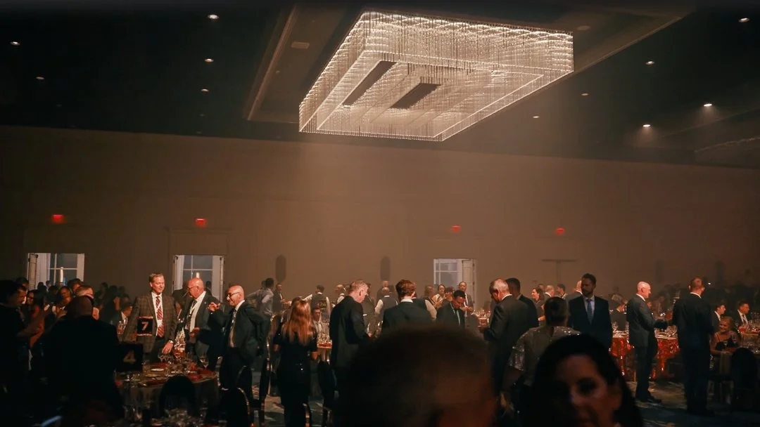
When it comes to event video production in Orlando, few projects test your creativity and coordination like multi-day corporate events. Recently, our team had the opportunity to partner with USG to capture their company’s annual celebration and awards weekend, hosted at the Signia by Hilton Orlando Bonnet Creek, with additional filming at Disney Springs.

This project was a true team effort from start to finish. It required thoughtful planning, long production days, and a fast turnaround — including delivering a fully edited four-minute recap video in less than 24 hours for the client’s final award ceremony.

Pre-Production and Planning

The foundation for a successful event production always begins in pre-production. Before cameras ever rolled, our team met several times with USG’s internal team and event coordinators to align on goals, schedules, and logistics.

Because this event spanned multiple venues including Disney Springs, we had to plan around tight timelines, restricted filming zones, and security clearances. Every crew position, camera setup, and coverage zone was carefully mapped out so that we could move quickly and capture the energy of the event without disrupting the experience for attendees.

Having this level of organization allowed us to focus on what really mattered once the event began: telling the story of the people and the celebration in an authentic, cinematic way.

Capturing the Event

Across several days, our crew documented everything from keynote sessions and breakout panels to team-building activities, social gatherings, and the grand award ceremony.

We approached each segment with a focus on storytelling rather than simple documentation — capturing moments that reflected USG’s culture, connection, and energy.

For fast-paced events like this, communication is everything. Our camera operators and producers stayed in constant contact with USG’s team to ensure no key moment was missed. By blending creative direction with logistical precision, we were able to create footage that felt both spontaneous and beautifully composed.

The Rush Edit Challenge

One of the most exciting parts of this project came in post-production. Our team was tasked with creating a four-minute highlight film to premiere on the final night of the event.

To make this possible, our editors began organizing and processing footage immediately after each day of filming. By running post-production in tandem with ongoing coverage, we stayed ahead of schedule and maintained a clear creative direction.

The result was a high-energy, emotional recap that played for the entire company during their closing celebration — a true culmination of the week’s work.

Collaboration Makes It Happen

Projects like this only succeed with a strong team and great communication. From pre-production to final delivery, our crew worked closely with USG’s internal staff and event partners to make sure every detail was executed with care.

Experience matters in event videography, especially when juggling multiple locations, clients, and deadlines. Having a seasoned crew that understands both the creative and logistical sides of production is what makes a seamless, stress-free experience possible for our clients.

Final Thoughts

This project was a reminder of why I love event videography. It’s fast, unpredictable, and challenging but also deeply rewarding. Capturing real moments and transforming them into a story that a company can be proud of for years to come is what makes this work meaningful.

If you’re planning a conference, company retreat, or large-scale event in the Florida area and are looking for professional video coverage, our team at Kyle Loftus Studios would love to help. We specialize in event video production, handling everything from pre-production and on-site filming to fast-turnaround editing and post-event storytelling.

Let’s create something memorable together.

http://www.kyleloftusstudios.com