← All Posts

·3 min read

Create the Work You Want to Attract

, and uniform.css sizes any
         main h1 at the page-title scale (.definitive-interior main h1), so
         one landed mid-read at 60px. The cap carries the page class to out-
         specify that rule, and covers the whole family at reading scale. */
      .blog-page .blg-wrap .blg-body h1, .blog-page .blg-wrap .blg-body h2,
      .blog-page .blg-wrap .blg-body h3, .blog-page .blg-wrap .blg-body h4 { margin: 2rem 0 0.75rem; font-family: "Playfair Display", Georgia, serif; font-weight: 400; line-height: 1.3; color: rgb(244 241 235 / 0.95); text-transform: none; letter-spacing: normal; max-width: none; }
      .blog-page .blg-wrap .blg-body h1, .blog-page .blg-wrap .blg-body h2 { font-size: clamp(1.15rem, 1rem + 0.8vw, 1.45rem); }
      .blog-page .blg-wrap .blg-body h3 { font-size: clamp(1.05rem, 0.95rem + 0.55vw, 1.3rem); }
      .blog-page .blg-wrap .blg-body h4 { font-size: clamp(1rem, 0.95rem + 0.3vw, 1.12rem); }
      /* A photo run is not a paragraph - it breaks out past the reading
         measure to ONE width token and packs like the photography archive.
         CSS columns balanced the run into three ragged stacks: a column ran
         long and dangled a photograph below the others, a wide frame overran
         the square its neighbours implied, and a hole opened where the last
         short column stopped. The rows are JUSTIFIED instead - solved at
         build time in galleryize.py, shipped as explicit flex rows.
         A cell's --a is its native aspect. flex-grow:var(--a) over a zero
         basis hands each photo in a row the width a_i x h out of the row's
         free space, so every photo in the row stands at the same height h
         and the last one lands exactly on the right edge - flush left AND
         right, nothing cropped, no measurement on the page. */
      .blg-body { --blg-wide: min(68rem, 92vw); --blg-gap: 0.62rem; }
      .blg-gallery { width: var(--blg-wide); margin: 2rem 0 2.2rem; margin-inline: calc(50% - var(--blg-wide) / 2); display: flex; flex-direction: column; gap: var(--blg-gap); }
      .blg-row { display: flex; column-gap: var(--blg-gap); width: var(--rw, 100%); margin-inline: auto; }
      .blg-nb { display: none; }
      .blg-gallery .blg-cell { flex-grow: var(--a, 1); flex-shrink: 1; flex-basis: 0; min-width: 0; aspect-ratio: var(--a, 1.5); margin: 0; padding: 0; overflow: hidden; border-radius: 0.3rem; background: #0b0d12; cursor: pointer; opacity: 0; transform: translateY(18px); transition: opacity 620ms cubic-bezier(0.22, 0.61, 0.21, 1), transform 740ms cubic-bezier(0.22, 0.61, 0.21, 1); }
      .blg-gallery .blg-cell.is-in { opacity: 1; transform: none; }
      .blg-gallery .blg-cell img { display: block; width: 100%; height: 100%; object-fit: cover; margin: 0; border-radius: 0; opacity: 0.86; transition: transform 760ms cubic-bezier(0.22, 0.61, 0.21, 1), opacity 420ms ease; }
      .blg-gallery .blg-cell:hover img, .blg-gallery .blg-cell:focus-visible img { opacity: 1; transform: scale(1.02); }
      .blg-gallery .blg-cell:focus-visible { outline: 1px solid var(--kls-accent, #fb5607); outline-offset: 2px; }
      /* the run measures itself against the article COLUMN, so the index
         rail simply narrows it - no second width rule for the railed page */
      @supports (container-type: inline-size) {
        .blg-wrap { container-type: inline-size; }
        .blg-body { --blg-wide: min(68rem, 100cqw); }
      }
      /* The phone keeps the grid - 2-up rows out of the same packer at a
         smaller row height, never one full-screen photograph per screen.
         The desktop rows dissolve (display:contents) and the build-time
         narrow breaks drive the lines instead, so one set of photographs
         serves both plans. */
      @media (max-width: 760px) {
        .blg-body { --blg-gap: 0.5rem; }
        .blg-gallery { flex-direction: row; flex-wrap: wrap; column-gap: var(--blg-gap); row-gap: 0; margin-bottom: 1.8rem; }
        .blg-row { display: contents; }
        .blg-nb { display: block; flex: 0 0 100%; height: var(--blg-gap); }
      }
      @media (prefers-reduced-motion: reduce) { .blg-gallery .blg-cell { opacity: 1; transform: none; transition: none; } }
      /* A short line stranded between two photo runs read as a fragment
         someone forgot to delete. It is the author's own beat - so it is set
         as one: centred, given air on both sides, a step up in scale. The
         builder finds it; not a word of it is moved or rewritten. */
      .blg-body .blg-beat { margin: clamp(2.4rem, 5.5vh, 3.6rem) auto; max-width: 34rem; text-align: center; }
      .blg-body .blg-beat p, .blg-body .blg-beat div { margin-left: auto; margin-right: auto; }
      /* Squarespace put white-space:pre-wrap INLINE on these paragraphs, so
         the source indent after each  printed as a real leading space
         and every line after the first sat 3px right of centre. pre-line
         keeps the author's line breaks and drops the indentation; it has to
         out-rank an inline style, hence the !important, and it is scoped to
         the beat alone. No character of the copy changes. */
      .blg-body .blg-beat p { margin-top: 0; margin-bottom: 0.4rem; white-space: pre-line !important; font-family: "Playfair Display", Georgia, serif; font-size: clamp(1.2rem, 1rem + 1vw, 1.65rem); line-height: 1.4; color: rgb(244 241 235 / 0.94); }
      .blg-body .blg-beat p:last-child { margin-bottom: 0; }
      /* end blg-gallery */


    Skip to content


          ← All Posts
          Jan 6, 2026·3 min read
          Create the Work You Want to Attract

Why I Made Becoming the New Indie — and Why I’ll Keep Making Films Like It

One of the most important lessons I’ve learned in my career is simple, but not always easy to accept:

You don’t attract the work you want by waiting for it.
You attract it by creating it.

For a long time, I thought the next opportunity would arrive after someone gave me permission. After the right client reached out. After the right budget appeared. After the “right” project landed in my inbox.

What I eventually realized is that the work you want rarely shows up on its own.

You have to make it first.

Why I Created Becoming the New Indie

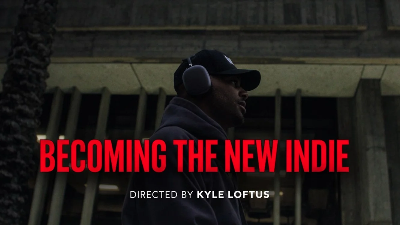
Becoming the New Indie is a documentary following Deraj — a music artist building a career on his own terms, outside of traditional industry structures. It’s a story about independence, persistence, and believing in the value of your work even when the path forward isn’t obvious.

But the reason I made this documentary goes beyond the story itself.

I created this film because I want to direct more narrative-driven, story-first projects. Films that feel intentional. Work that prioritizes emotion, pacing, strong cinematography, and meaning — not just execution.

Rather than waiting for those projects to magically come my way, I went out and created one.

Creating the Work That Reflects Where You’re Going

This is something I see a lot, especially with filmmakers and creatives:

Someone wants to direct narrative films, but their portfolio is filled with weddings.
Or they want to shoot documentaries, but all they’re showing is short-form commercial work.
Or they want bigger, more meaningful projects — but nothing they’re putting out reflects that direction.

The truth is, clients and collaborators can only hire you for what they see you doing.

If you want different projects, you have to create different work.

That’s why Becoming the New Indie exists. And it’s why I’ve created two additional documentaries that I’ll be releasing later this year as well. Each project is a deliberate step toward the type of stories I want to tell more of — and the type of work I want to attract moving forward.

Not Waiting for Permission

None of these documentaries were commissioned.

No one asked me to make them.

And that’s exactly the point.

Instead of hoping the “right” opportunity would come along, I chose to invest my time, energy, and creativity into projects that aligned with where I want my career to go — not just where it has been.

These films aren’t practice. They aren’t placeholders. They’re proof of concept.

They show how I think about story.
How I work with real people.
How I build emotion through visuals, pacing, and sound.

And most importantly, they show what kind of work I care about.

A Better Long-Term Strategy

In my experience, this approach has been far more effective than waiting.

Creating the work you want to attract:

  • Builds clarity in your creative direction

  • Attracts clients and collaborators who resonate with that vision

  • Positions you for opportunities that actually excite you

  • Creates momentum instead of stagnation

It turns your portfolio into a statement — not just a collection of past jobs.

Looking Ahead

Becoming the New Indie is just the beginning.

Over the next year, I’ll be continuing to release documentary and narrative-driven projects that focus on real stories, meaningful impact, and intentional filmmaking.

If you’re an artist, band, brand, or organization looking to tell a story — or if you’re searching for a director, DP, or production partner who genuinely cares about narrative and execution — I’d love to connect.

Sometimes the fastest way to get where you want to go is to stop waiting…
and start creating the work that proves you belong there.

http://www.kyleloftusstudios.com