← All Posts

·4 min read

How We Helped Faster Way to Fat Loss Capture Content in the Most Cost-Effective Way Possible

, and uniform.css sizes any
         main h1 at the page-title scale (.definitive-interior main h1), so
         one landed mid-read at 60px. The cap carries the page class to out-
         specify that rule, and covers the whole family at reading scale. */
      .blog-page .blg-wrap .blg-body h1, .blog-page .blg-wrap .blg-body h2,
      .blog-page .blg-wrap .blg-body h3, .blog-page .blg-wrap .blg-body h4 { margin: 2rem 0 0.75rem; font-family: "Playfair Display", Georgia, serif; font-weight: 400; line-height: 1.3; color: rgb(244 241 235 / 0.95); text-transform: none; letter-spacing: normal; max-width: none; }
      .blog-page .blg-wrap .blg-body h1, .blog-page .blg-wrap .blg-body h2 { font-size: clamp(1.15rem, 1rem + 0.8vw, 1.45rem); }
      .blog-page .blg-wrap .blg-body h3 { font-size: clamp(1.05rem, 0.95rem + 0.55vw, 1.3rem); }
      .blog-page .blg-wrap .blg-body h4 { font-size: clamp(1rem, 0.95rem + 0.3vw, 1.12rem); }
      /* A photo run is not a paragraph - it breaks out past the reading
         measure to ONE width token and packs like the photography archive.
         CSS columns balanced the run into three ragged stacks: a column ran
         long and dangled a photograph below the others, a wide frame overran
         the square its neighbours implied, and a hole opened where the last
         short column stopped. The rows are JUSTIFIED instead - solved at
         build time in galleryize.py, shipped as explicit flex rows.
         A cell's --a is its native aspect. flex-grow:var(--a) over a zero
         basis hands each photo in a row the width a_i x h out of the row's
         free space, so every photo in the row stands at the same height h
         and the last one lands exactly on the right edge - flush left AND
         right, nothing cropped, no measurement on the page. */
      .blg-body { --blg-wide: min(68rem, 92vw); --blg-gap: 0.62rem; }
      .blg-gallery { width: var(--blg-wide); margin: 2rem 0 2.2rem; margin-inline: calc(50% - var(--blg-wide) / 2); display: flex; flex-direction: column; gap: var(--blg-gap); }
      .blg-row { display: flex; column-gap: var(--blg-gap); width: var(--rw, 100%); margin-inline: auto; }
      .blg-nb { display: none; }
      .blg-gallery .blg-cell { flex-grow: var(--a, 1); flex-shrink: 1; flex-basis: 0; min-width: 0; aspect-ratio: var(--a, 1.5); margin: 0; padding: 0; overflow: hidden; border-radius: 0.3rem; background: #0b0d12; cursor: pointer; opacity: 0; transform: translateY(18px); transition: opacity 620ms cubic-bezier(0.22, 0.61, 0.21, 1), transform 740ms cubic-bezier(0.22, 0.61, 0.21, 1); }
      .blg-gallery .blg-cell.is-in { opacity: 1; transform: none; }
      .blg-gallery .blg-cell img { display: block; width: 100%; height: 100%; object-fit: cover; margin: 0; border-radius: 0; opacity: 0.86; transition: transform 760ms cubic-bezier(0.22, 0.61, 0.21, 1), opacity 420ms ease; }
      .blg-gallery .blg-cell:hover img, .blg-gallery .blg-cell:focus-visible img { opacity: 1; transform: scale(1.02); }
      .blg-gallery .blg-cell:focus-visible { outline: 1px solid var(--kls-accent, #fb5607); outline-offset: 2px; }
      /* the run measures itself against the article COLUMN, so the index
         rail simply narrows it - no second width rule for the railed page */
      @supports (container-type: inline-size) {
        .blg-wrap { container-type: inline-size; }
        .blg-body { --blg-wide: min(68rem, 100cqw); }
      }
      /* The phone keeps the grid - 2-up rows out of the same packer at a
         smaller row height, never one full-screen photograph per screen.
         The desktop rows dissolve (display:contents) and the build-time
         narrow breaks drive the lines instead, so one set of photographs
         serves both plans. */
      @media (max-width: 760px) {
        .blg-body { --blg-gap: 0.5rem; }
        .blg-gallery { flex-direction: row; flex-wrap: wrap; column-gap: var(--blg-gap); row-gap: 0; margin-bottom: 1.8rem; }
        .blg-row { display: contents; }
        .blg-nb { display: block; flex: 0 0 100%; height: var(--blg-gap); }
      }
      @media (prefers-reduced-motion: reduce) { .blg-gallery .blg-cell { opacity: 1; transform: none; transition: none; } }
      /* A short line stranded between two photo runs read as a fragment
         someone forgot to delete. It is the author's own beat - so it is set
         as one: centred, given air on both sides, a step up in scale. The
         builder finds it; not a word of it is moved or rewritten. */
      .blg-body .blg-beat { margin: clamp(2.4rem, 5.5vh, 3.6rem) auto; max-width: 34rem; text-align: center; }
      .blg-body .blg-beat p, .blg-body .blg-beat div { margin-left: auto; margin-right: auto; }
      /* Squarespace put white-space:pre-wrap INLINE on these paragraphs, so
         the source indent after each  printed as a real leading space
         and every line after the first sat 3px right of centre. pre-line
         keeps the author's line breaks and drops the indentation; it has to
         out-rank an inline style, hence the !important, and it is scoped to
         the beat alone. No character of the copy changes. */
      .blg-body .blg-beat p { margin-top: 0; margin-bottom: 0.4rem; white-space: pre-line !important; font-family: "Playfair Display", Georgia, serif; font-size: clamp(1.2rem, 1rem + 1vw, 1.65rem); line-height: 1.4; color: rgb(244 241 235 / 0.94); }
      .blg-body .blg-beat p:last-child { margin-bottom: 0; }
      /* end blg-gallery */


    Skip to content


          ← All Posts
          Mar 11, 2025·4 min read
          How We Helped Faster Way to Fat Loss Capture Content in the Most Cost-Effective Way Possible

At Kyle Loftus Studios, we pride ourselves on being more than just a production company. We strive to be true partners with our clients, working alongside them to help achieve their goals in the most effective and cost-efficient way. A recent project with Faster Way to Fat Loss is the perfect example of how we bring this philosophy to life.

The Challenge: Capturing Content with Multiple Coaches, All in One Place

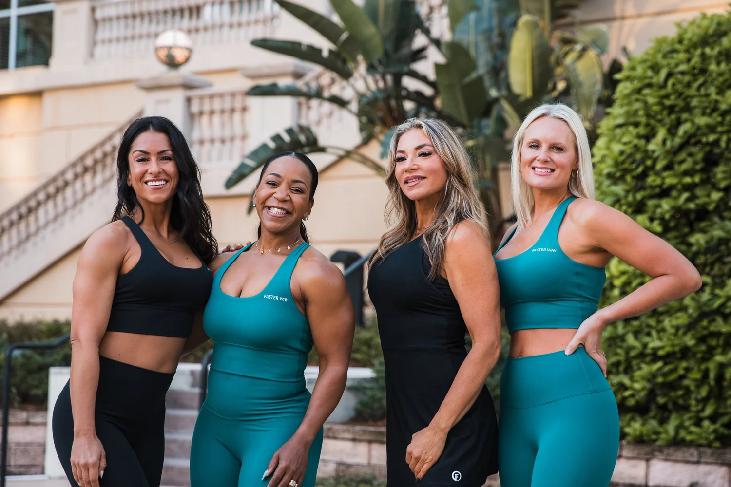
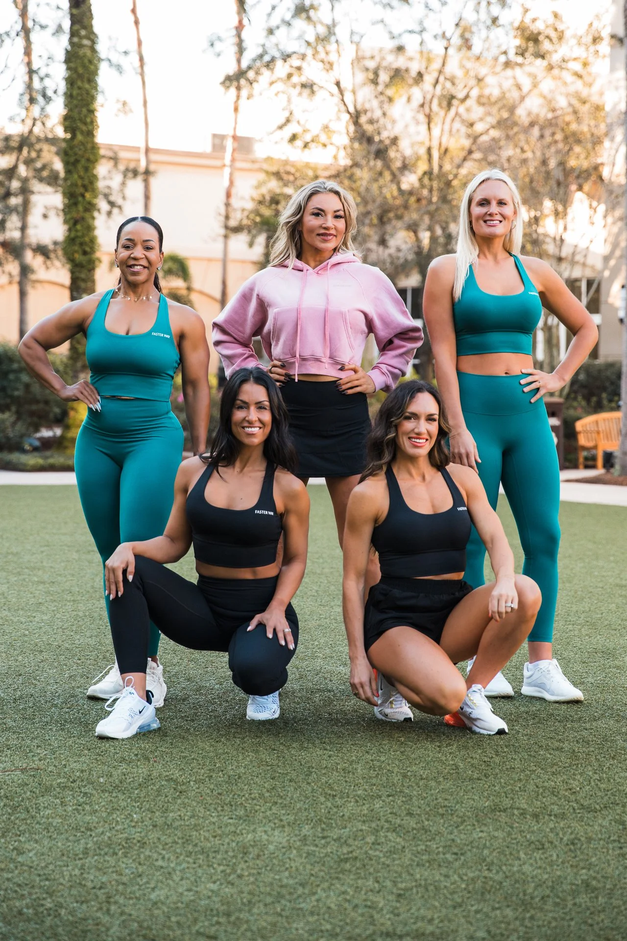
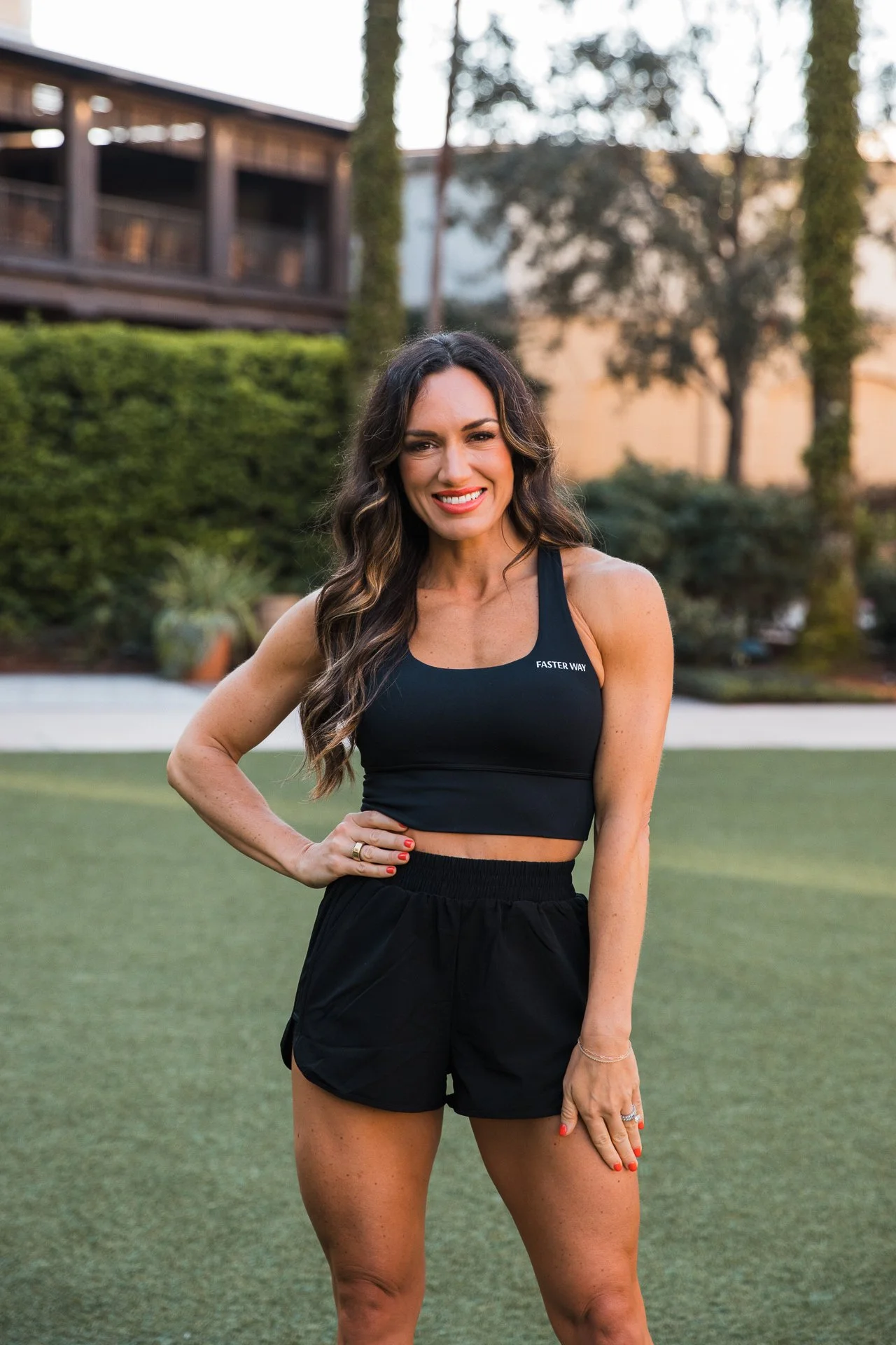
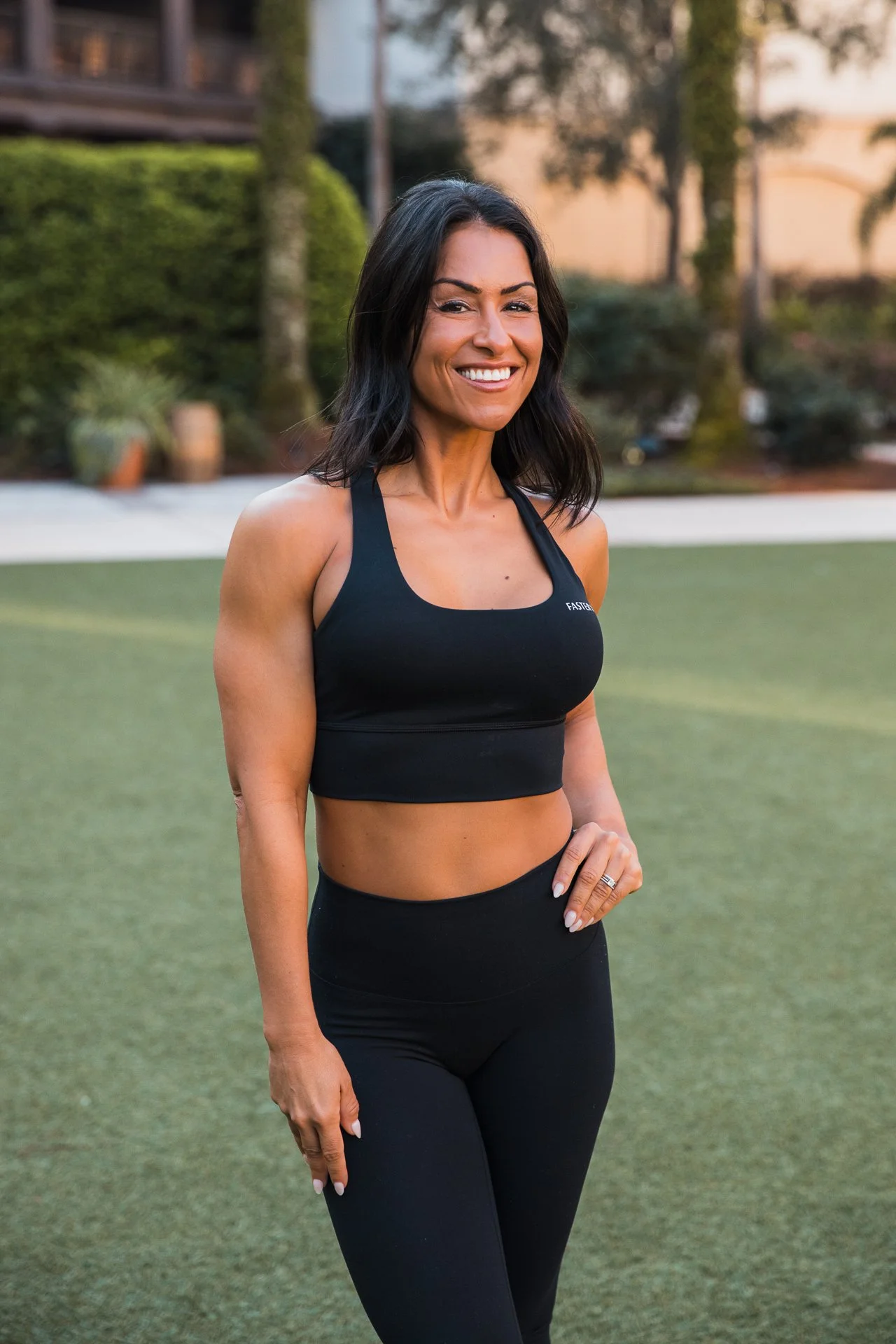
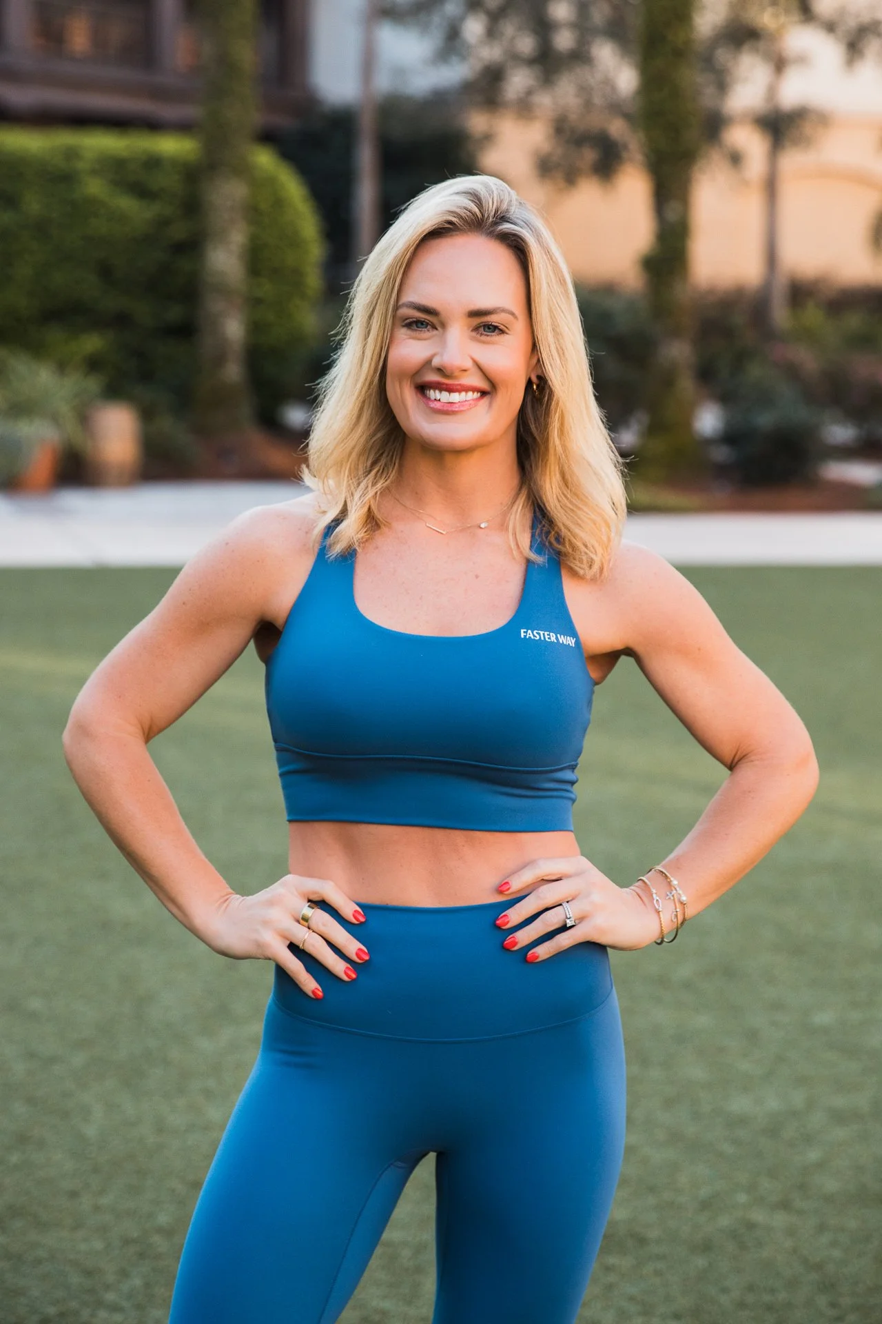
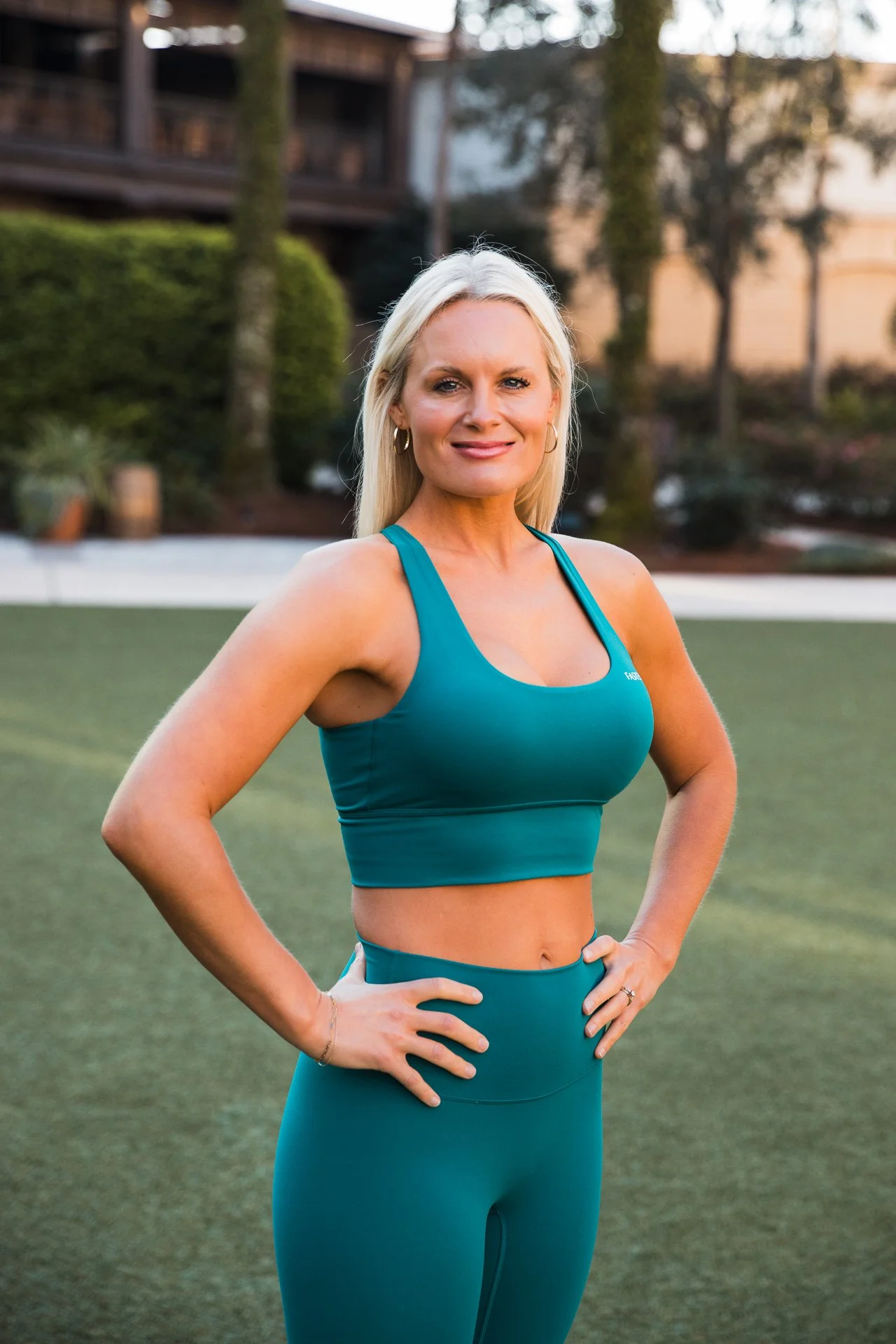
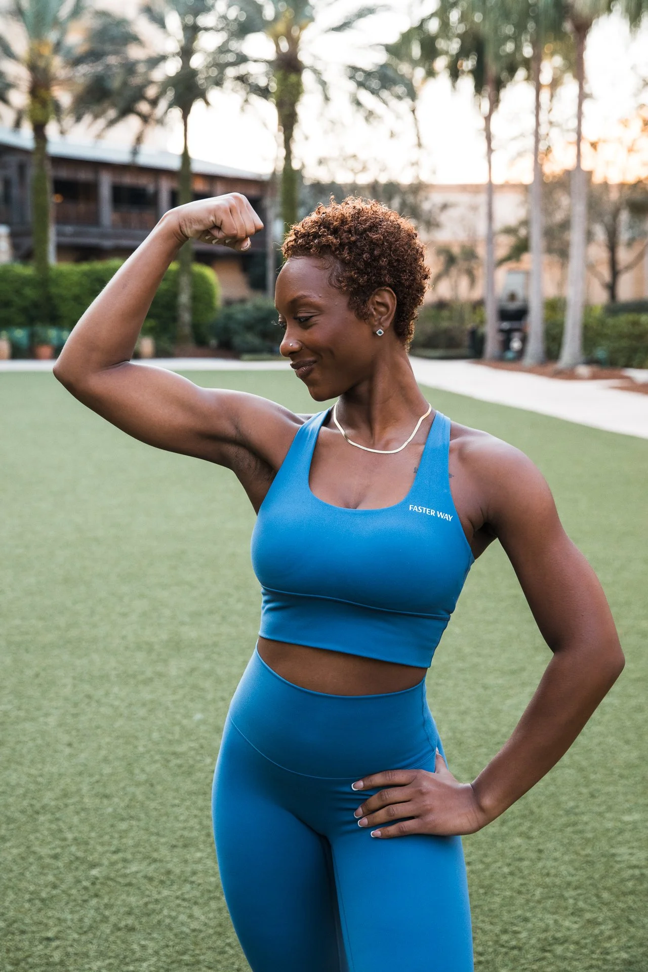
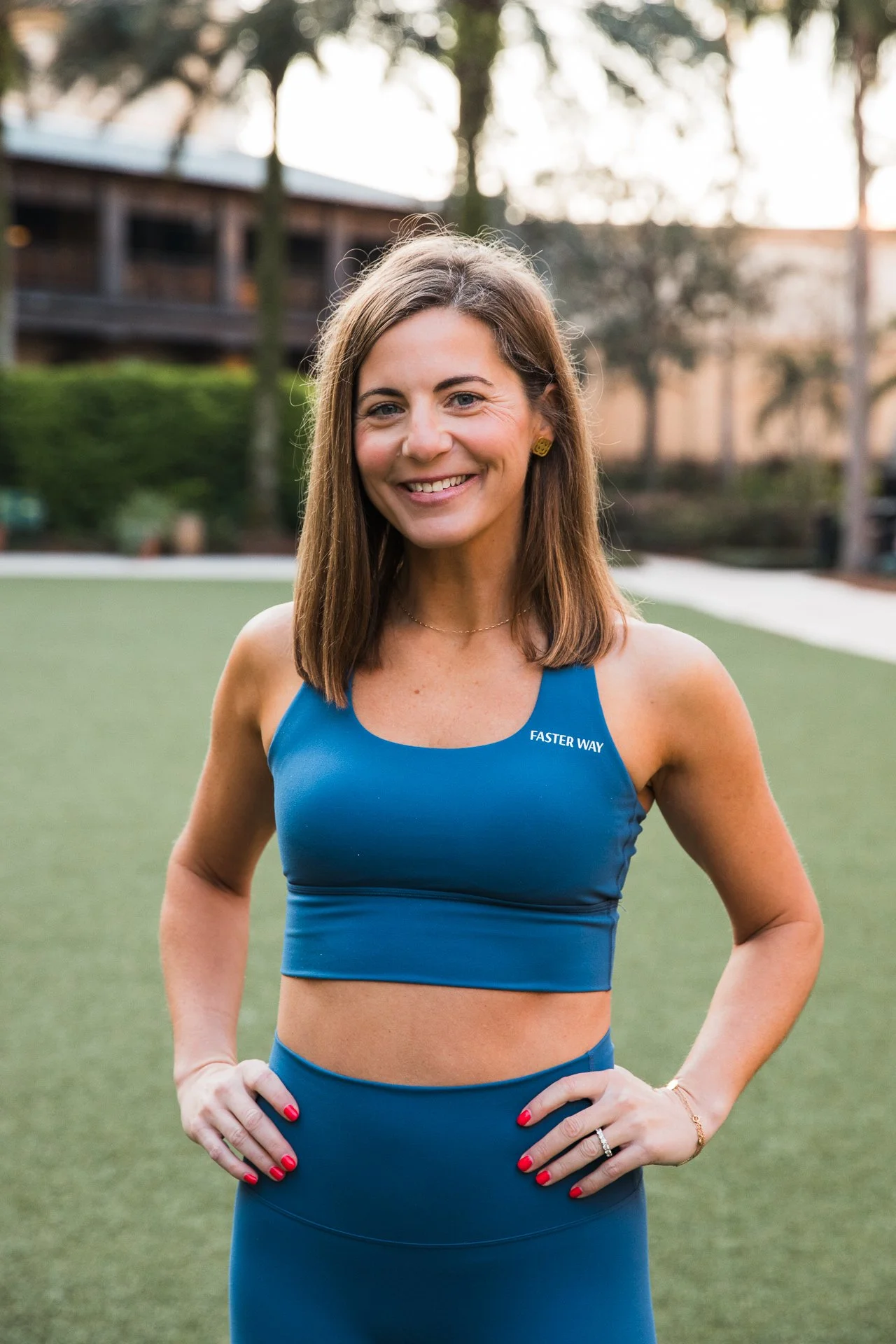
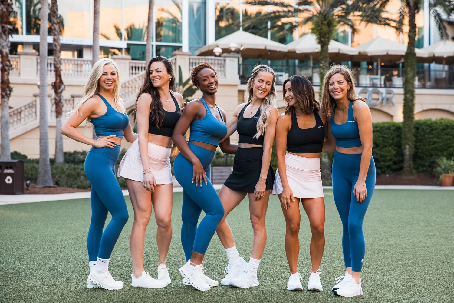
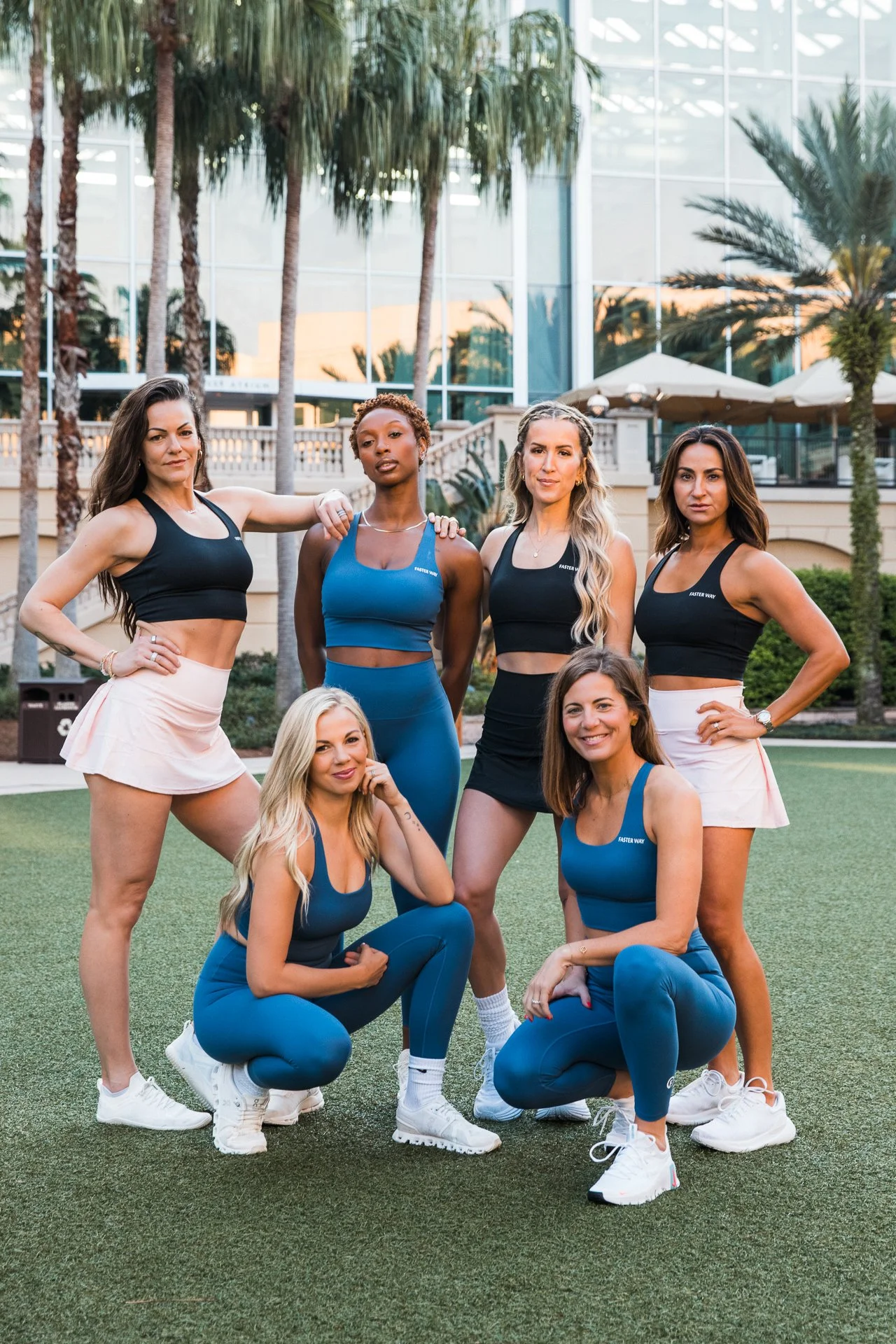
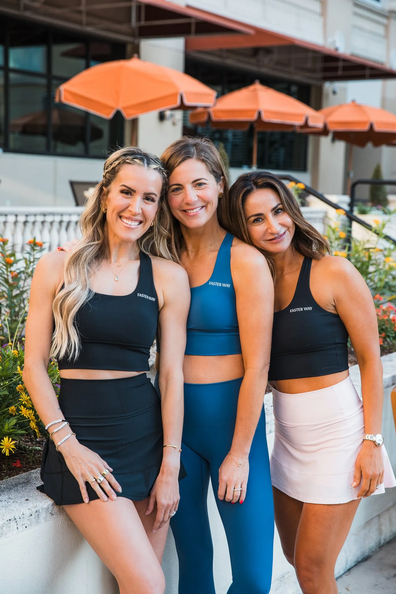
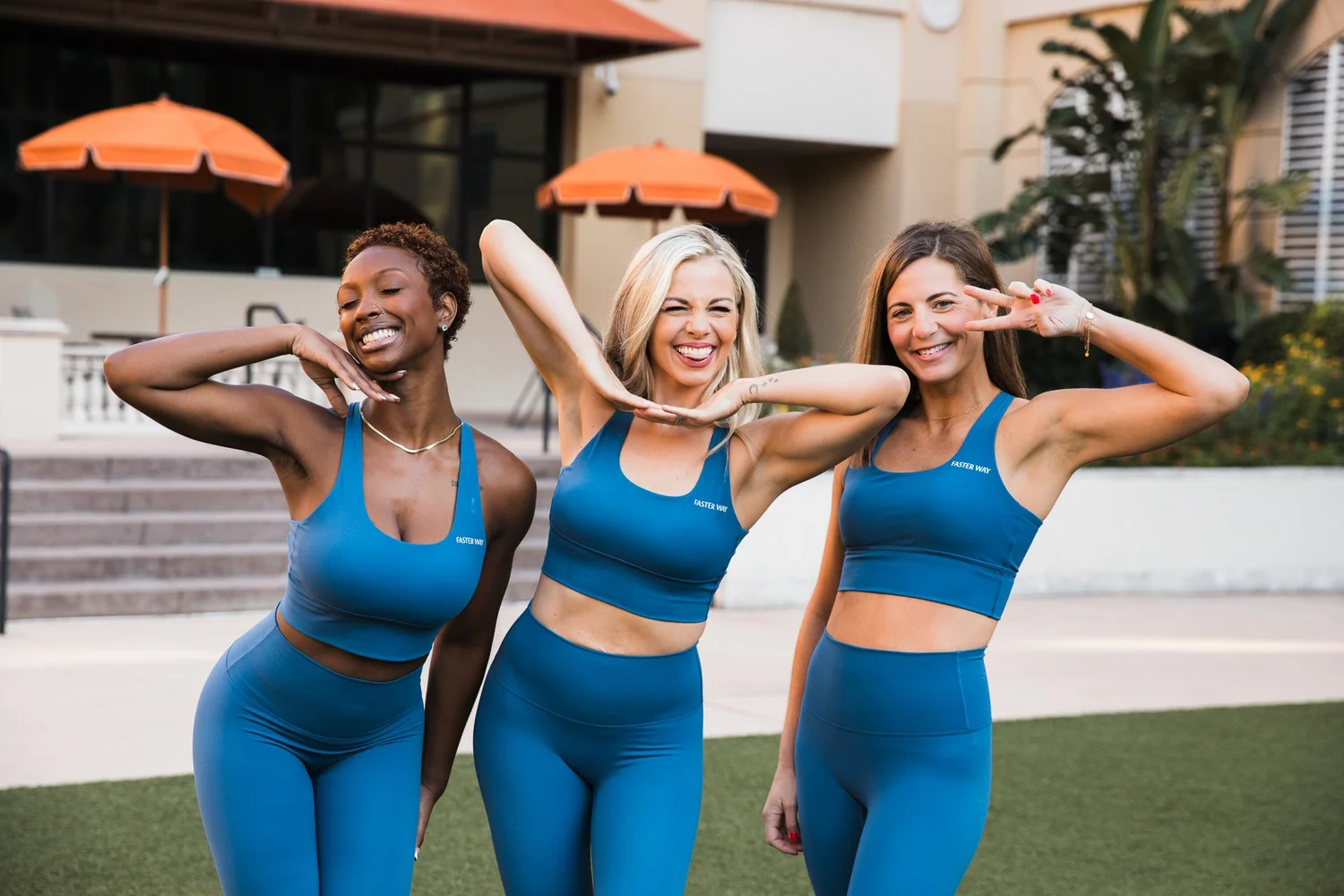
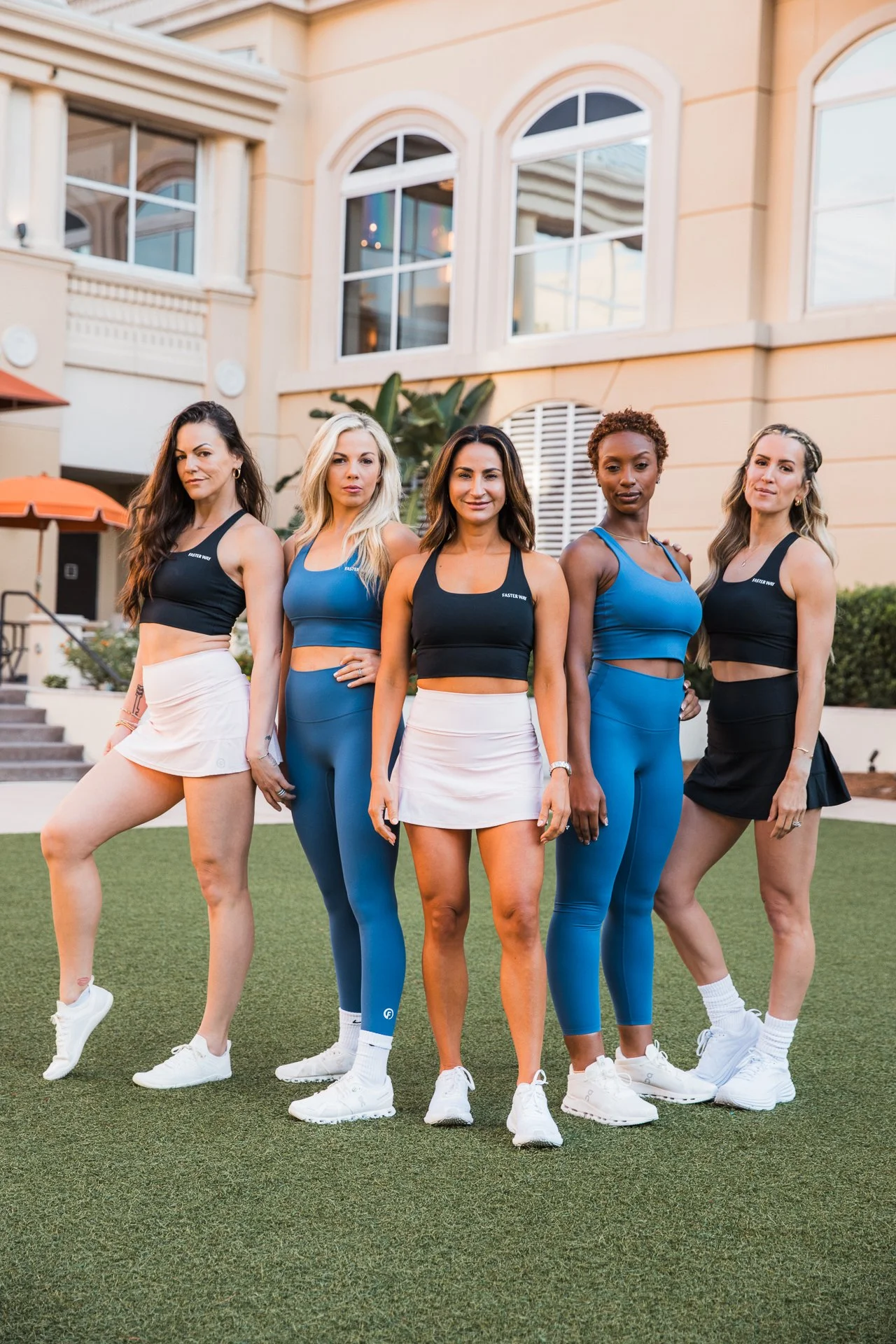
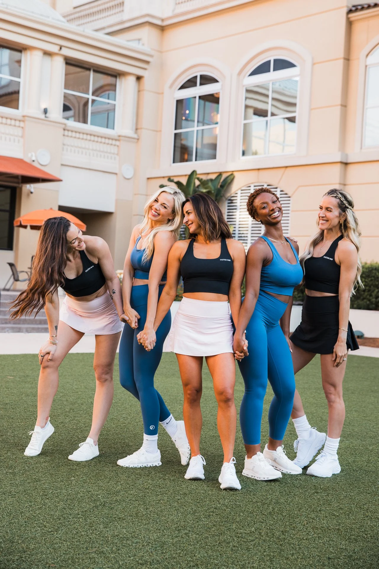
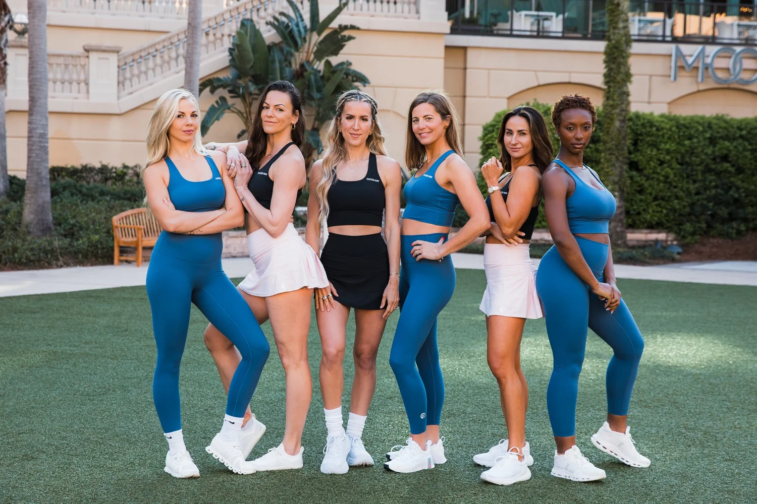
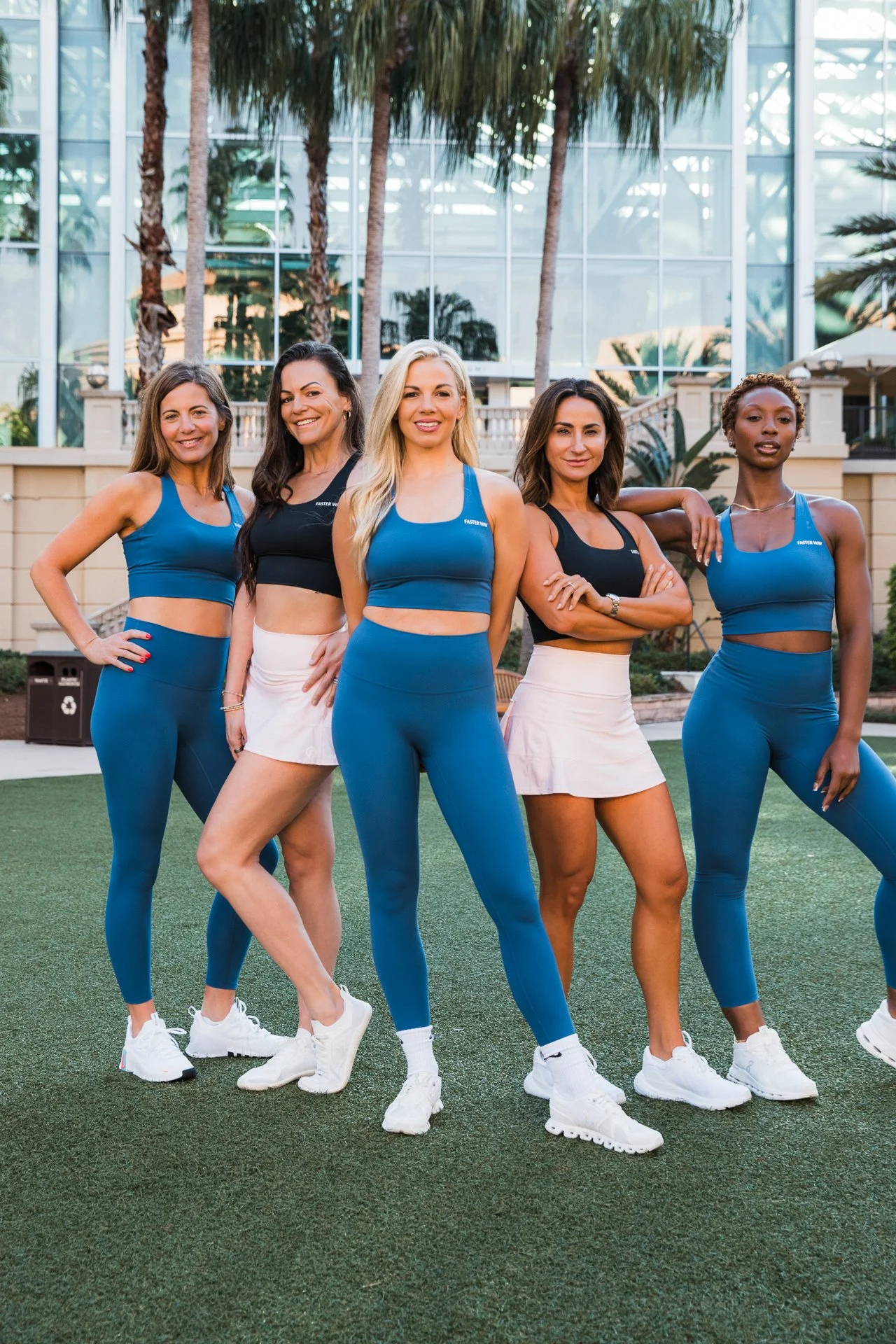
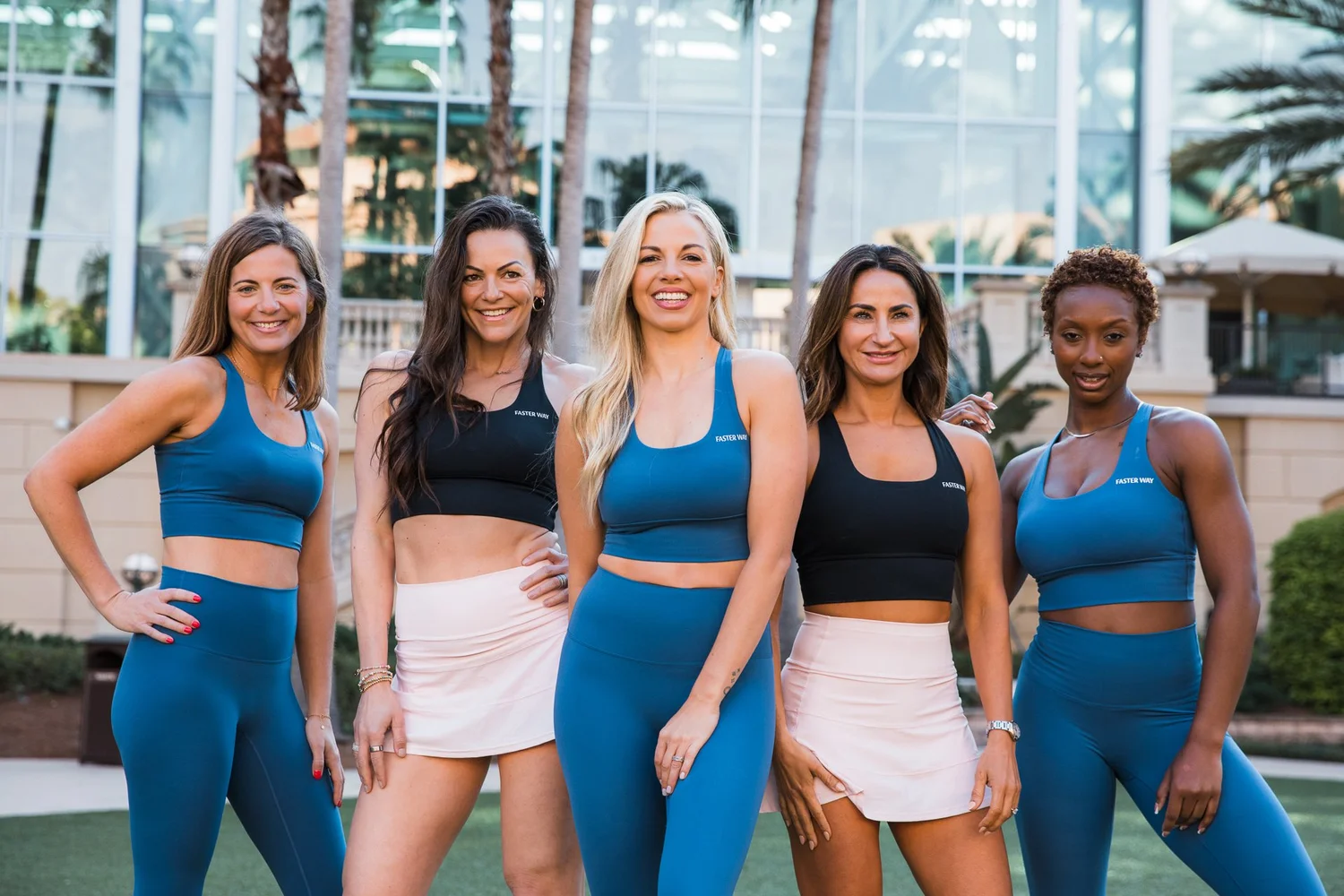
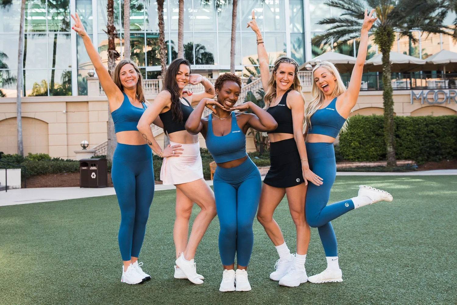
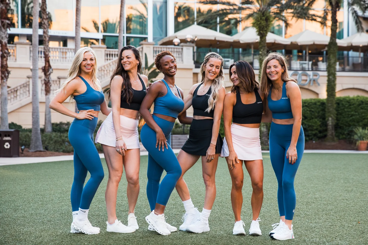
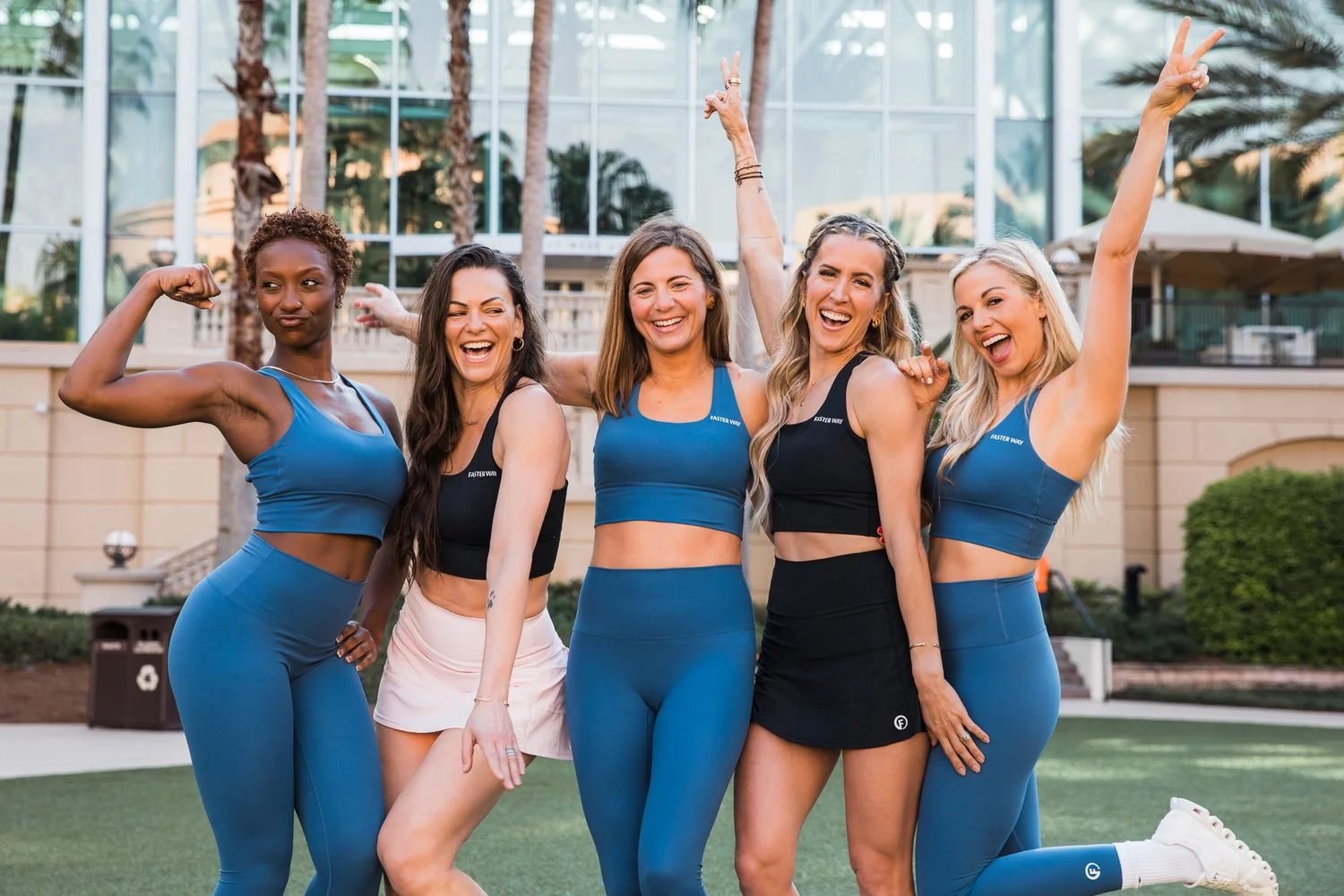
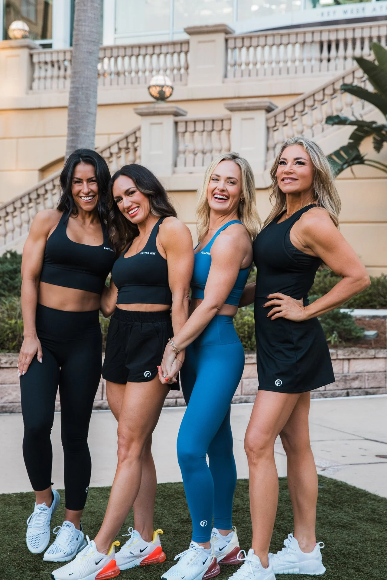
Faster Way to Fat Loss had an exciting new spring clothing line that needed content captured for their campaign. The twist? They had coaches flying in from all across the country to attend a major conference in Orlando. For them, coordinating an individual production day for each coach would be logistically challenging and expensive.

Instead of asking them to pay for the significant cost of flying each coach to Florida for separate shooting days, we saw an opportunity to work smarter, not harder. With a little creativity and flexibility, we could coordinate with their event schedule to capture all the content in one place, saving them money and making the most of the time and resources available.

The Solution: Coordinated Scheduling and a Flexible Approach

Rather than forcing Faster Way to Fat Loss into the rigid constraints of booking a half-day or full-day shoot (which is common in the industry), we took a more collaborative approach. We aligned the production with the coaches' schedules during the multi-day event. Instead of blocking off an entire day, we coordinated to shoot two different days, each about two hours in the morning. This was a highly efficient and flexible solution that allowed us to get everything we needed while minimizing disruption to the coaches’ schedules.

This kind of flexibility is something we pride ourselves on. Most production companies demand clients book a full day or half-day in order to capture enough footage, but we know that this may not always be feasible or necessary for our clients. Instead, we focus on creating a partnership where we can understand their needs, align our approach, and execute a production plan that works best for them—not just us.

A Partnership Approach: More Than Just a Production Company

At Kyle Loftus Studios, we’re not just looking for ways to make money. Instead, we focus on building a true partnership with each of our clients. Our goal is to help them succeed, whether it's making their campaign more effective, reducing costs, or saving time. We understand that each client has different needs, and we tailor our approach accordingly.

In this case, the flexibility we offered Faster Way to Fat Loss in terms of scheduling allowed them to capture the content they needed without exceeding their budget or compromising their event. This kind of partnership-focused approach is one of the many things that sets us apart from other production companies. Instead of just pushing for the largest project or the highest fees, we work closely with our clients to ensure they are successful with what they need.

The Result: Great Content and a Happy Client

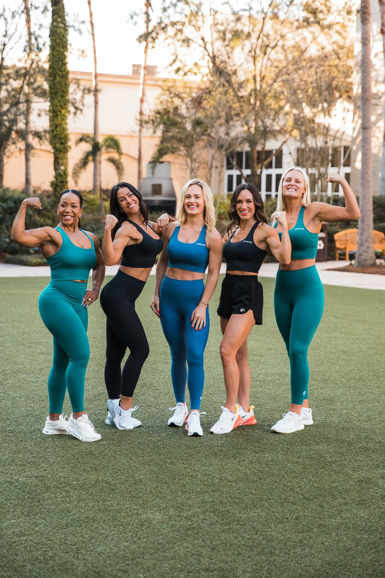
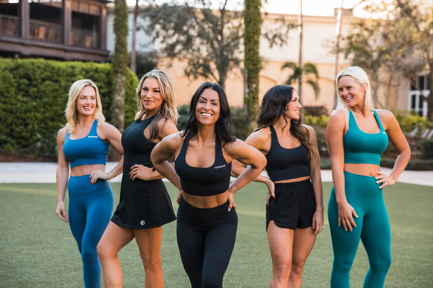
By working around Faster Way to Fat Loss’s event schedule, we were able to efficiently capture content with all of their coaches in just a few hours over two days. This allowed them to get the content they needed for their spring clothing campaign—without the financial burden of flying everyone in separately. The end result was a smooth production, high-quality content, and a satisfied client who felt supported throughout the entire process.

At Kyle Loftus Studios, we are committed to making the production process as easy, efficient, and cost-effective as possible for our clients. When you partner with us, you’re not just getting a team to execute your vision; you’re getting a true collaborator who is invested in your success.

If you're ready to take your brand to the next level with a flexible and partnership-driven production approach, we’d love to work with you. Let’s create something amazing together!

Ready to start your next project with a production team that truly listens to your needs? Reach out today to schedule a consultation and learn how we can help you achieve your vision in the most cost-effective and efficient way possible.
http://www.kyleloftusstudios.com