← All Posts

·6 min read

How We Helped Eat Prima Revamp Their Brand and Position Themselves as a Premium Luxury Product

, and uniform.css sizes any
         main h1 at the page-title scale (.definitive-interior main h1), so
         one landed mid-read at 60px. The cap carries the page class to out-
         specify that rule, and covers the whole family at reading scale. */
      .blog-page .blg-wrap .blg-body h1, .blog-page .blg-wrap .blg-body h2,
      .blog-page .blg-wrap .blg-body h3, .blog-page .blg-wrap .blg-body h4 { margin: 2rem 0 0.75rem; font-family: "Playfair Display", Georgia, serif; font-weight: 400; line-height: 1.3; color: rgb(244 241 235 / 0.95); text-transform: none; letter-spacing: normal; max-width: none; }
      .blog-page .blg-wrap .blg-body h1, .blog-page .blg-wrap .blg-body h2 { font-size: clamp(1.15rem, 1rem + 0.8vw, 1.45rem); }
      .blog-page .blg-wrap .blg-body h3 { font-size: clamp(1.05rem, 0.95rem + 0.55vw, 1.3rem); }
      .blog-page .blg-wrap .blg-body h4 { font-size: clamp(1rem, 0.95rem + 0.3vw, 1.12rem); }
      /* A photo run is not a paragraph - it breaks out past the reading
         measure to ONE width token and packs like the photography archive.
         CSS columns balanced the run into three ragged stacks: a column ran
         long and dangled a photograph below the others, a wide frame overran
         the square its neighbours implied, and a hole opened where the last
         short column stopped. The rows are JUSTIFIED instead - solved at
         build time in galleryize.py, shipped as explicit flex rows.
         A cell's --a is its native aspect. flex-grow:var(--a) over a zero
         basis hands each photo in a row the width a_i x h out of the row's
         free space, so every photo in the row stands at the same height h
         and the last one lands exactly on the right edge - flush left AND
         right, nothing cropped, no measurement on the page. */
      .blg-body { --blg-wide: min(68rem, 92vw); --blg-gap: 0.62rem; }
      .blg-gallery { width: var(--blg-wide); margin: 2rem 0 2.2rem; margin-inline: calc(50% - var(--blg-wide) / 2); display: flex; flex-direction: column; gap: var(--blg-gap); }
      .blg-row { display: flex; column-gap: var(--blg-gap); width: var(--rw, 100%); margin-inline: auto; }
      .blg-nb { display: none; }
      .blg-gallery .blg-cell { flex-grow: var(--a, 1); flex-shrink: 1; flex-basis: 0; min-width: 0; aspect-ratio: var(--a, 1.5); margin: 0; padding: 0; overflow: hidden; border-radius: 0.3rem; background: #0b0d12; cursor: pointer; opacity: 0; transform: translateY(18px); transition: opacity 620ms cubic-bezier(0.22, 0.61, 0.21, 1), transform 740ms cubic-bezier(0.22, 0.61, 0.21, 1); }
      .blg-gallery .blg-cell.is-in { opacity: 1; transform: none; }
      .blg-gallery .blg-cell img { display: block; width: 100%; height: 100%; object-fit: cover; margin: 0; border-radius: 0; opacity: 0.86; transition: transform 760ms cubic-bezier(0.22, 0.61, 0.21, 1), opacity 420ms ease; }
      .blg-gallery .blg-cell:hover img, .blg-gallery .blg-cell:focus-visible img { opacity: 1; transform: scale(1.02); }
      .blg-gallery .blg-cell:focus-visible { outline: 1px solid var(--kls-accent, #fb5607); outline-offset: 2px; }
      /* the run measures itself against the article COLUMN, so the index
         rail simply narrows it - no second width rule for the railed page */
      @supports (container-type: inline-size) {
        .blg-wrap { container-type: inline-size; }
        .blg-body { --blg-wide: min(68rem, 100cqw); }
      }
      /* The phone keeps the grid - 2-up rows out of the same packer at a
         smaller row height, never one full-screen photograph per screen.
         The desktop rows dissolve (display:contents) and the build-time
         narrow breaks drive the lines instead, so one set of photographs
         serves both plans. */
      @media (max-width: 760px) {
        .blg-body { --blg-gap: 0.5rem; }
        .blg-gallery { flex-direction: row; flex-wrap: wrap; column-gap: var(--blg-gap); row-gap: 0; margin-bottom: 1.8rem; }
        .blg-row { display: contents; }
        .blg-nb { display: block; flex: 0 0 100%; height: var(--blg-gap); }
      }
      @media (prefers-reduced-motion: reduce) { .blg-gallery .blg-cell { opacity: 1; transform: none; transition: none; } }
      /* A short line stranded between two photo runs read as a fragment
         someone forgot to delete. It is the author's own beat - so it is set
         as one: centred, given air on both sides, a step up in scale. The
         builder finds it; not a word of it is moved or rewritten. */
      .blg-body .blg-beat { margin: clamp(2.4rem, 5.5vh, 3.6rem) auto; max-width: 34rem; text-align: center; }
      .blg-body .blg-beat p, .blg-body .blg-beat div { margin-left: auto; margin-right: auto; }
      /* Squarespace put white-space:pre-wrap INLINE on these paragraphs, so
         the source indent after each  printed as a real leading space
         and every line after the first sat 3px right of centre. pre-line
         keeps the author's line breaks and drops the indentation; it has to
         out-rank an inline style, hence the !important, and it is scoped to
         the beat alone. No character of the copy changes. */
      .blg-body .blg-beat p { margin-top: 0; margin-bottom: 0.4rem; white-space: pre-line !important; font-family: "Playfair Display", Georgia, serif; font-size: clamp(1.2rem, 1rem + 1vw, 1.65rem); line-height: 1.4; color: rgb(244 241 235 / 0.94); }
      .blg-body .blg-beat p:last-child { margin-bottom: 0; }
      /* end blg-gallery */


    Skip to content


          ← All Posts
          Mar 25, 2025·6 min read
          How We Helped Eat Prima Revamp Their Brand and Position Themselves as a Premium Luxury Product

At Kyle Loftus Studios, we specialize in creating high-end commercial content that not only looks stunning but also delivers results. Recently, we had the privilege of working with Eat Prima, a growing brand with a vision to transform their marketing and content into a luxury, high-quality experience that matched their premium natural ingredients. Despite not having a massive marketing budget, Eat Prima approached us with one simple question: Can you help us reposition our brand and create content that drives results? And our answer was an enthusiastic, Absolutely.

This post takes you behind the scenes of how we collaborated with Eat Prima to elevate their brand and make their product stand out in an increasingly competitive market.

The Challenge: Repositioning Eat Prima as a Premium Brand


Eat Prima, while a rising star in the market, had found their branding and content no longer reflecting the high-end, luxurious product they were offering. The company is dedicated to providing customers with top-quality, natural ingredients, but their existing marketing and visual assets didn’t quite match the perception they wanted to create in the market. As a brand on the rise, they didn’t have the multi-million-dollar budgets of larger companies, but they knew that revamping their branding was the key to accelerating their growth.

Our Approach: Creating a Strategic Content Plan That Makes Sense


When Eat Prima approached us, we didn’t just see this as another project – we saw a business opportunity for growth, and we treated it as such. From the very beginning, our philosophy was clear: If it makes money, it makes sense. If it makes sense, it makes money.

With this in mind, we took a consultative approach to understand Eat Prima’s current position, their growth aspirations, and how we could best use video and photo content to propel them to the next level. We asked ourselves, How can we position this brand as a premium luxury product while being mindful of their budget?

Our strategy focused not just on creating beautiful visuals but on ensuring those visuals converted into results. It’s about making sure that every piece of content serves a larger purpose, whether that’s increasing brand awareness, driving sales, or positioning the brand as a market leader.

The Execution: High-End Commercial Production with a Focus on ROI


We understand the importance of delivering high-quality content that aligns with both the aesthetic and the commercial goals of the brand. For Eat Prima, we set out to create visuals that conveyed luxury, sophistication, and quality – all while staying within their budget. This was no easy task, but it’s what we do best.

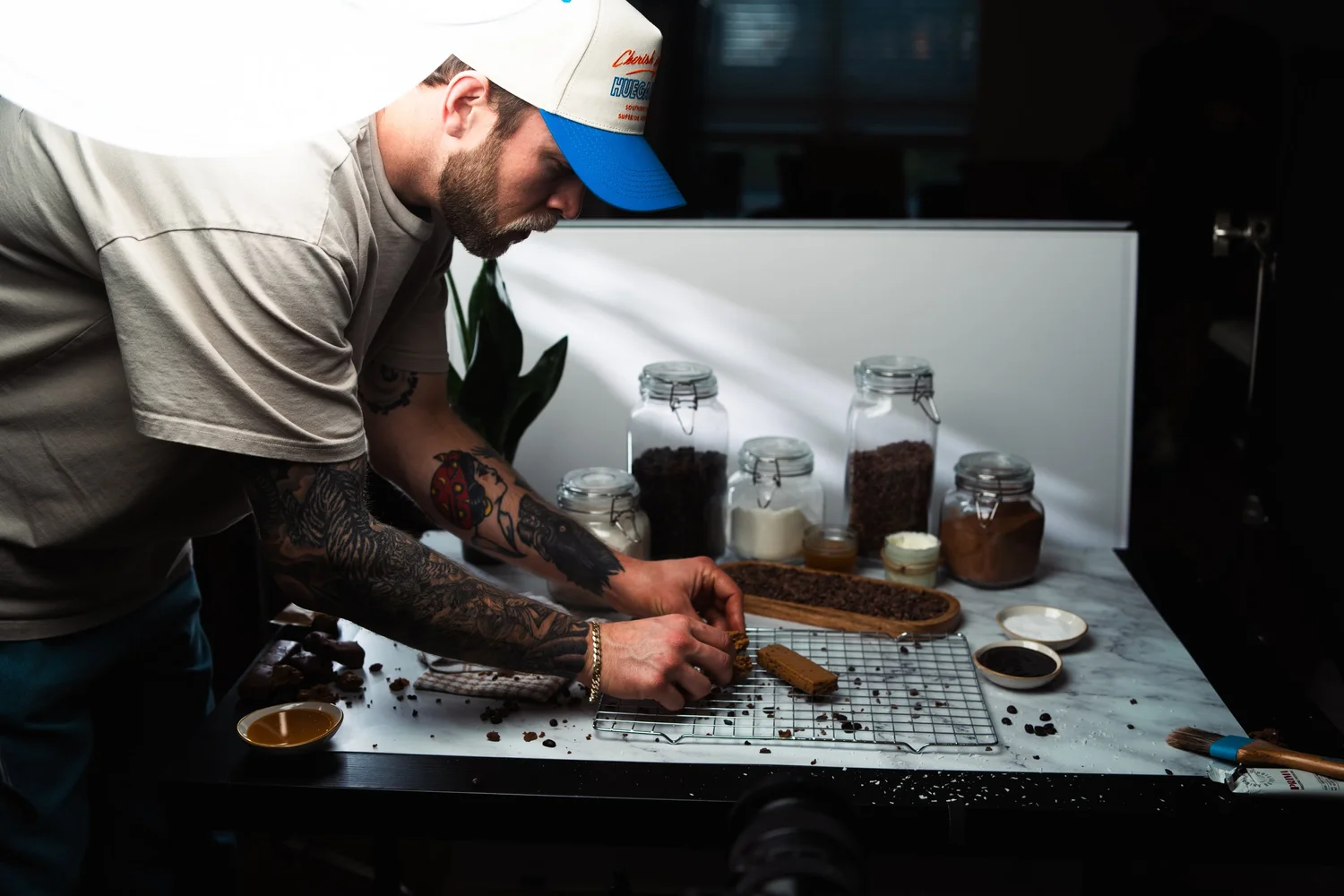
From concept development and storyboarding to shooting and post-production, we worked closely with Eat Prima to ensure every detail matched their vision. The result? A series of commercials that elevate their brand’s positioning and showcase their premium ingredients in the most luxurious way possible.

But here’s where our process truly stands out: We didn’t just focus on the production. We made sure to align the content with Eat Prima’s marketing strategy. We considered how the content would be used in their marketing campaigns, making sure it would generate measurable results. The goal was to produce content that not only looked beautiful but also drove the ROI they needed to reinvest and grow their brand.

Our Philosophy: Business Partnerships for Long-Term Growth


What really sets us apart is how we work with our clients. We don’t just create content; we develop long-term strategies with our clients, ensuring they get the most out of every dollar they spend. For Eat Prima, our goal wasn’t just to create a one-time commercial but to establish a partnership where they could come back to us time and time again.

When our clients win, we win. That’s why we take the time to understand their current position, their goals, and the marketplace they’re trying to break into. We know that if we can help them achieve success with our content, they’ll keep coming back for more, allowing us to grow with them. We treat our clients not just as customers, but as business partners.

This approach has allowed us to build lasting relationships with our clients, making sure that the results we produce continue to yield returns well beyond the initial project.

Conclusion: A Partnership That Delivers Results


Working with Eat Prima was an exciting challenge, and we’re incredibly proud of what we’ve achieved together. By carefully aligning their brand’s positioning with high-quality, strategic content, we helped them take a giant step forward in their growth journey. The project is a testament to our ability to deliver stunning visuals that resonate with the target audience while keeping an eye on the bottom line.

At Kyle Loftus Studios, we specialize in creating high-end commercial content that not only looks good but also drives results. If you’re a brand looking to elevate your positioning and drive real business growth, we’d love to help you do the same.

Let’s create something extraordinary together.

http://www.kyleloftusstudios.com