← All Posts

·4 min read

Pushing Creative Limits: How We Bring Fresh, Bold Ideas to Jeremiah’s Monthly Campaigns

, and uniform.css sizes any
         main h1 at the page-title scale (.definitive-interior main h1), so
         one landed mid-read at 60px. The cap carries the page class to out-
         specify that rule, and covers the whole family at reading scale. */
      .blog-page .blg-wrap .blg-body h1, .blog-page .blg-wrap .blg-body h2,
      .blog-page .blg-wrap .blg-body h3, .blog-page .blg-wrap .blg-body h4 { margin: 2rem 0 0.75rem; font-family: "Playfair Display", Georgia, serif; font-weight: 400; line-height: 1.3; color: rgb(244 241 235 / 0.95); text-transform: none; letter-spacing: normal; max-width: none; }
      .blog-page .blg-wrap .blg-body h1, .blog-page .blg-wrap .blg-body h2 { font-size: clamp(1.15rem, 1rem + 0.8vw, 1.45rem); }
      .blog-page .blg-wrap .blg-body h3 { font-size: clamp(1.05rem, 0.95rem + 0.55vw, 1.3rem); }
      .blog-page .blg-wrap .blg-body h4 { font-size: clamp(1rem, 0.95rem + 0.3vw, 1.12rem); }
      /* A photo run is not a paragraph - it breaks out past the reading
         measure to ONE width token and packs like the photography archive.
         CSS columns balanced the run into three ragged stacks: a column ran
         long and dangled a photograph below the others, a wide frame overran
         the square its neighbours implied, and a hole opened where the last
         short column stopped. The rows are JUSTIFIED instead - solved at
         build time in galleryize.py, shipped as explicit flex rows.
         A cell's --a is its native aspect. flex-grow:var(--a) over a zero
         basis hands each photo in a row the width a_i x h out of the row's
         free space, so every photo in the row stands at the same height h
         and the last one lands exactly on the right edge - flush left AND
         right, nothing cropped, no measurement on the page. */
      .blg-body { --blg-wide: min(68rem, 92vw); --blg-gap: 0.62rem; }
      .blg-gallery { width: var(--blg-wide); margin: 2rem 0 2.2rem; margin-inline: calc(50% - var(--blg-wide) / 2); display: flex; flex-direction: column; gap: var(--blg-gap); }
      .blg-row { display: flex; column-gap: var(--blg-gap); width: var(--rw, 100%); margin-inline: auto; }
      .blg-nb { display: none; }
      .blg-gallery .blg-cell { flex-grow: var(--a, 1); flex-shrink: 1; flex-basis: 0; min-width: 0; aspect-ratio: var(--a, 1.5); margin: 0; padding: 0; overflow: hidden; border-radius: 0.3rem; background: #0b0d12; cursor: pointer; opacity: 0; transform: translateY(18px); transition: opacity 620ms cubic-bezier(0.22, 0.61, 0.21, 1), transform 740ms cubic-bezier(0.22, 0.61, 0.21, 1); }
      .blg-gallery .blg-cell.is-in { opacity: 1; transform: none; }
      .blg-gallery .blg-cell img { display: block; width: 100%; height: 100%; object-fit: cover; margin: 0; border-radius: 0; opacity: 0.86; transition: transform 760ms cubic-bezier(0.22, 0.61, 0.21, 1), opacity 420ms ease; }
      .blg-gallery .blg-cell:hover img, .blg-gallery .blg-cell:focus-visible img { opacity: 1; transform: scale(1.02); }
      .blg-gallery .blg-cell:focus-visible { outline: 1px solid var(--kls-accent, #fb5607); outline-offset: 2px; }
      /* the run measures itself against the article COLUMN, so the index
         rail simply narrows it - no second width rule for the railed page */
      @supports (container-type: inline-size) {
        .blg-wrap { container-type: inline-size; }
        .blg-body { --blg-wide: min(68rem, 100cqw); }
      }
      /* The phone keeps the grid - 2-up rows out of the same packer at a
         smaller row height, never one full-screen photograph per screen.
         The desktop rows dissolve (display:contents) and the build-time
         narrow breaks drive the lines instead, so one set of photographs
         serves both plans. */
      @media (max-width: 760px) {
        .blg-body { --blg-gap: 0.5rem; }
        .blg-gallery { flex-direction: row; flex-wrap: wrap; column-gap: var(--blg-gap); row-gap: 0; margin-bottom: 1.8rem; }
        .blg-row { display: contents; }
        .blg-nb { display: block; flex: 0 0 100%; height: var(--blg-gap); }
      }
      @media (prefers-reduced-motion: reduce) { .blg-gallery .blg-cell { opacity: 1; transform: none; transition: none; } }
      /* A short line stranded between two photo runs read as a fragment
         someone forgot to delete. It is the author's own beat - so it is set
         as one: centred, given air on both sides, a step up in scale. The
         builder finds it; not a word of it is moved or rewritten. */
      .blg-body .blg-beat { margin: clamp(2.4rem, 5.5vh, 3.6rem) auto; max-width: 34rem; text-align: center; }
      .blg-body .blg-beat p, .blg-body .blg-beat div { margin-left: auto; margin-right: auto; }
      /* Squarespace put white-space:pre-wrap INLINE on these paragraphs, so
         the source indent after each  printed as a real leading space
         and every line after the first sat 3px right of centre. pre-line
         keeps the author's line breaks and drops the indentation; it has to
         out-rank an inline style, hence the !important, and it is scoped to
         the beat alone. No character of the copy changes. */
      .blg-body .blg-beat p { margin-top: 0; margin-bottom: 0.4rem; white-space: pre-line !important; font-family: "Playfair Display", Georgia, serif; font-size: clamp(1.2rem, 1rem + 1vw, 1.65rem); line-height: 1.4; color: rgb(244 241 235 / 0.94); }
      .blg-body .blg-beat p:last-child { margin-bottom: 0; }
      /* end blg-gallery */


    Skip to content


          ← All Posts
          Mar 25, 2025·4 min read
          Pushing Creative Limits: How We Bring Fresh, Bold Ideas to Jeremiah’s Monthly Campaigns

When working with a brand like Jeremiah’s Italian Ice, creativity is everything. Their brand identity is fun, playful, bold, and cool, appealing to kids, parents, and families alike. But the real challenge? Keeping things fresh with every new product release. Each month, we’re tasked with developing a new and exciting creative campaign that aligns with their branding while also introducing something unique and attention-grabbing. And we love every second of it!
The Challenge of Always Creating Something New

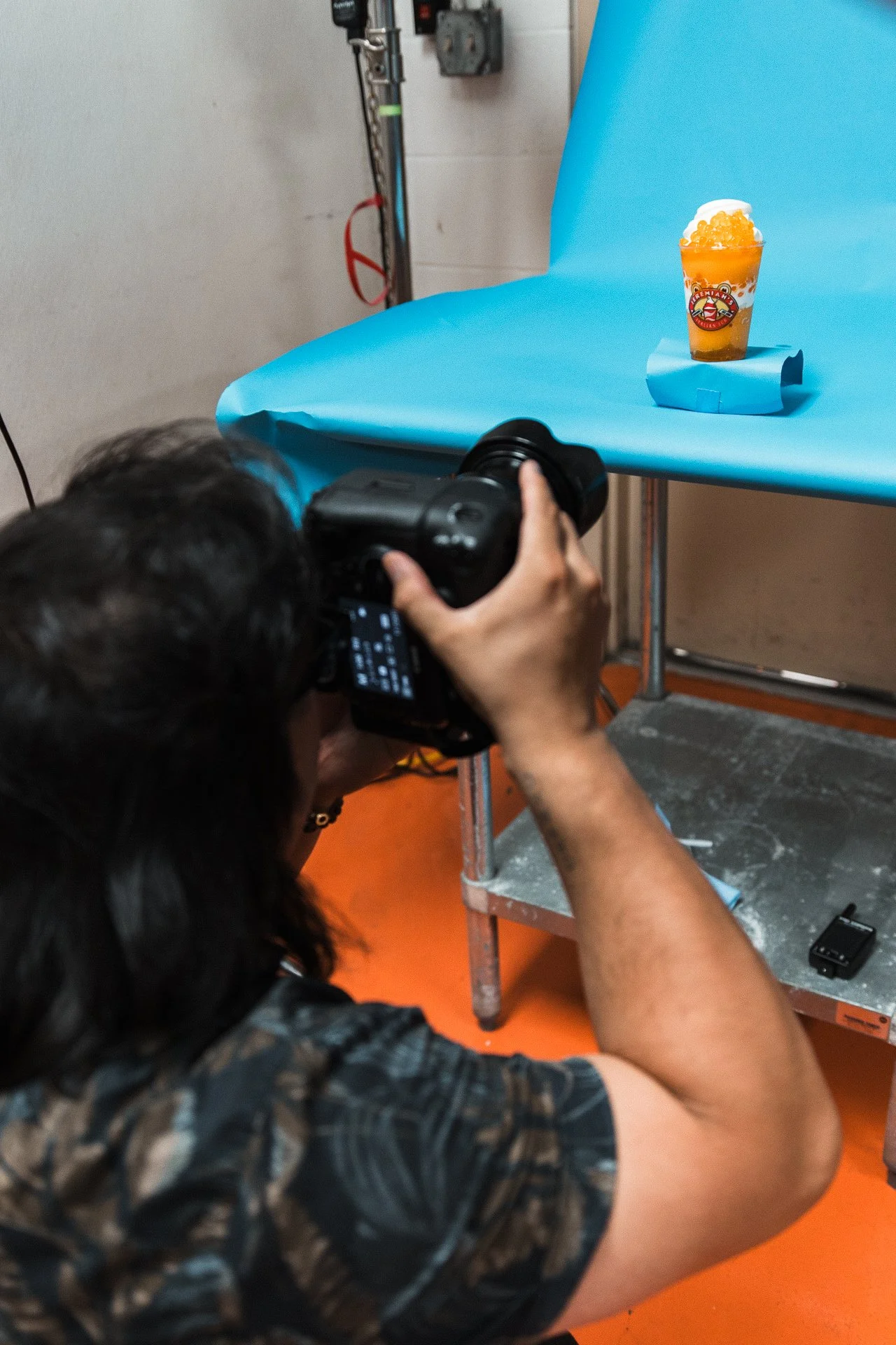
With Jeremiah’s, no two projects are ever the same. Every campaign brings new flavors, new themes, and new opportunities to push creative boundaries. The key is maintaining their signature brand identity while constantly reimagining our approach to keep customers engaged. That means exploring bold concepts, fresh visual styles, and innovative storytelling techniques to craft standout content.
The Hoppin' Boba Campaign: A Kawaii Dreamworld in Live-Action

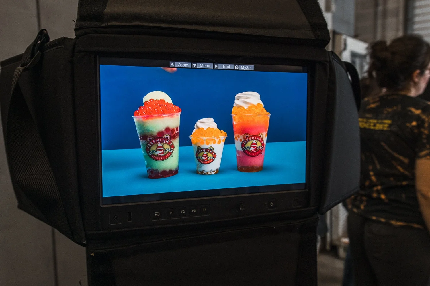
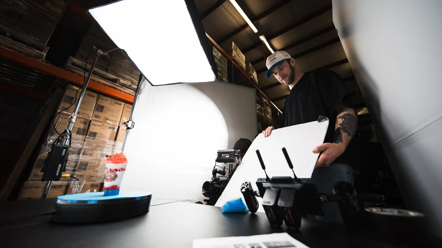
For the launch of Hoppin’ Boba, we decided to take a playful, Japanese-inspired approach by tapping into kawaii culture and animation. Boba tea is often associated with Japanese trends, so it only made sense to create a bright, colorful, animated world to showcase the new product in an engaging way.

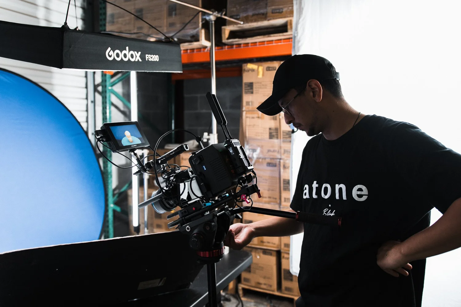
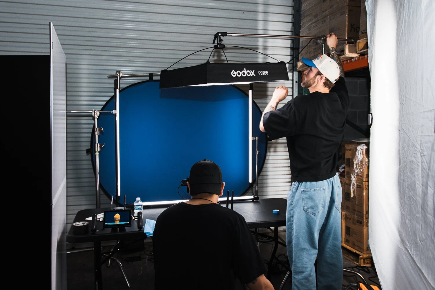
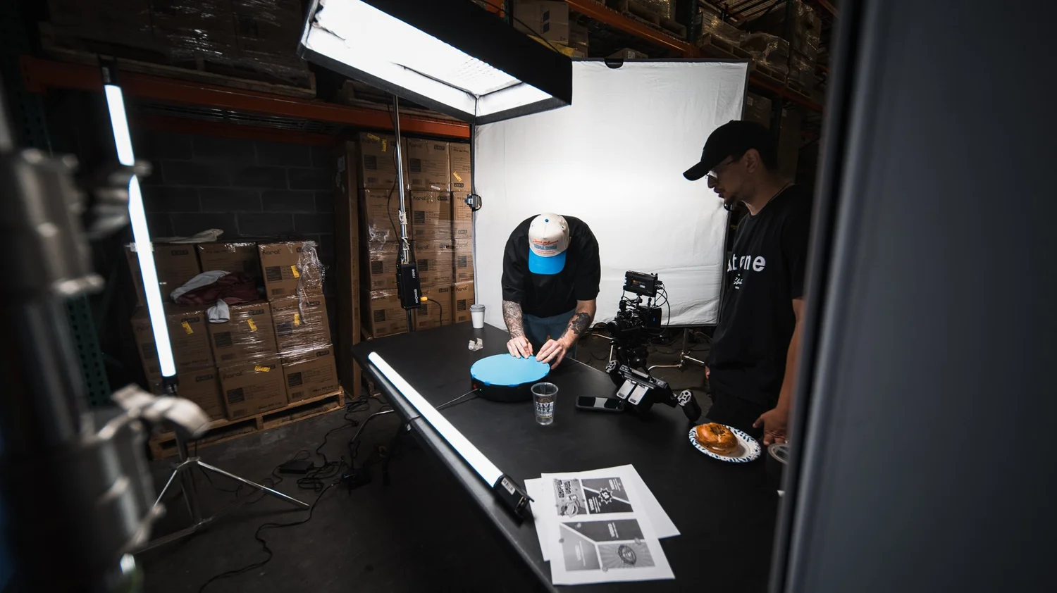
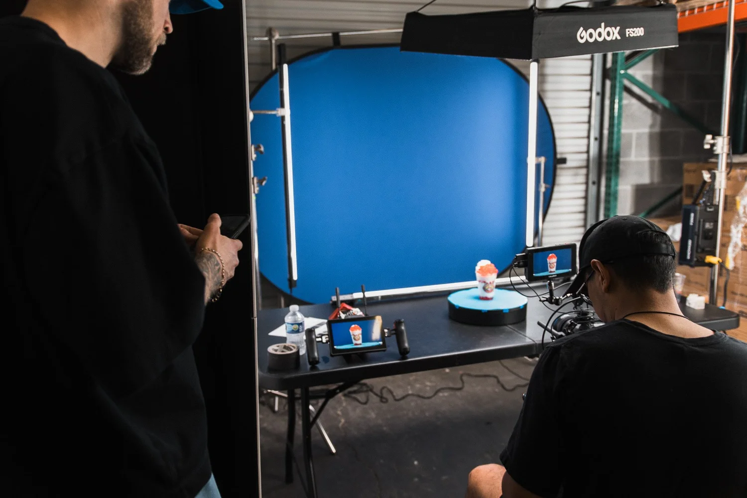
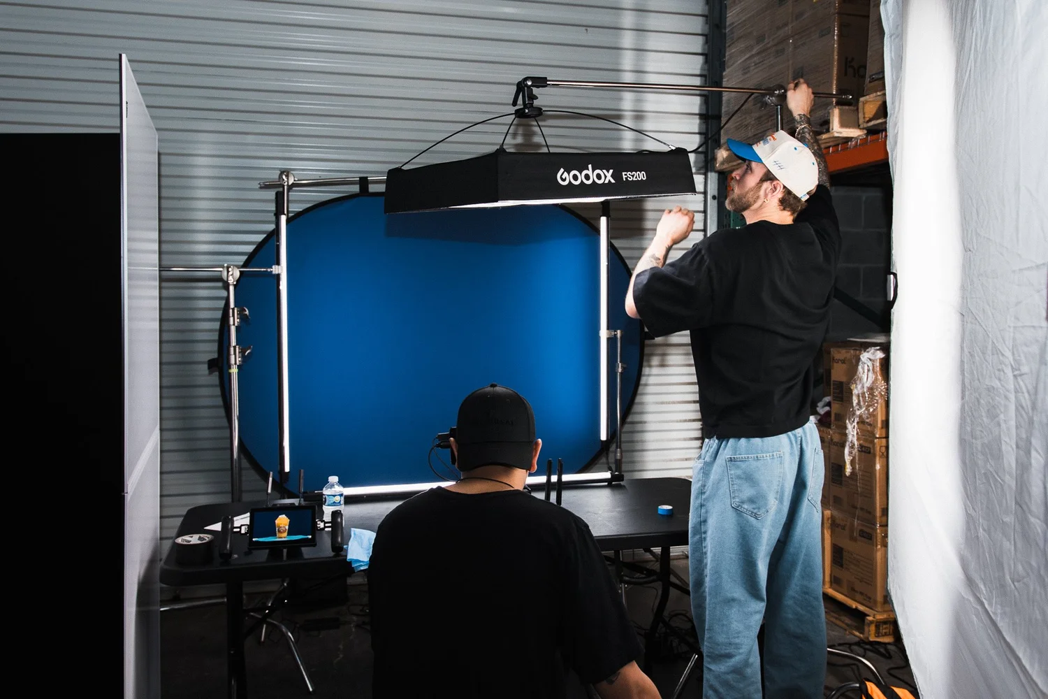
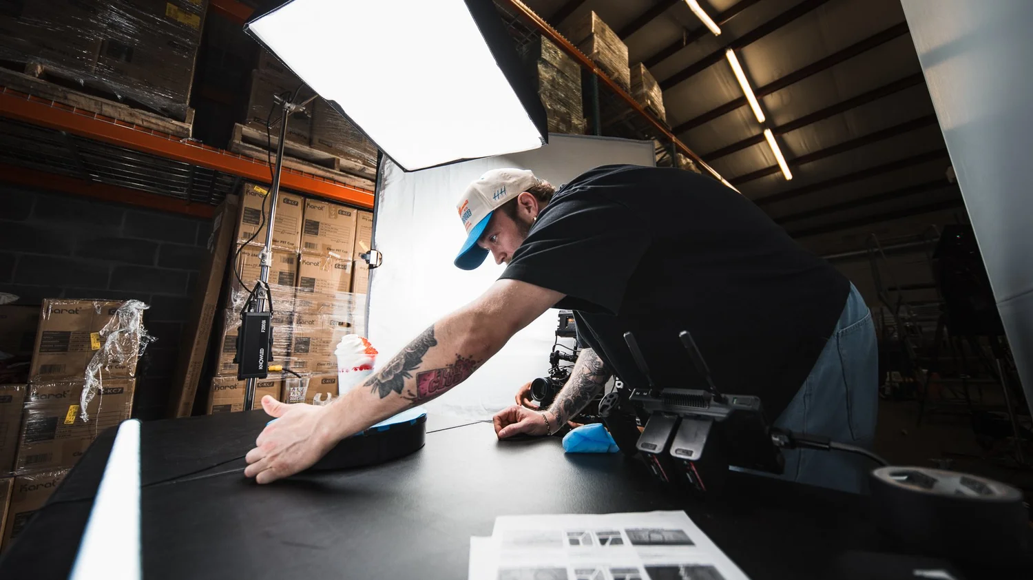
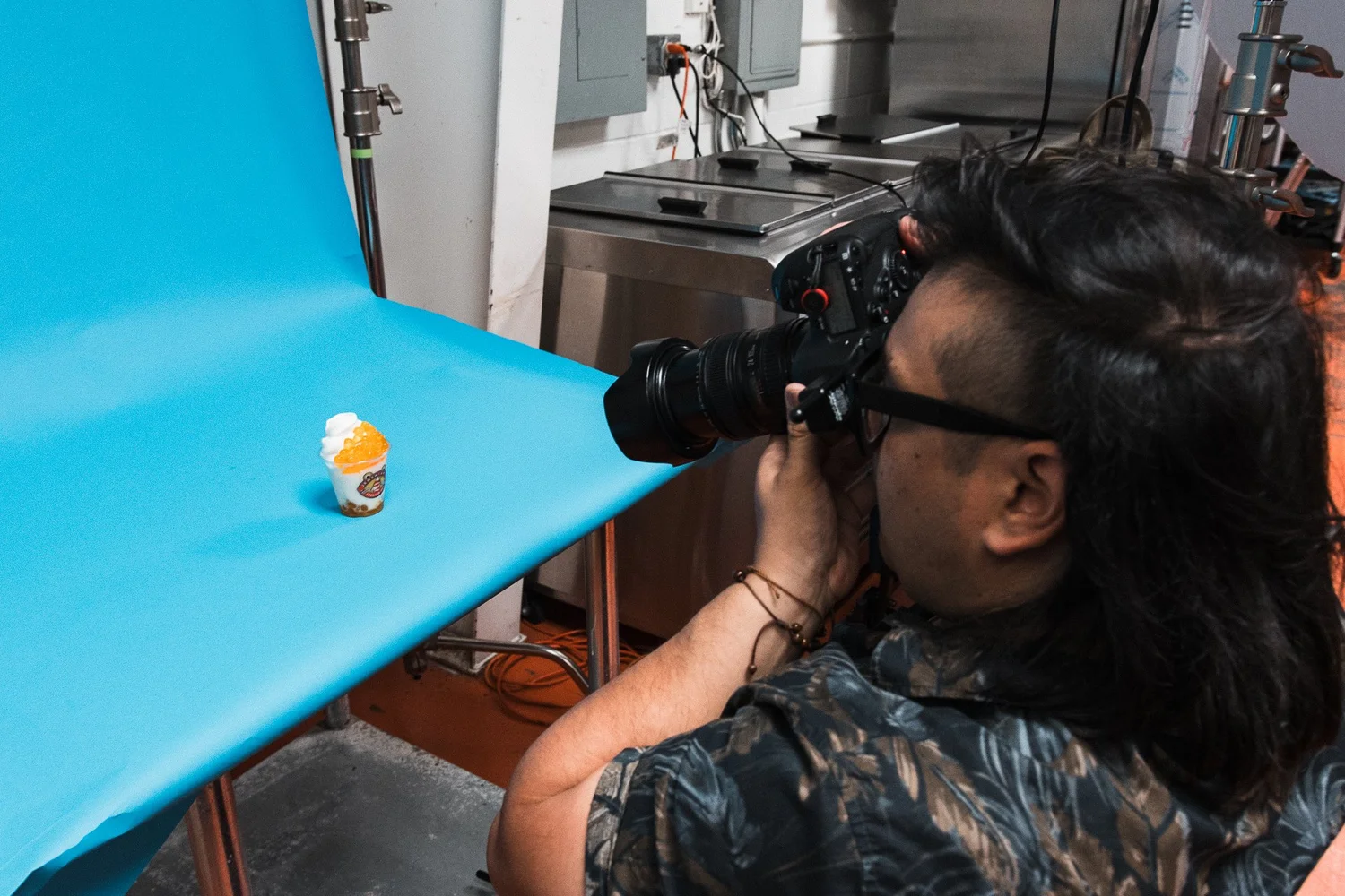
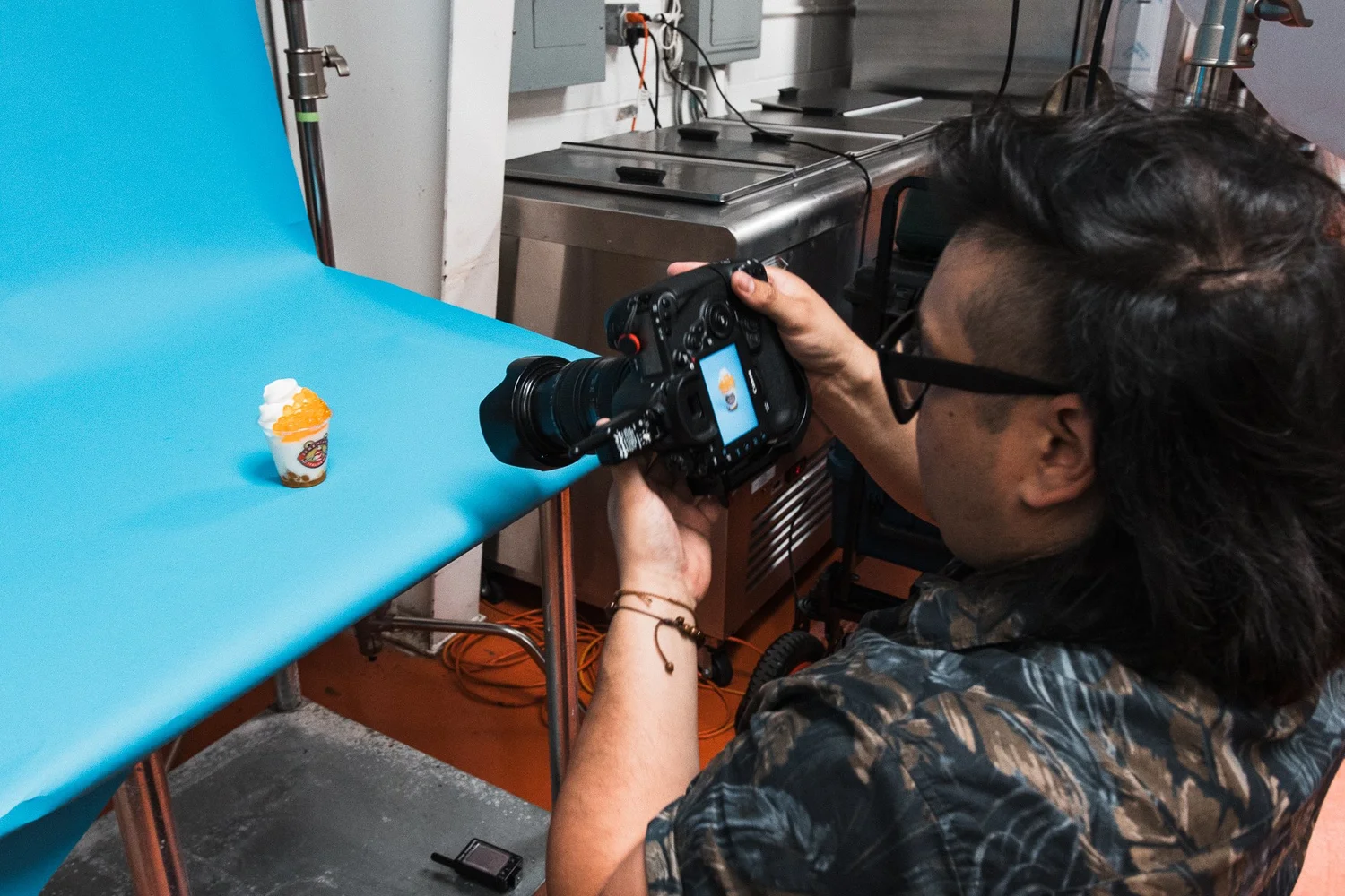
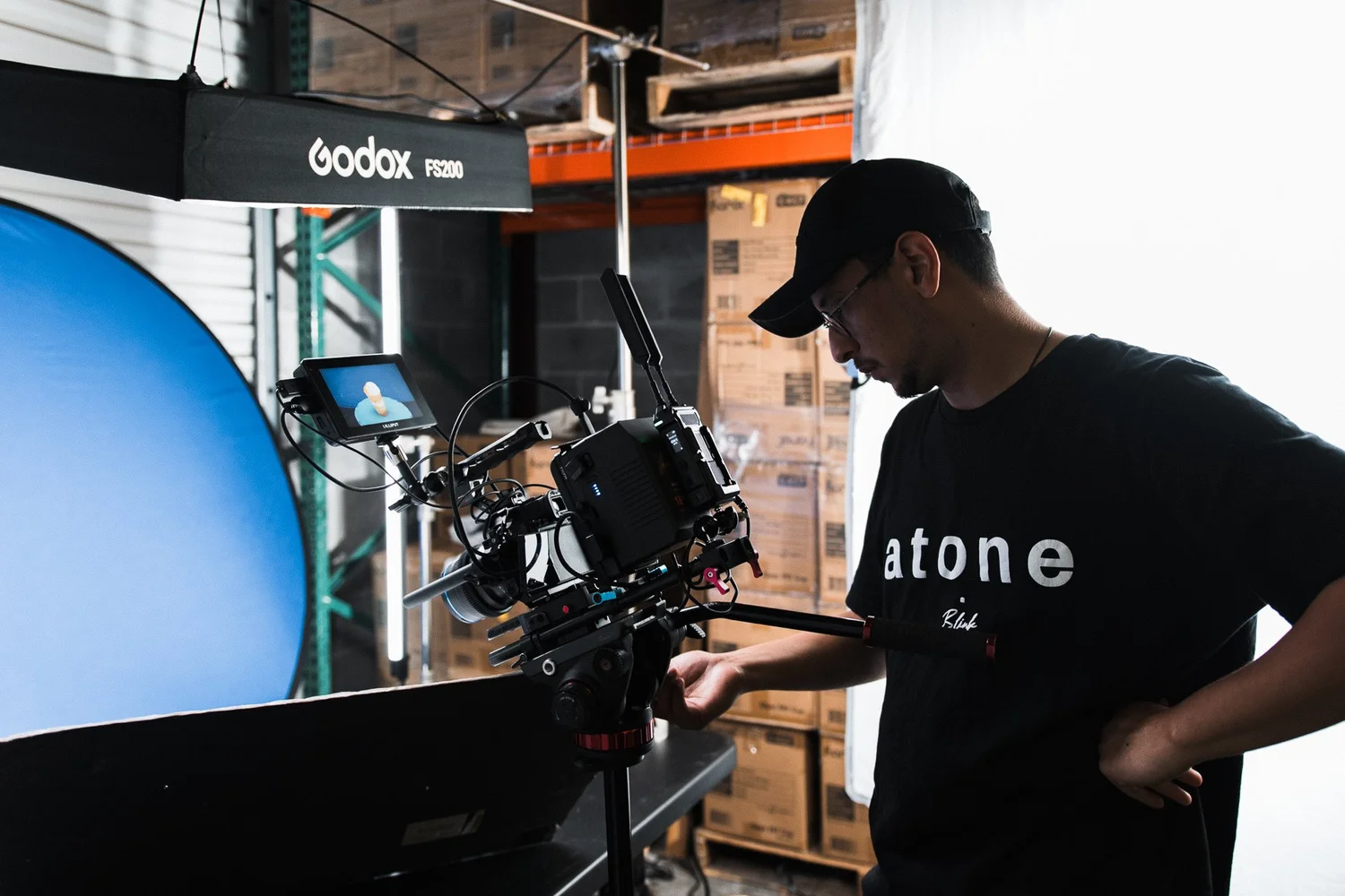
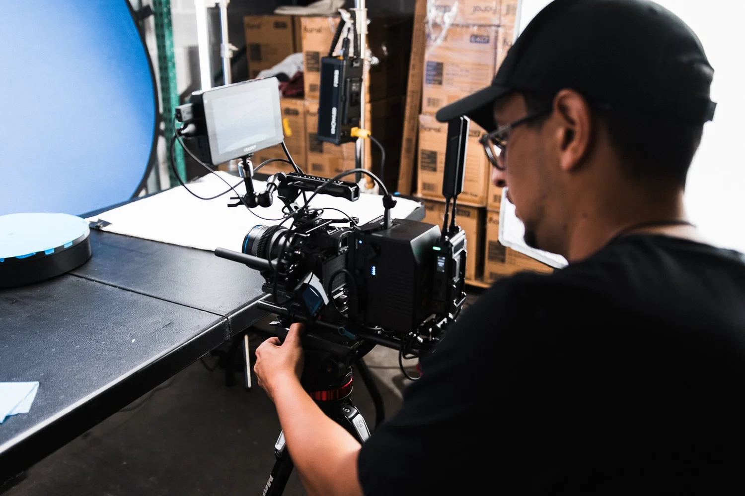
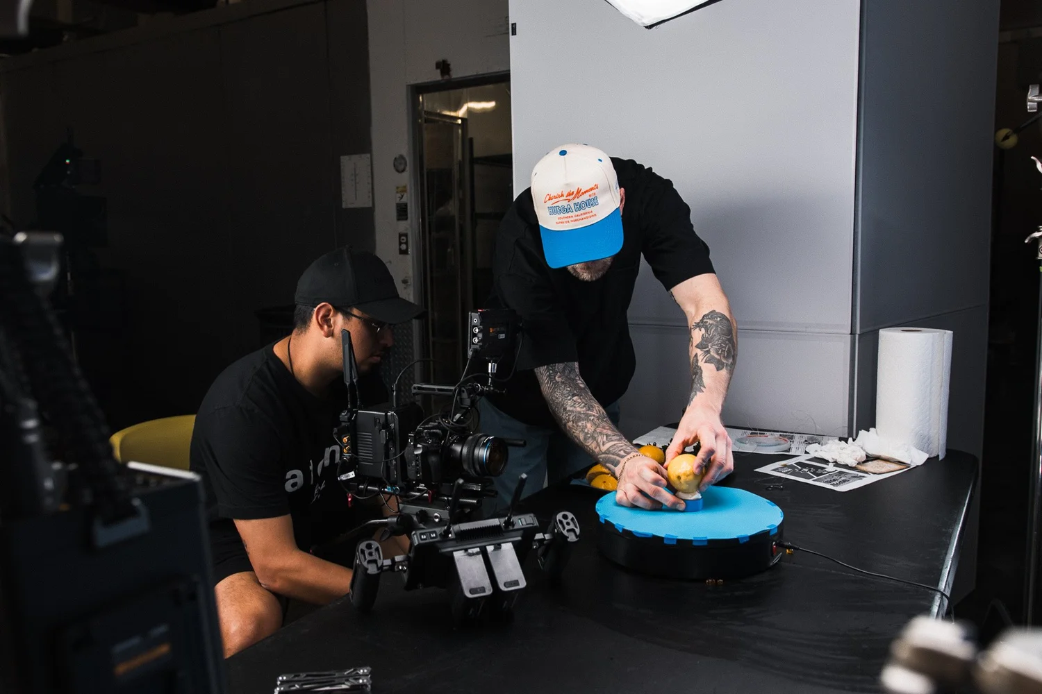
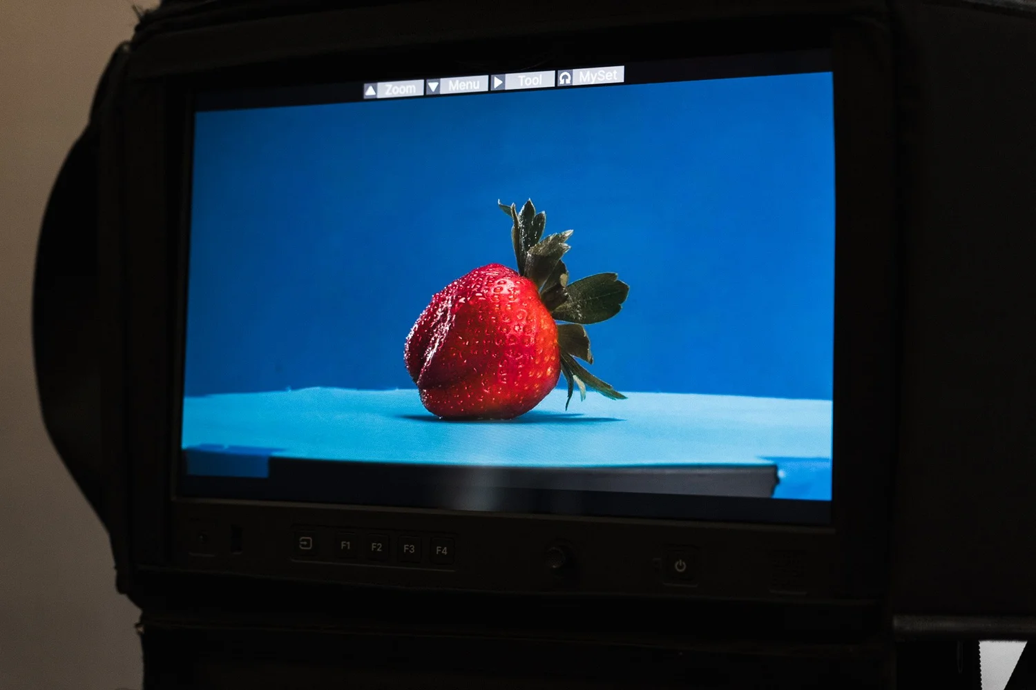
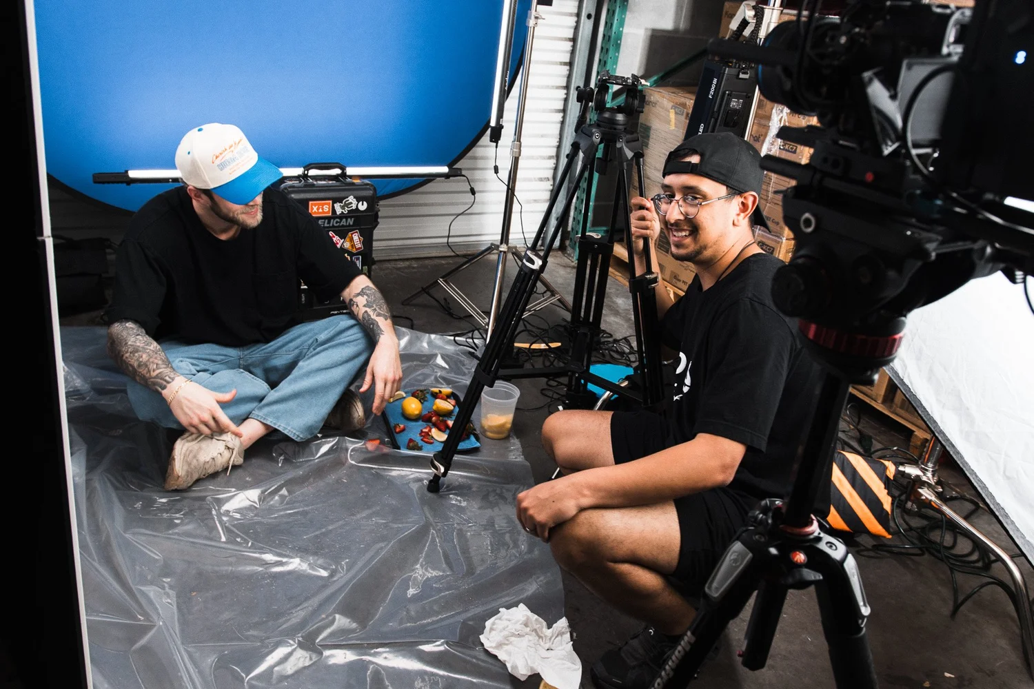
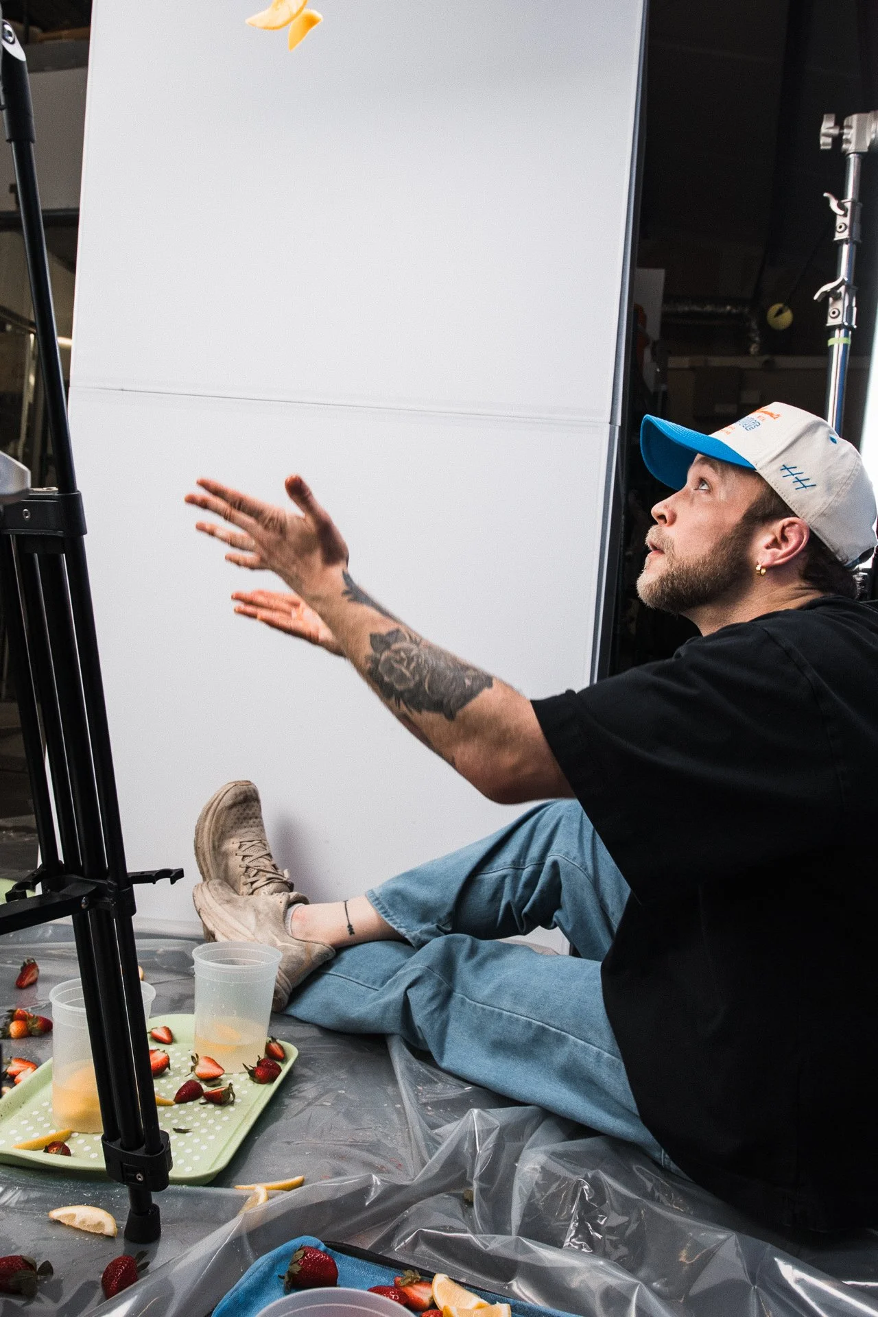
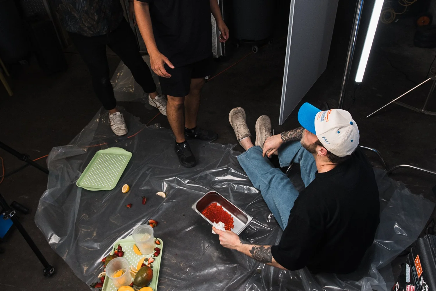
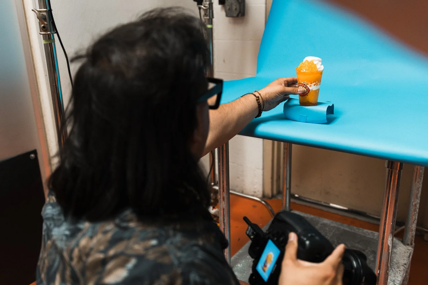
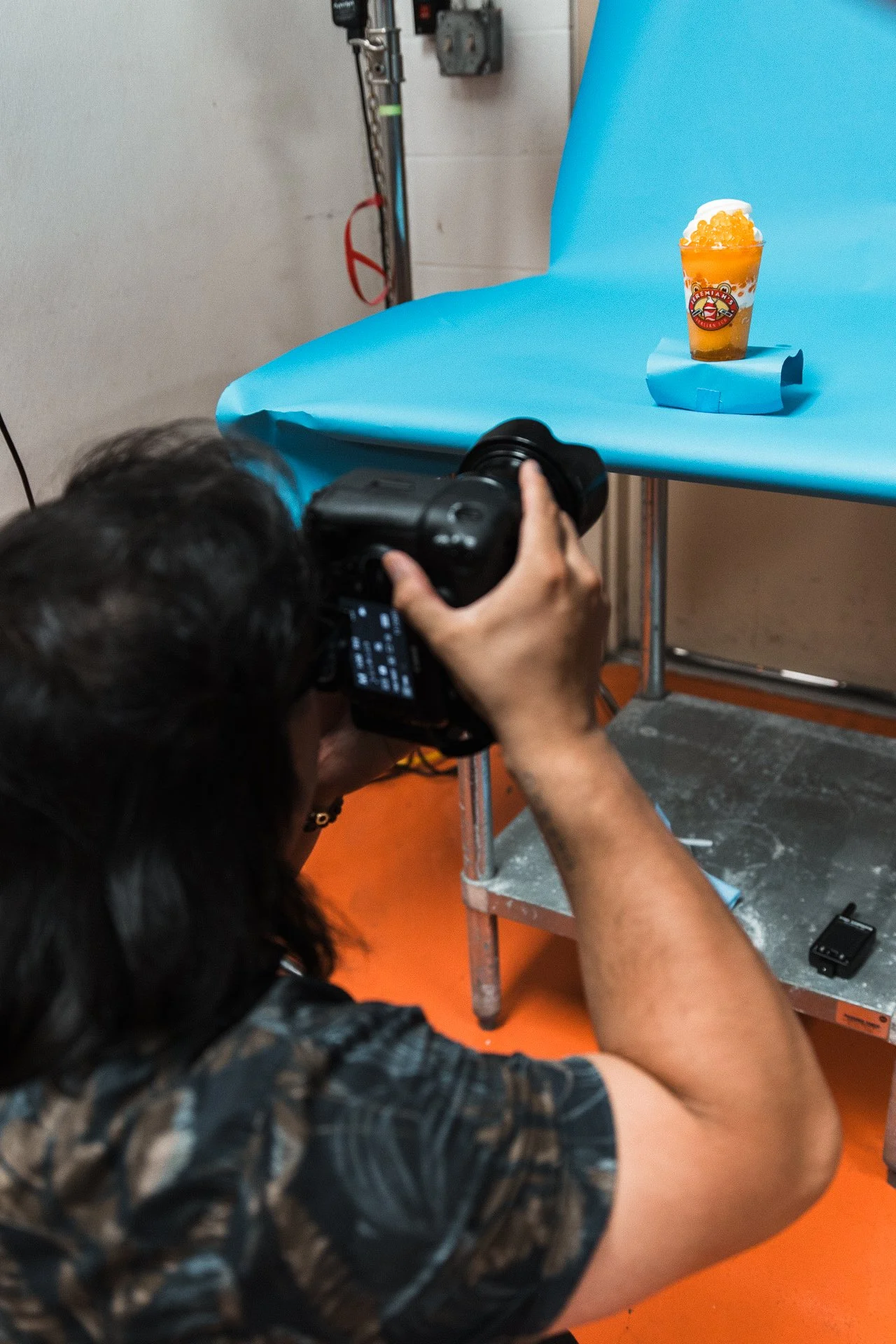
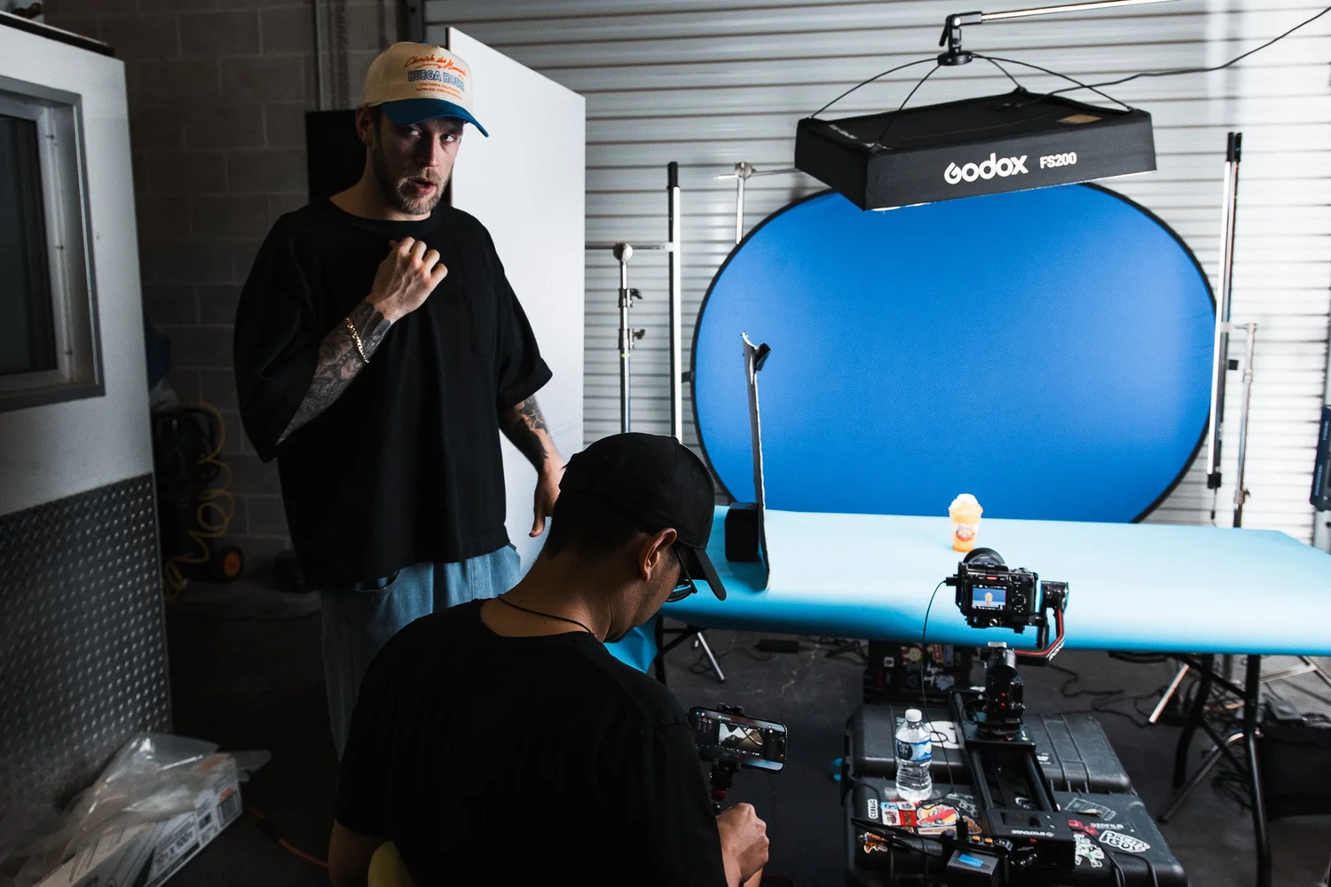
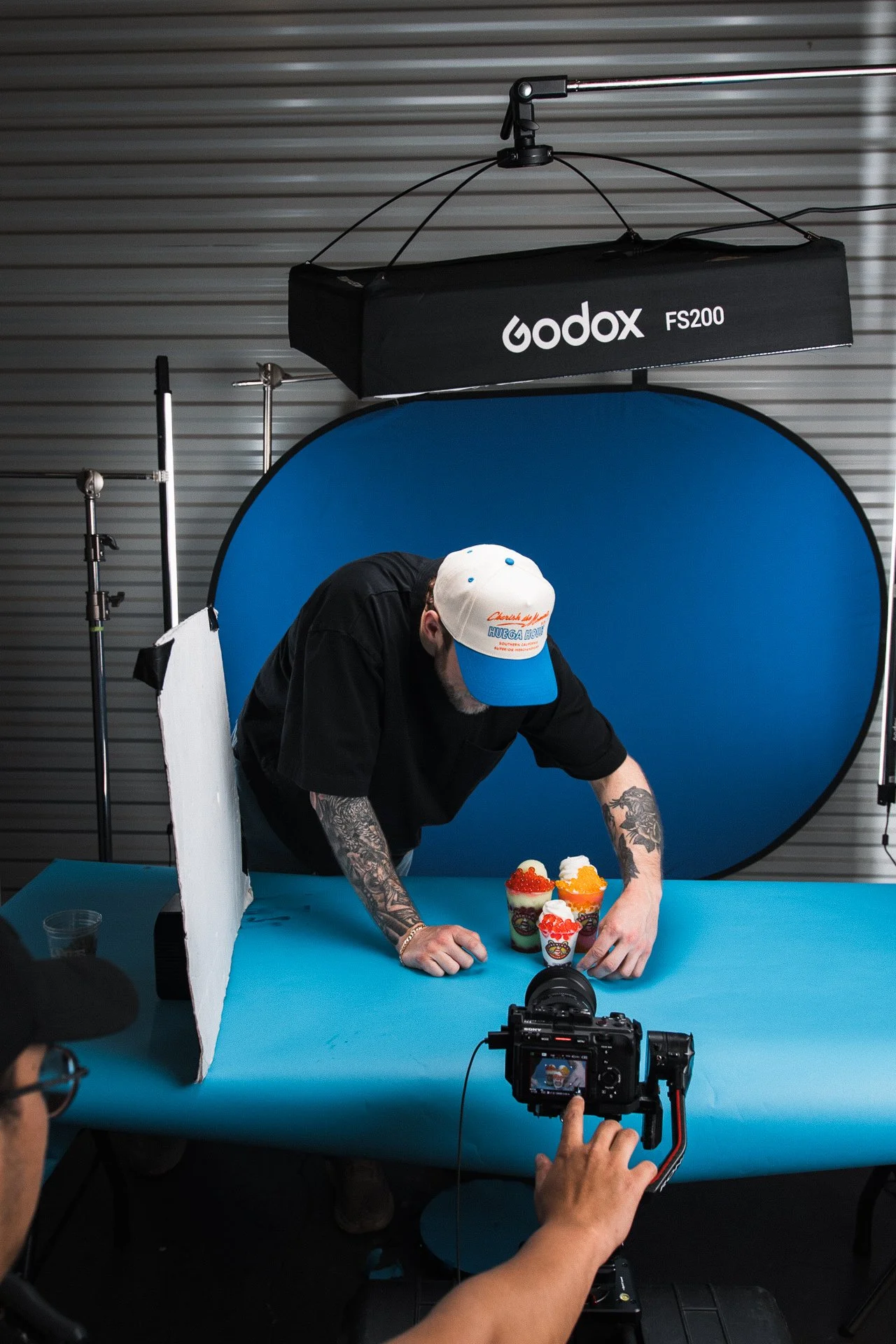
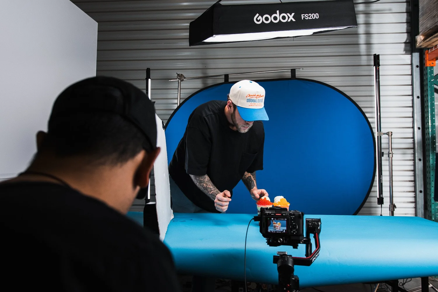
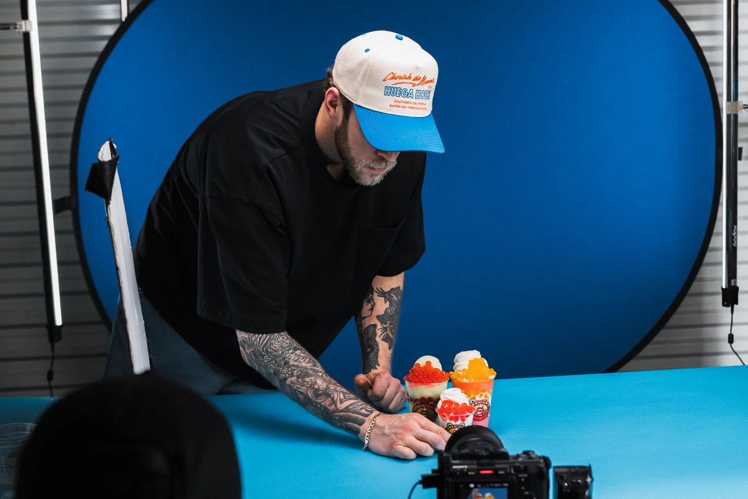
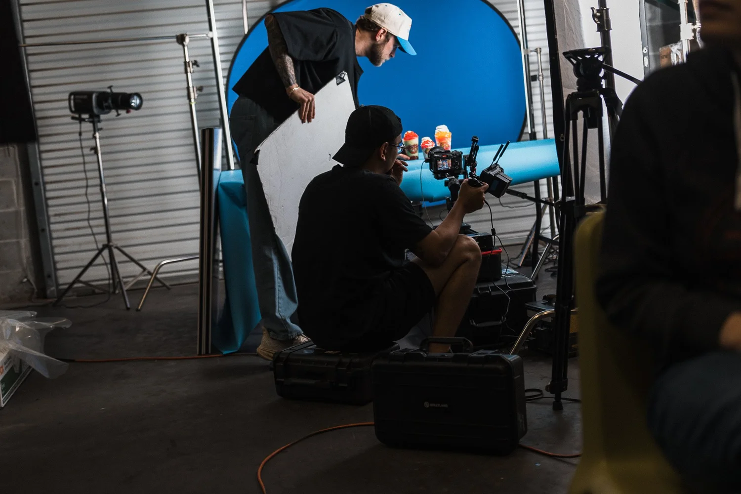
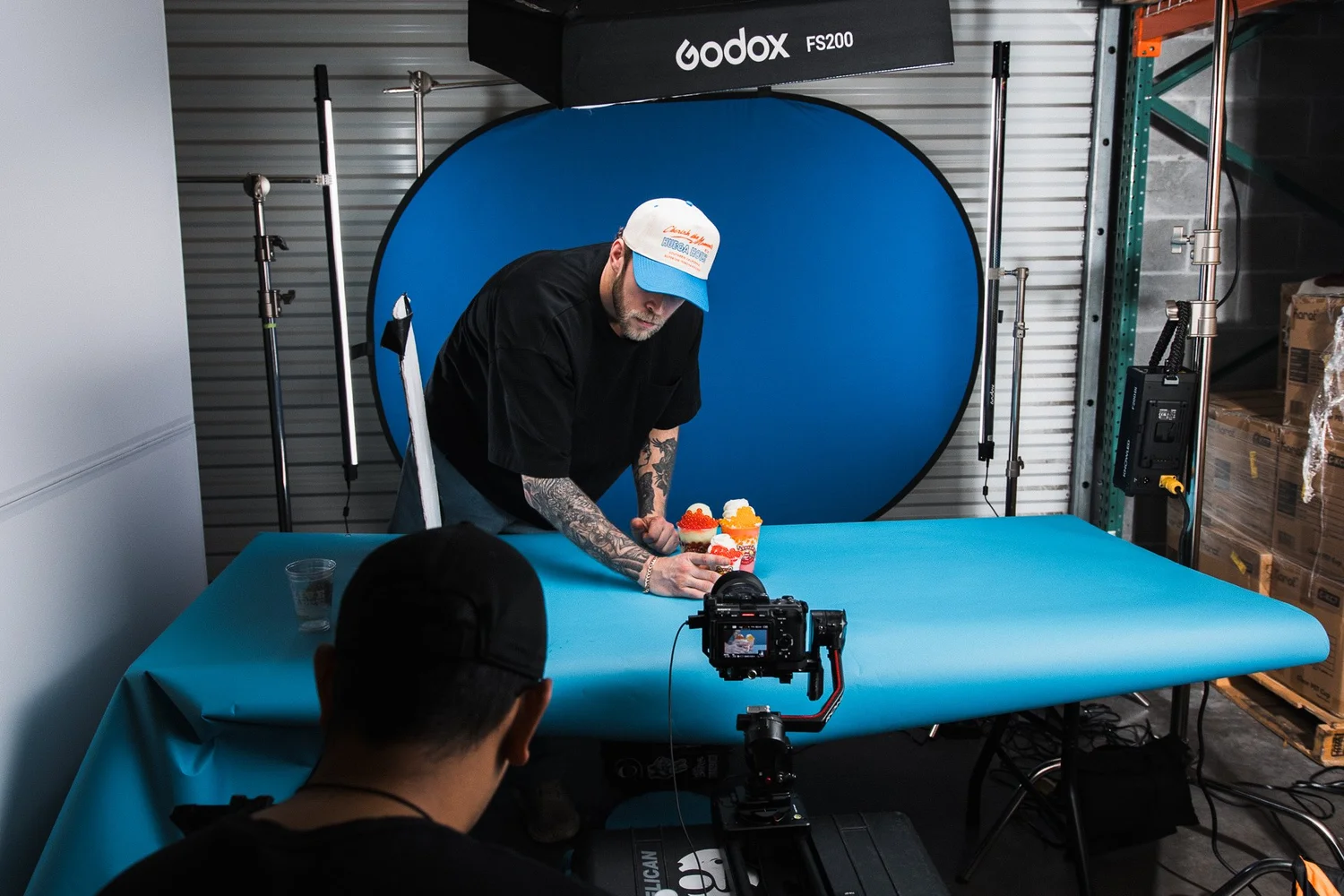
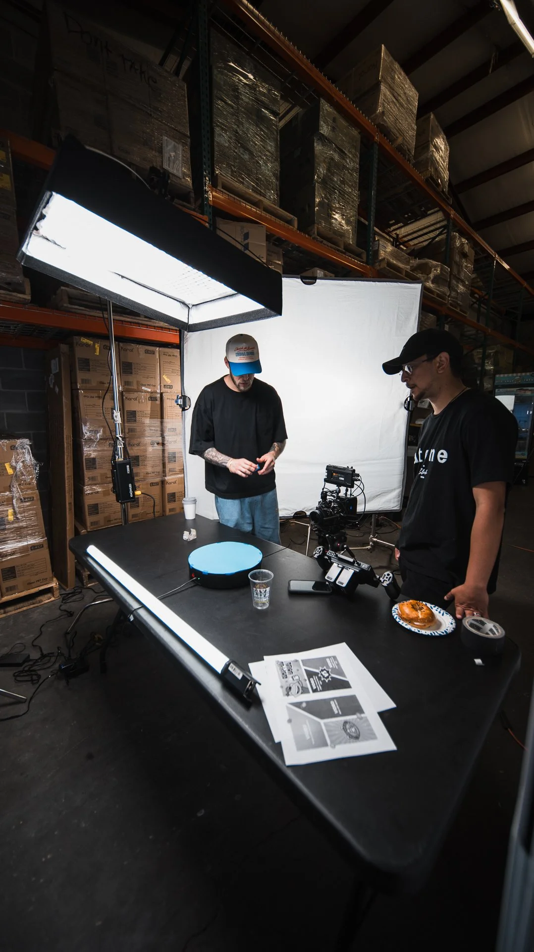
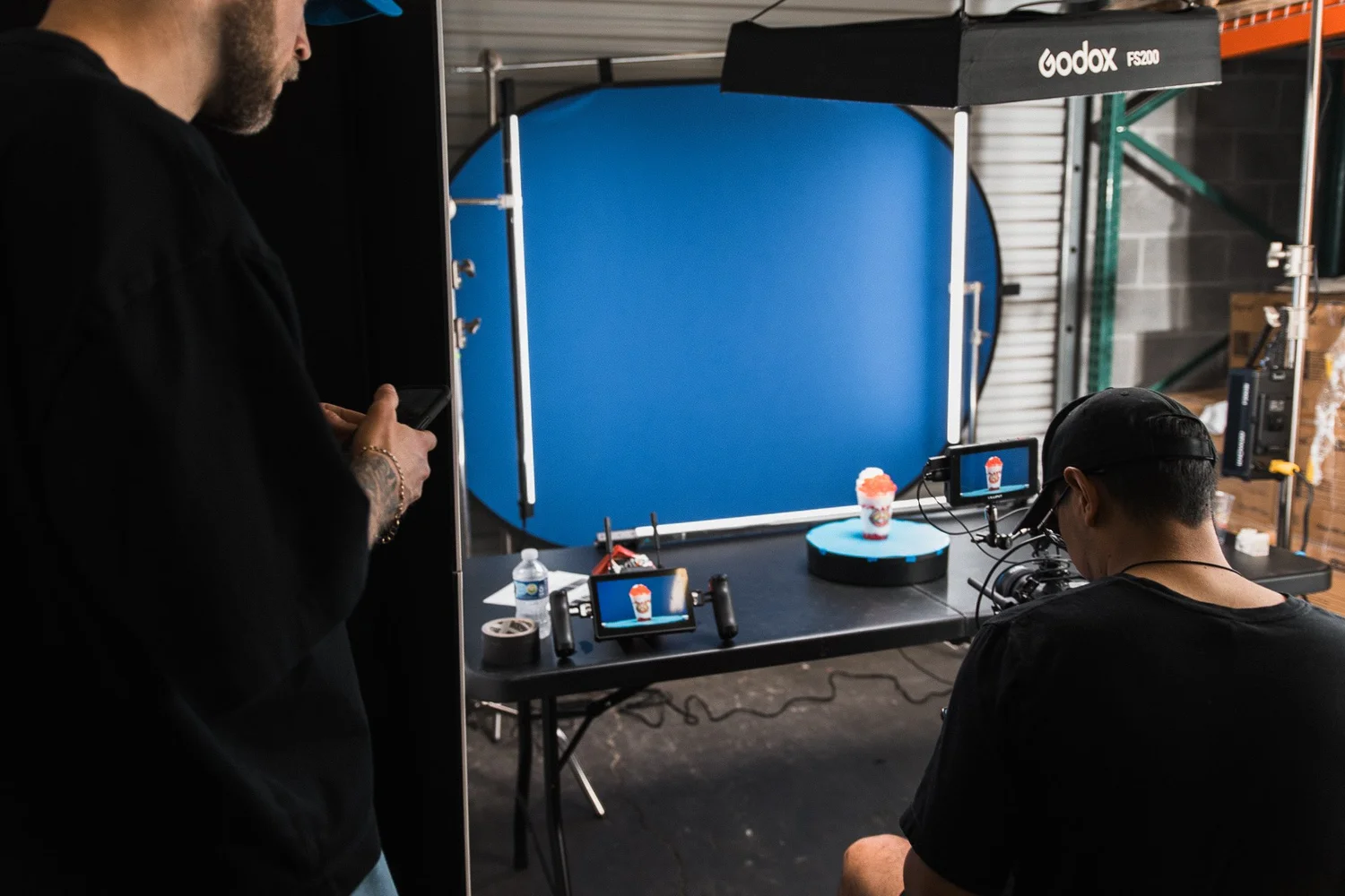
Our creative concept? A live-action comic book world. We shot everything on a blue screen, allowing us to key out the background and build custom animated environments from scratch. The result was a fun, funky, and immersive animated scene that brought the Jeremiah’s brand to life in a fresh, visually dynamic way.
Mastering Blue Screen & Post-Production Magic

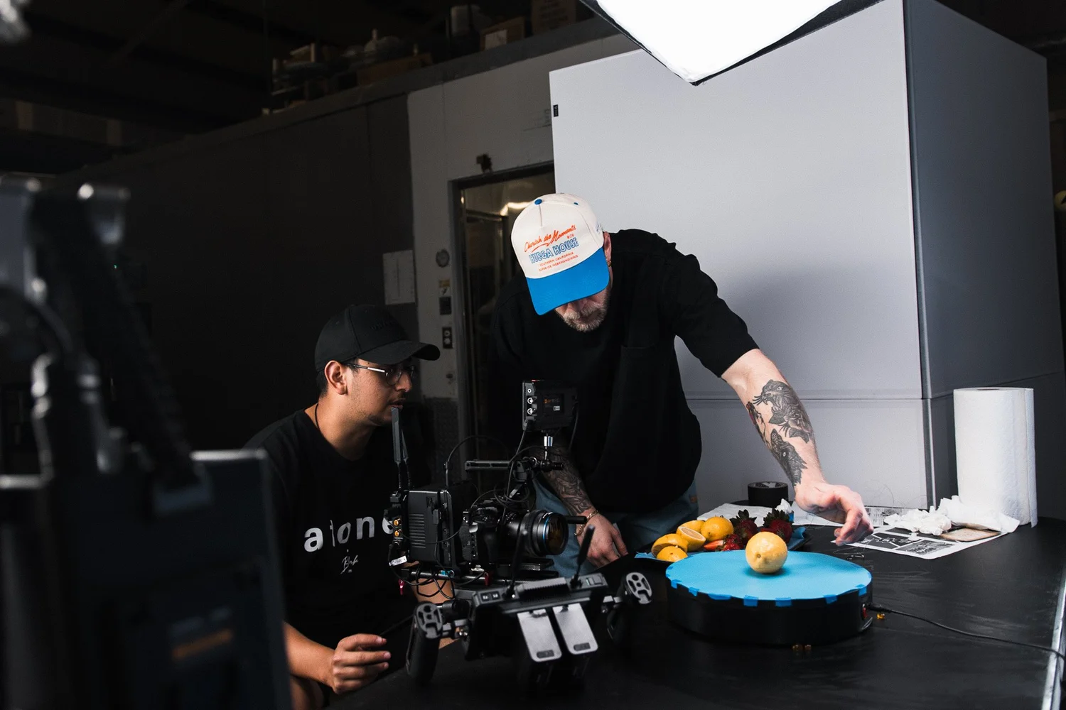
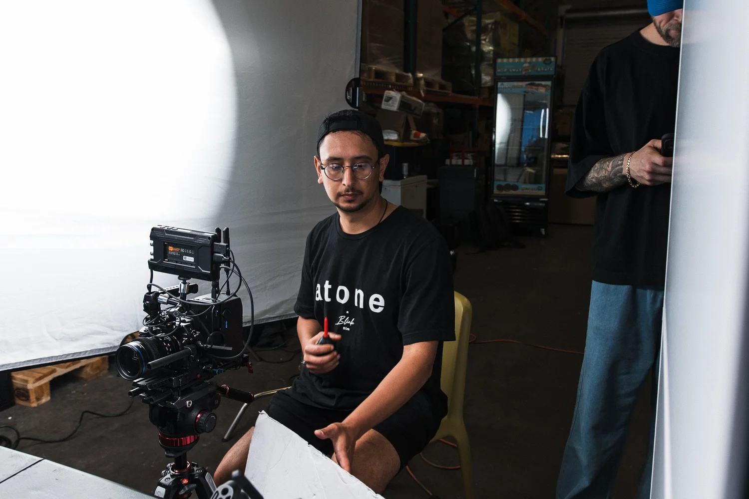
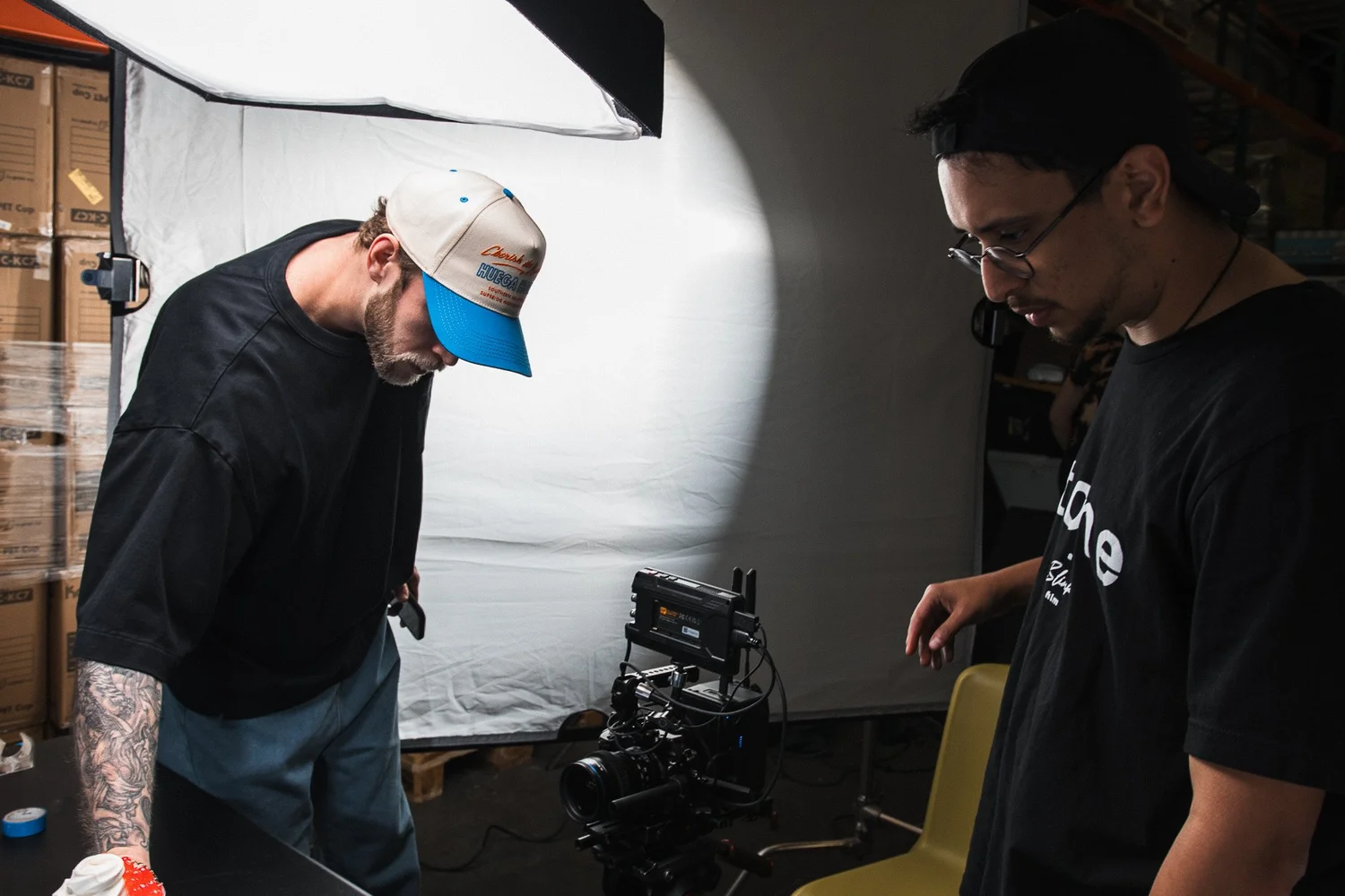
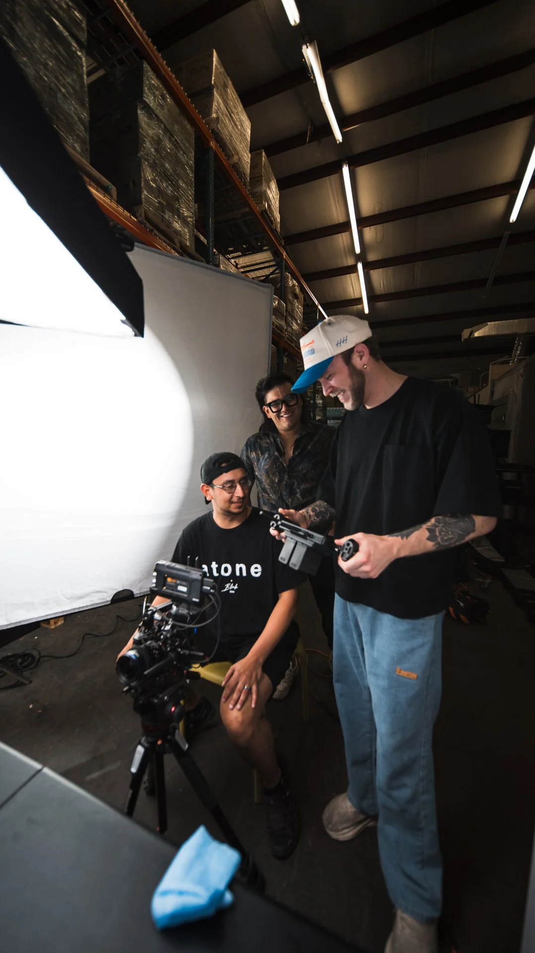
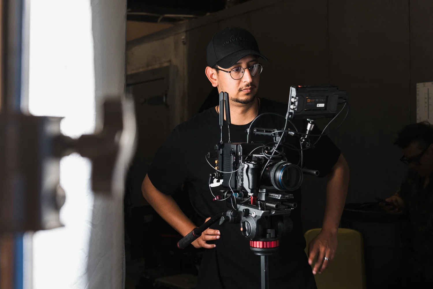
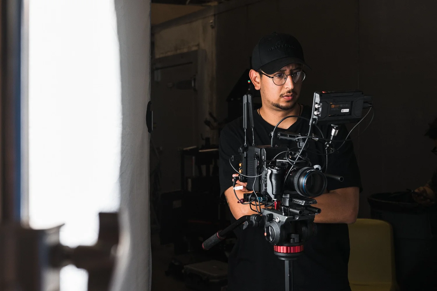
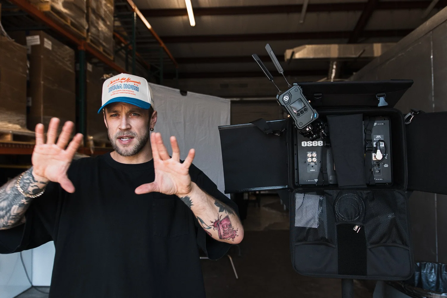
Shooting on blue screen meant we had to nail every detail—from lighting and product placement to performance and framing. Everything had to be precisely executed to ensure seamless integration with our handcrafted animated backgrounds.

Post-production was where the real magic happened. Our team meticulously composited, animated, and color-graded each shot to match the kawaii-inspired aesthetic we envisioned. It was a technical and creative challenge, but we thrive on that. With years of high-end commercial video production experience, we were able to blend live-action with animation flawlessly—creating a campaign that feels fresh, exciting, and completely on-brand for Jeremiah’s.

Why We Love Working with Jeremiah’s

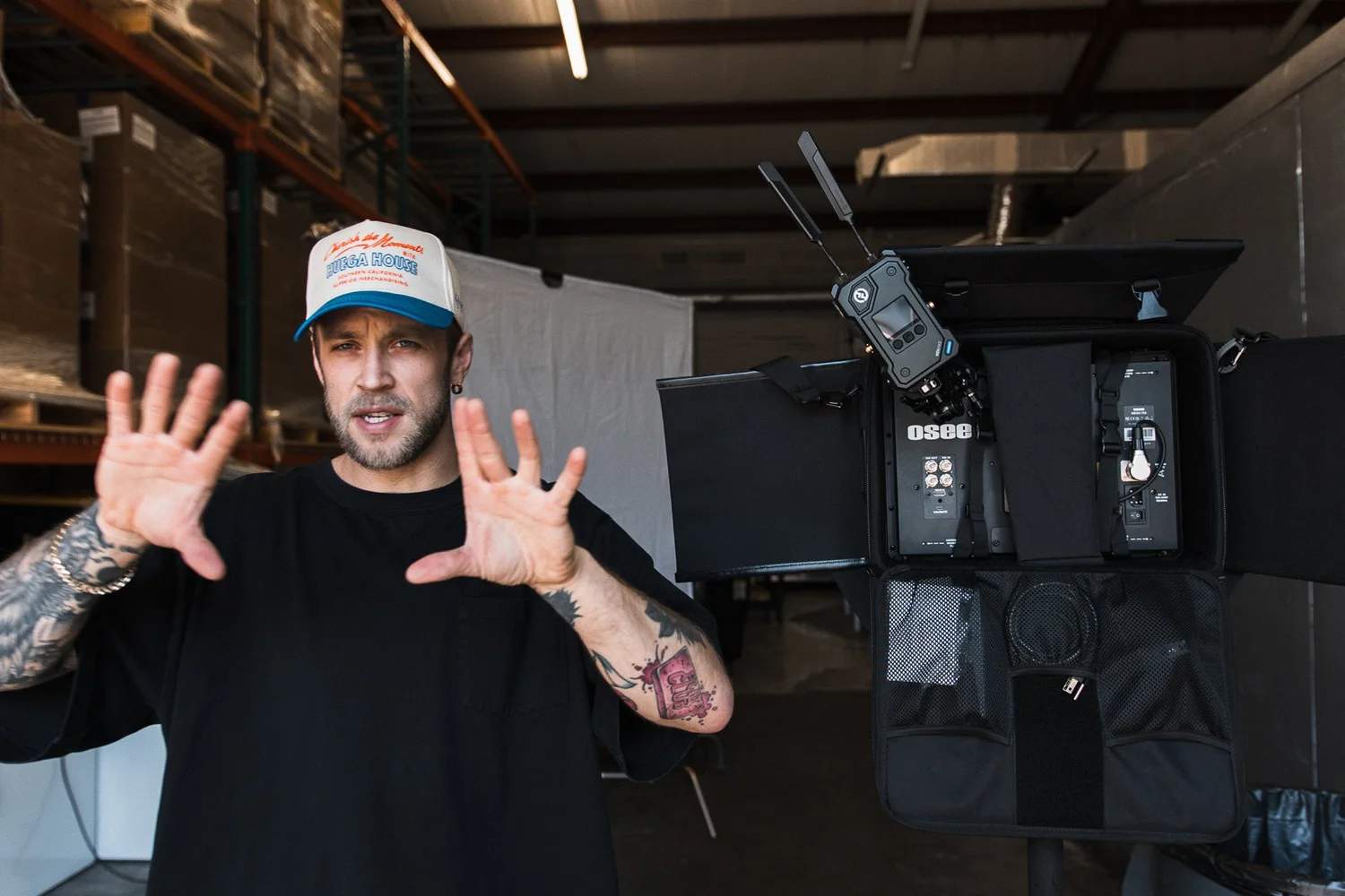
Collaborating with Jeremiah’s is always an adventure. Their openness to bold, outside-the-box ideas allows us to push creative boundaries and experiment with new storytelling techniques. From nostalgic retro themes to animated fantasy worlds, we’re constantly evolving our approach to make each campaign more engaging than the last.

The result? A brand that stays relevant, exciting, and constantly in the spotlight. And for us, that means continuing to innovate, create, and deliver high-quality content that keeps customers coming back for more.

Stay tuned for the official release of the Hoppin’ Boba campaign—we can’t wait to share the final content soon! If you’re looking for a video production team that can take your brand’s creative vision to the next level, let’s talk. We specialize in crafting high-end, strategic content that captivates audiences and drives real results.
http://www.kyleloftusstudios.com