← All Posts

·7 min read

What's with the Bag? (6/27/17)

, and uniform.css sizes any
         main h1 at the page-title scale (.definitive-interior main h1), so
         one landed mid-read at 60px. The cap carries the page class to out-
         specify that rule, and covers the whole family at reading scale. */
      .blog-page .blg-wrap .blg-body h1, .blog-page .blg-wrap .blg-body h2,
      .blog-page .blg-wrap .blg-body h3, .blog-page .blg-wrap .blg-body h4 { margin: 2rem 0 0.75rem; font-family: "Playfair Display", Georgia, serif; font-weight: 400; line-height: 1.3; color: rgb(244 241 235 / 0.95); text-transform: none; letter-spacing: normal; max-width: none; }
      .blog-page .blg-wrap .blg-body h1, .blog-page .blg-wrap .blg-body h2 { font-size: clamp(1.15rem, 1rem + 0.8vw, 1.45rem); }
      .blog-page .blg-wrap .blg-body h3 { font-size: clamp(1.05rem, 0.95rem + 0.55vw, 1.3rem); }
      .blog-page .blg-wrap .blg-body h4 { font-size: clamp(1rem, 0.95rem + 0.3vw, 1.12rem); }
      /* A photo run is not a paragraph - it breaks out past the reading
         measure to ONE width token and packs like the photography archive.
         CSS columns balanced the run into three ragged stacks: a column ran
         long and dangled a photograph below the others, a wide frame overran
         the square its neighbours implied, and a hole opened where the last
         short column stopped. The rows are JUSTIFIED instead - solved at
         build time in galleryize.py, shipped as explicit flex rows.
         A cell's --a is its native aspect. flex-grow:var(--a) over a zero
         basis hands each photo in a row the width a_i x h out of the row's
         free space, so every photo in the row stands at the same height h
         and the last one lands exactly on the right edge - flush left AND
         right, nothing cropped, no measurement on the page. */
      .blg-body { --blg-wide: min(68rem, 92vw); --blg-gap: 0.62rem; }
      .blg-gallery { width: var(--blg-wide); margin: 2rem 0 2.2rem; margin-inline: calc(50% - var(--blg-wide) / 2); display: flex; flex-direction: column; gap: var(--blg-gap); }
      .blg-row { display: flex; column-gap: var(--blg-gap); width: var(--rw, 100%); margin-inline: auto; }
      .blg-nb { display: none; }
      .blg-gallery .blg-cell { flex-grow: var(--a, 1); flex-shrink: 1; flex-basis: 0; min-width: 0; aspect-ratio: var(--a, 1.5); margin: 0; padding: 0; overflow: hidden; border-radius: 0.3rem; background: #0b0d12; cursor: pointer; opacity: 0; transform: translateY(18px); transition: opacity 620ms cubic-bezier(0.22, 0.61, 0.21, 1), transform 740ms cubic-bezier(0.22, 0.61, 0.21, 1); }
      .blg-gallery .blg-cell.is-in { opacity: 1; transform: none; }
      .blg-gallery .blg-cell img { display: block; width: 100%; height: 100%; object-fit: cover; margin: 0; border-radius: 0; opacity: 0.86; transition: transform 760ms cubic-bezier(0.22, 0.61, 0.21, 1), opacity 420ms ease; }
      .blg-gallery .blg-cell:hover img, .blg-gallery .blg-cell:focus-visible img { opacity: 1; transform: scale(1.02); }
      .blg-gallery .blg-cell:focus-visible { outline: 1px solid var(--kls-accent, #fb5607); outline-offset: 2px; }
      /* the run measures itself against the article COLUMN, so the index
         rail simply narrows it - no second width rule for the railed page */
      @supports (container-type: inline-size) {
        .blg-wrap { container-type: inline-size; }
        .blg-body { --blg-wide: min(68rem, 100cqw); }
      }
      /* The phone keeps the grid - 2-up rows out of the same packer at a
         smaller row height, never one full-screen photograph per screen.
         The desktop rows dissolve (display:contents) and the build-time
         narrow breaks drive the lines instead, so one set of photographs
         serves both plans. */
      @media (max-width: 760px) {
        .blg-body { --blg-gap: 0.5rem; }
        .blg-gallery { flex-direction: row; flex-wrap: wrap; column-gap: var(--blg-gap); row-gap: 0; margin-bottom: 1.8rem; }
        .blg-row { display: contents; }
        .blg-nb { display: block; flex: 0 0 100%; height: var(--blg-gap); }
      }
      @media (prefers-reduced-motion: reduce) { .blg-gallery .blg-cell { opacity: 1; transform: none; transition: none; } }
      /* A short line stranded between two photo runs read as a fragment
         someone forgot to delete. It is the author's own beat - so it is set
         as one: centred, given air on both sides, a step up in scale. The
         builder finds it; not a word of it is moved or rewritten. */
      .blg-body .blg-beat { margin: clamp(2.4rem, 5.5vh, 3.6rem) auto; max-width: 34rem; text-align: center; }
      .blg-body .blg-beat p, .blg-body .blg-beat div { margin-left: auto; margin-right: auto; }
      /* Squarespace put white-space:pre-wrap INLINE on these paragraphs, so
         the source indent after each  printed as a real leading space
         and every line after the first sat 3px right of centre. pre-line
         keeps the author's line breaks and drops the indentation; it has to
         out-rank an inline style, hence the !important, and it is scoped to
         the beat alone. No character of the copy changes. */
      .blg-body .blg-beat p { margin-top: 0; margin-bottom: 0.4rem; white-space: pre-line !important; font-family: "Playfair Display", Georgia, serif; font-size: clamp(1.2rem, 1rem + 1vw, 1.65rem); line-height: 1.4; color: rgb(244 241 235 / 0.94); }
      .blg-body .blg-beat p:last-child { margin-bottom: 0; }
      /* end blg-gallery */


    Skip to content


          ← All Posts
          Jun 28, 2017·7 min read
          What's with the Bag? (6/27/17)

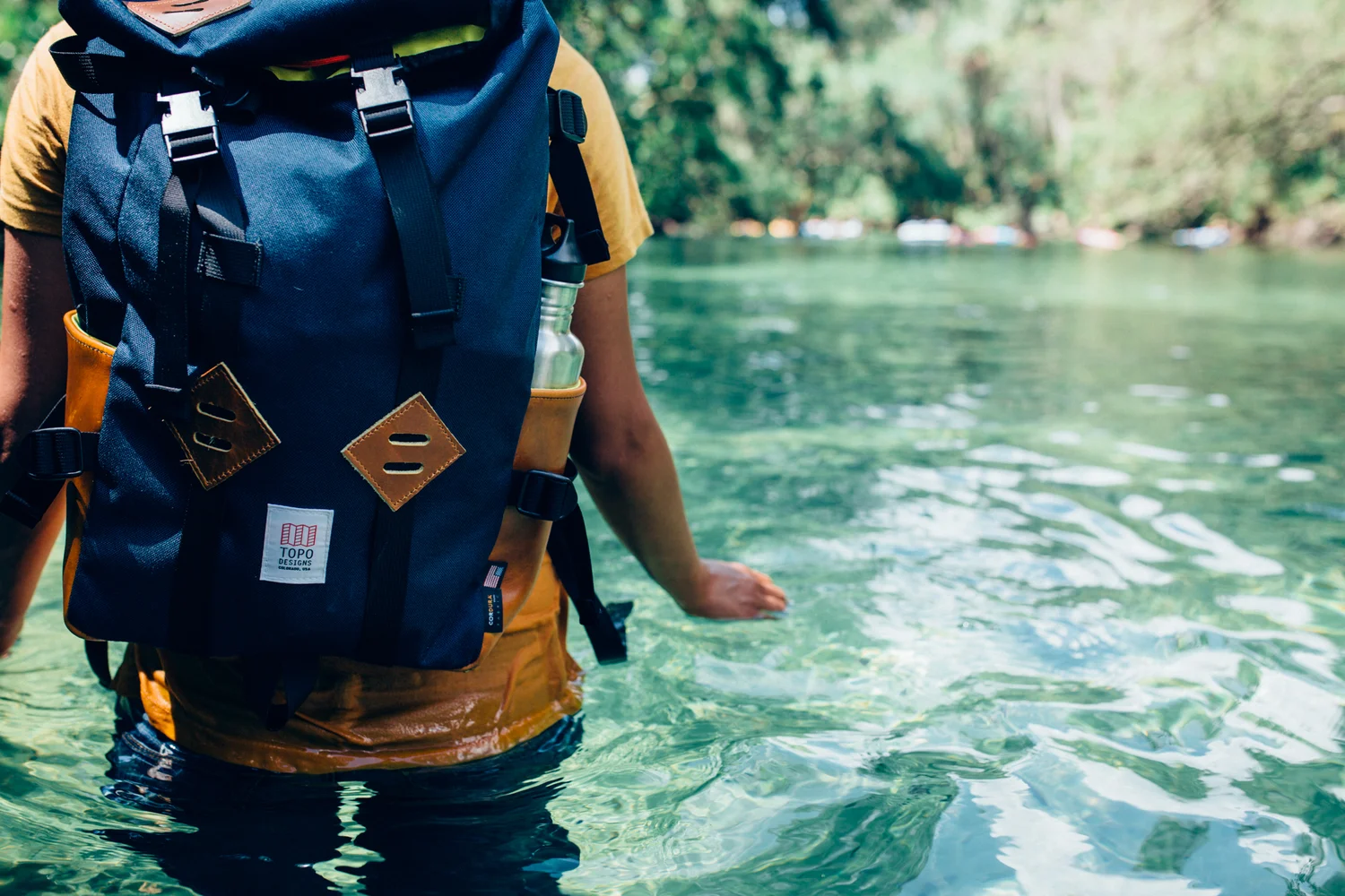
It was a sunny Tuesday morning, hot, humid, and everything Florida (tons of bugs) when Gavriela and I set off to explore Blue Springs State Park. We met up in the parking lot and showered ourselves in bug spray before venturing into the bush. Next was a nice mist of sunscreen. Why a mist you ask? Well it's all about applying the proper amount to protect your skin but also leave you with a tan...spoiler alert I failed. Luckily Gavriela was more than thrilled to carry all the necessities in her Topo Design bag to save the day. 

Mhm..

Ahhh...

After hiking for roughly an hour I asked Gavriela to give me her pack so she could have a rest from carrying all the nourishing gummy worms and water haha. I snagged the backpack and slid my left arm through the hole while I carried my camera in the other. I was immediately caught off guard by the comfortably-insulated straps. I've never used a travel pack that felt so soft on my skin. It was like laying that perfect wool sock you have in your closet right on top of your shoulder which is a giant step from the feeling of sandpaper we all usually get. I was trying to find the words to express how comfortable the strap was when I was abruptly interrupted by Gavriela exclaiming,  "You think one strap feels good, just wait until you get the other one on..man that's good."

We went back and forth all day taking turns wearing the pack like we just got our favorite childhood toy. We switched off putting the KLETTERSACK to the test, feeling out its durability, comfort, and water resistance. Gavriela and myself we're both amazed out how well the pack's functionality revealed itself in such a short period of time.

In just a few hours we both fell in love with the Tops Design KLETTERSACK for a lot of reason but here are a four key ones:

1. Comfort

The pack never felt too heavy and neither of us found ourselves constantly adjusting every ten minutes like you most often see with hikers and their backpacks..the struggle.

2. Durability- I was extremely please with the packs durability when under duress from  pressure, pulling, tugging, ripping etc.  Everything on the pack and in the pack is secured and sown tightly. I was very surprised at how well sealed it was. 

2. Durability

I was extremely please with the packs durability when under duress from  pressure, pulling, tugging, ripping etc.  Everything on the pack and in the pack is secured and sown tightly. I was very surprised at how well sealed it was. 

3. Ease of use- The pack is extremely easy to use and adjust. No longer does one have to spend thirty minutes adjusting their straps back and forth to get them the equal length. Furthermore, the pack has a small but efficient set of pockets to utilize which provides endless variations for stuffing your pack. Remember that shirt of yours that the zipper always gets caught in when your trying to zip it up? Well no need to worry about the zippers on the KLETTERSACK. The zippers move flawlessly and I love it!

3. Ease of Use

3. Ease of use- The pack is extremely easy to use and adjust. No longer does one have to spend thirty minutes adjusting their straps back and forth to get them the equal length. Furthermore, the pack has a small but efficient set of pockets to utilize which provides endless variations for stuffing your pack. Remember that shirt of yours that the zipper always gets caught in when your trying to zip it up? Well no need to worry about the zippers on the KLETTERSACK. The zippers move flawlessly and I love it!

4. The Look

The KLETTERSACK is a perfect mixture between modern design and minimalistic living. The look is sleek, simple and bold. I absolutely love the color combinations in this particular KLETTERSACK and how well the bright yellows and reds compliment the dark blue base of the pack.  

“The KLETERSACK is the best daypack for photographers...hands down.”
— Kyle Loftus

Check out all the photos from our Blue Springs adventure below! A special thanks to Topo Designs for partnering we me on this adventure. 

http://www.kyleloftusstudios.com