Skip to content
← All Posts

Oct 24, 2022·1 min read

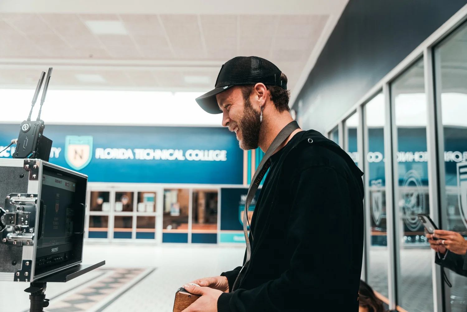
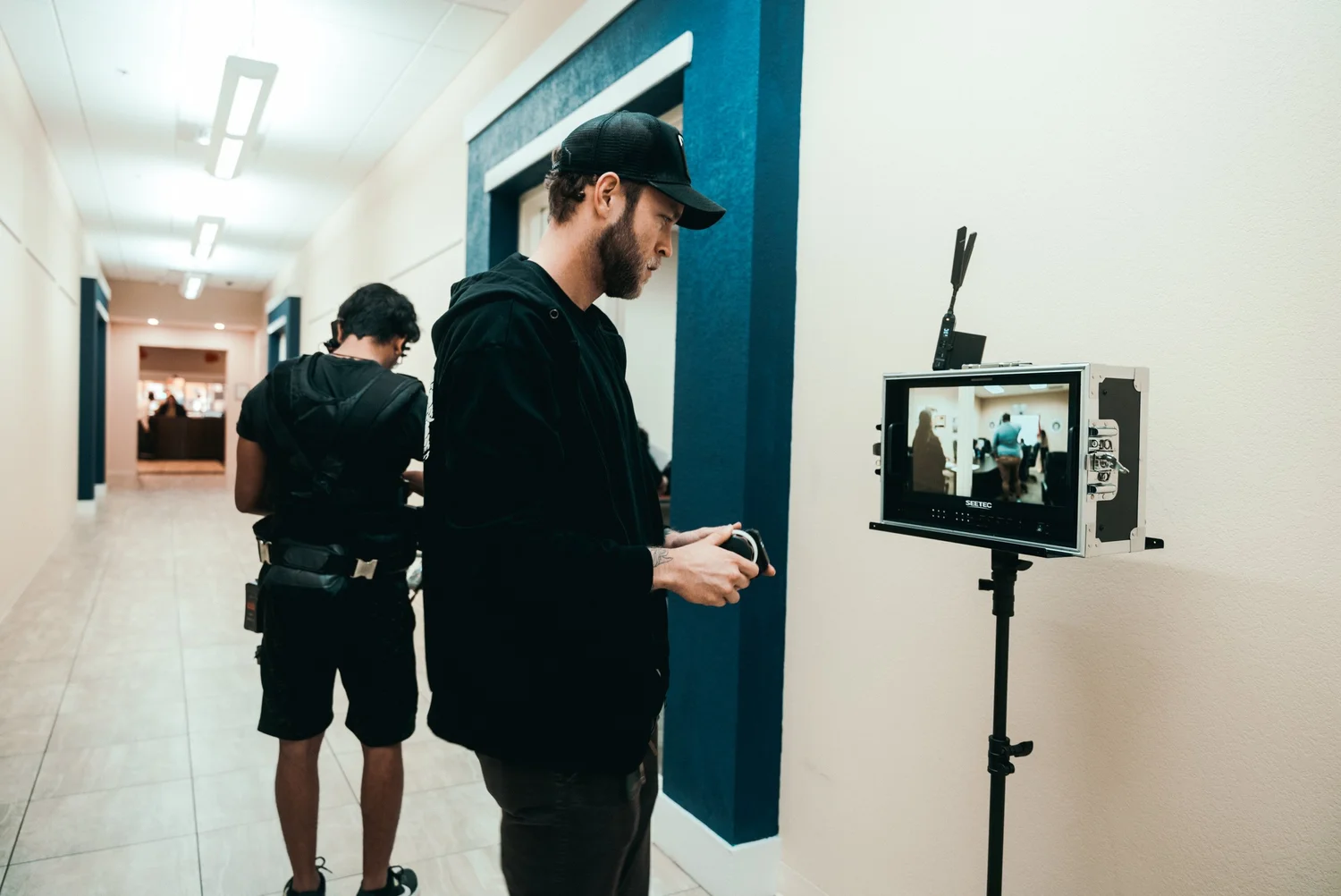
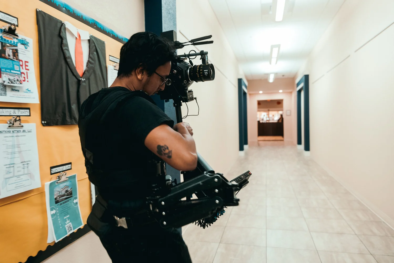
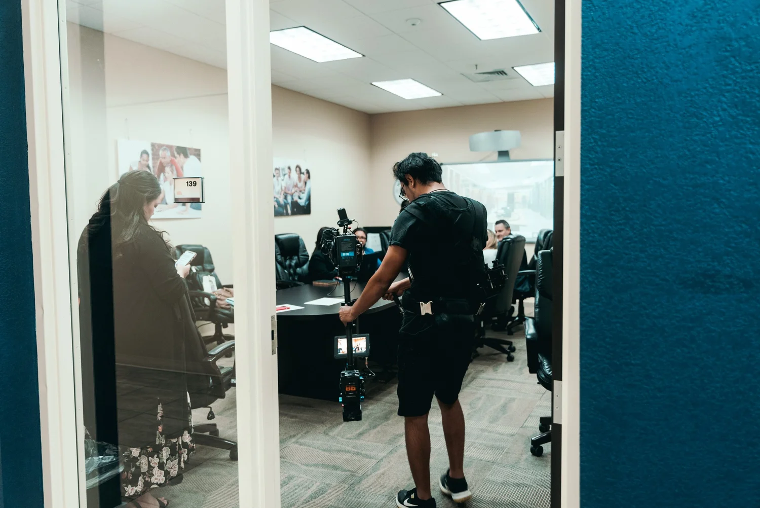
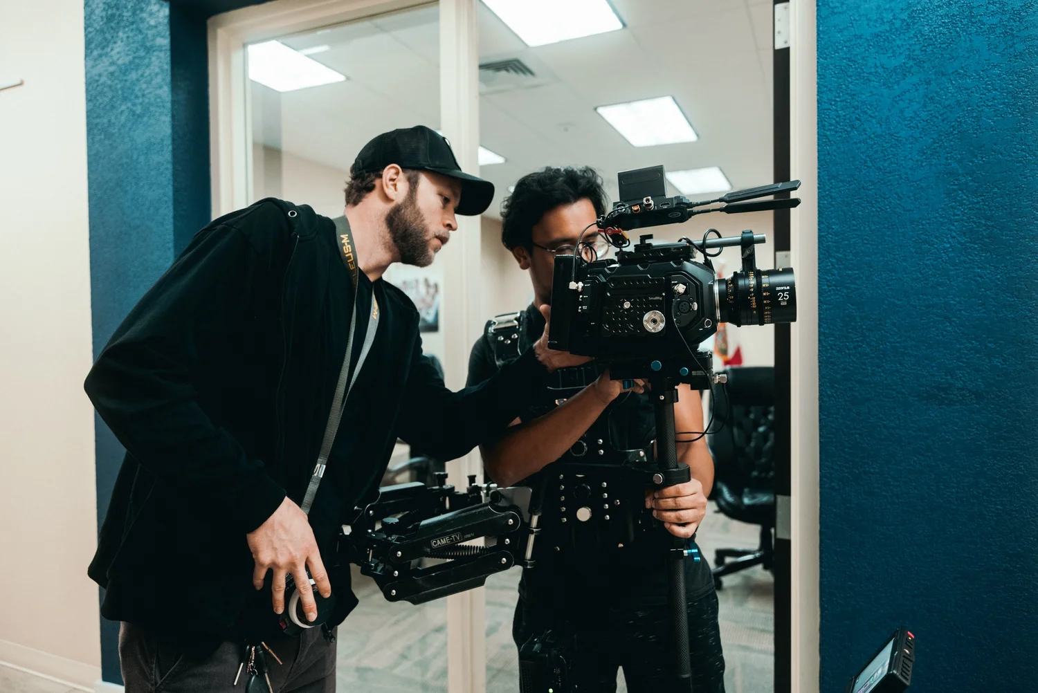
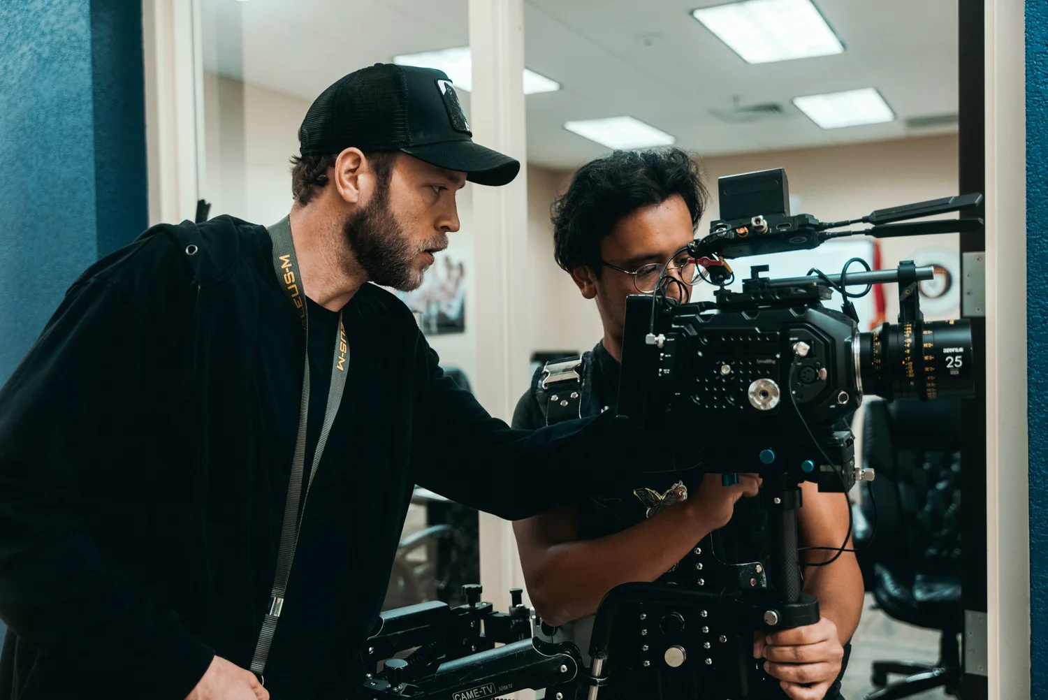
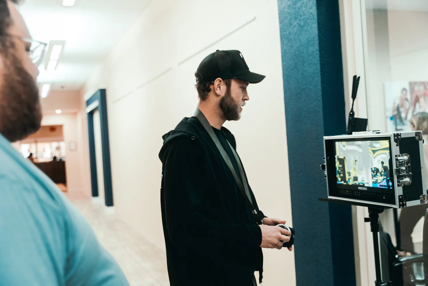
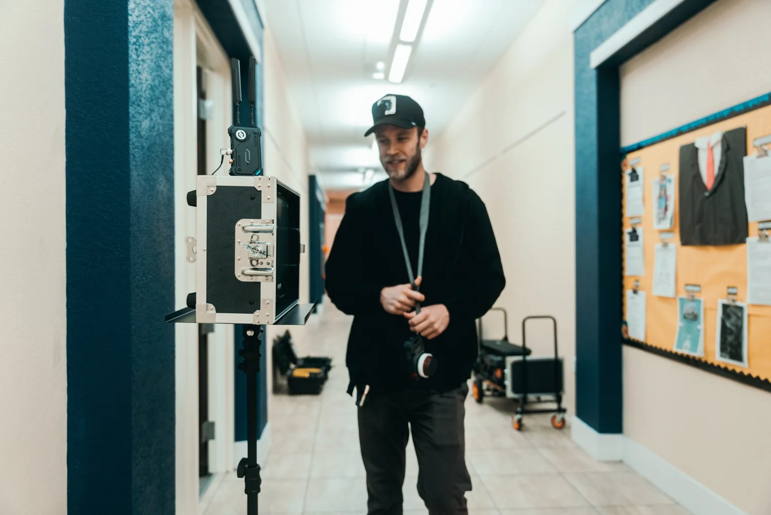
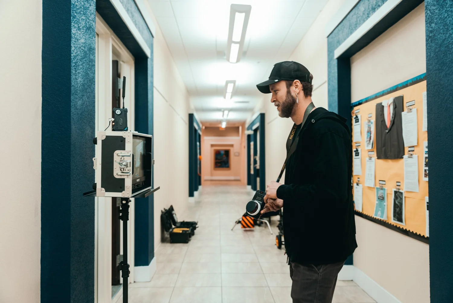
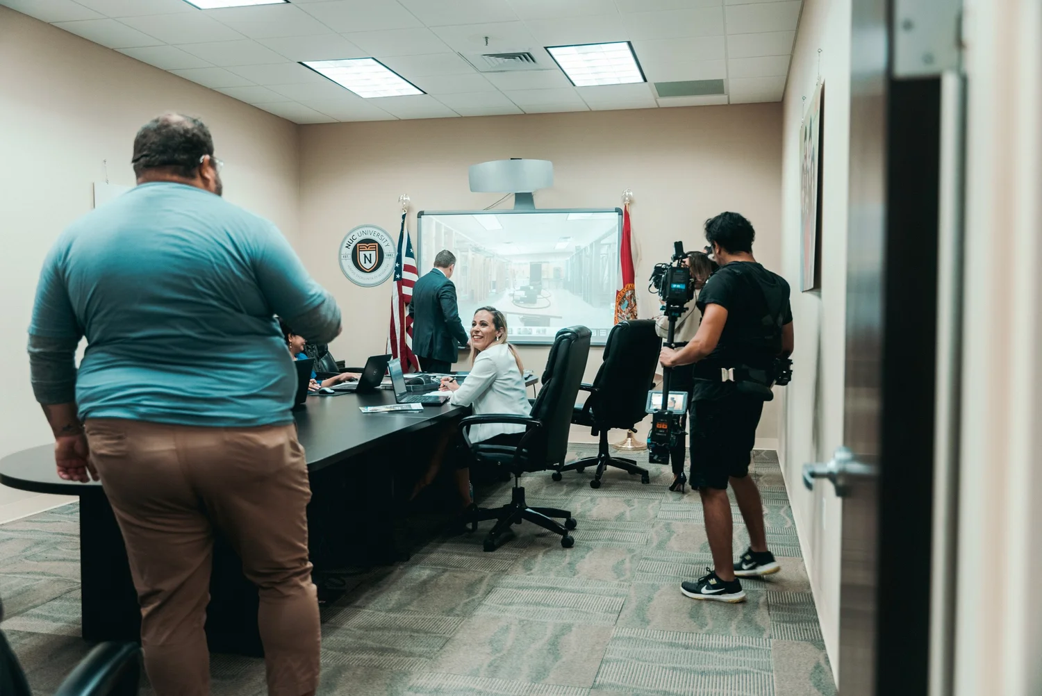
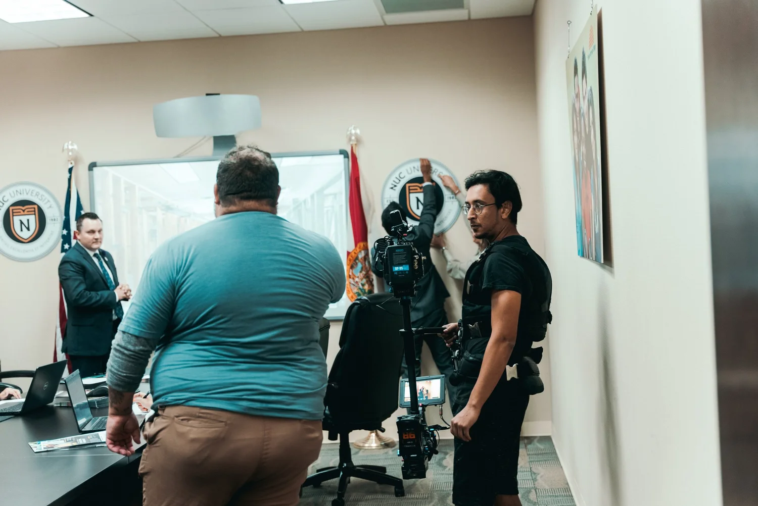
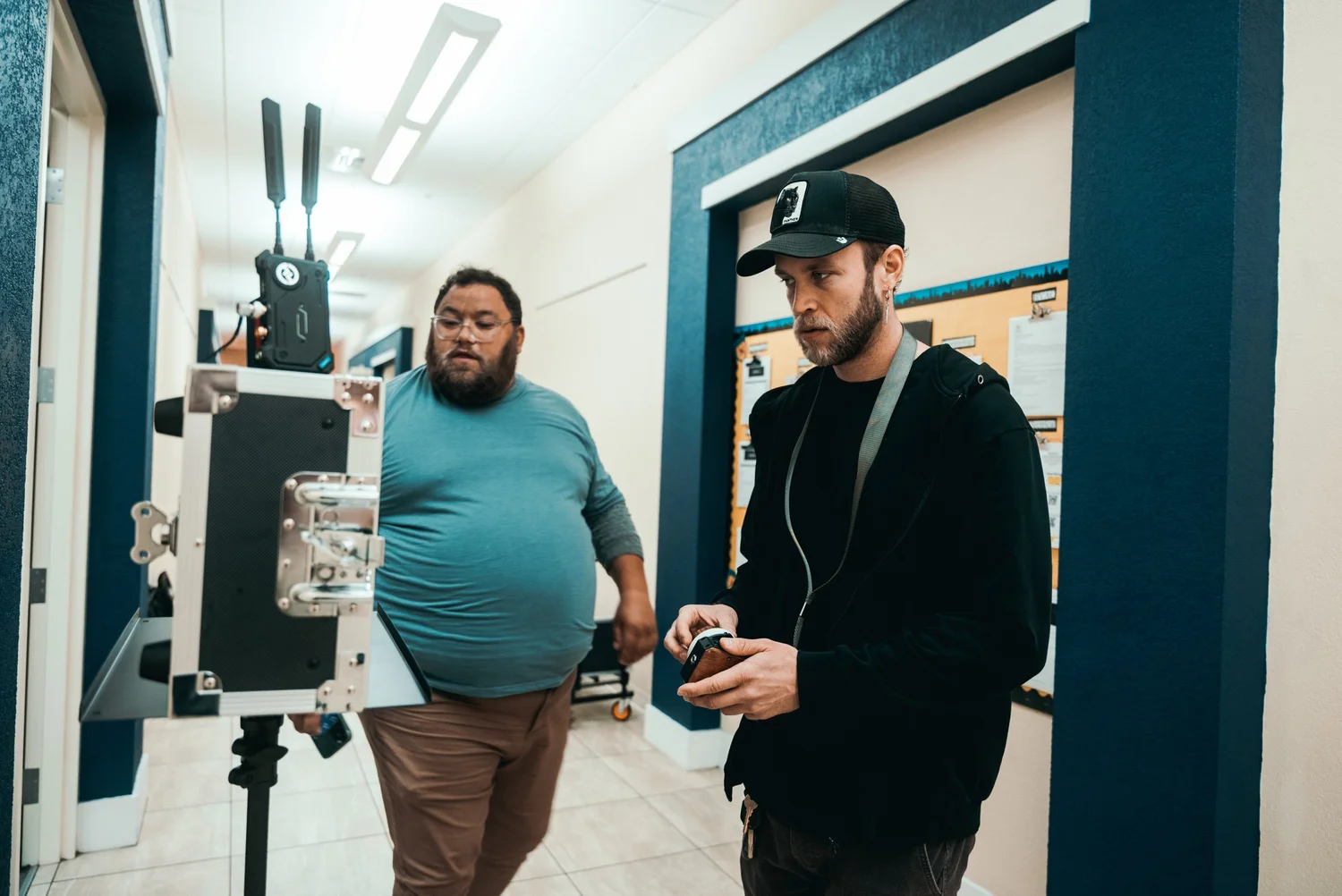
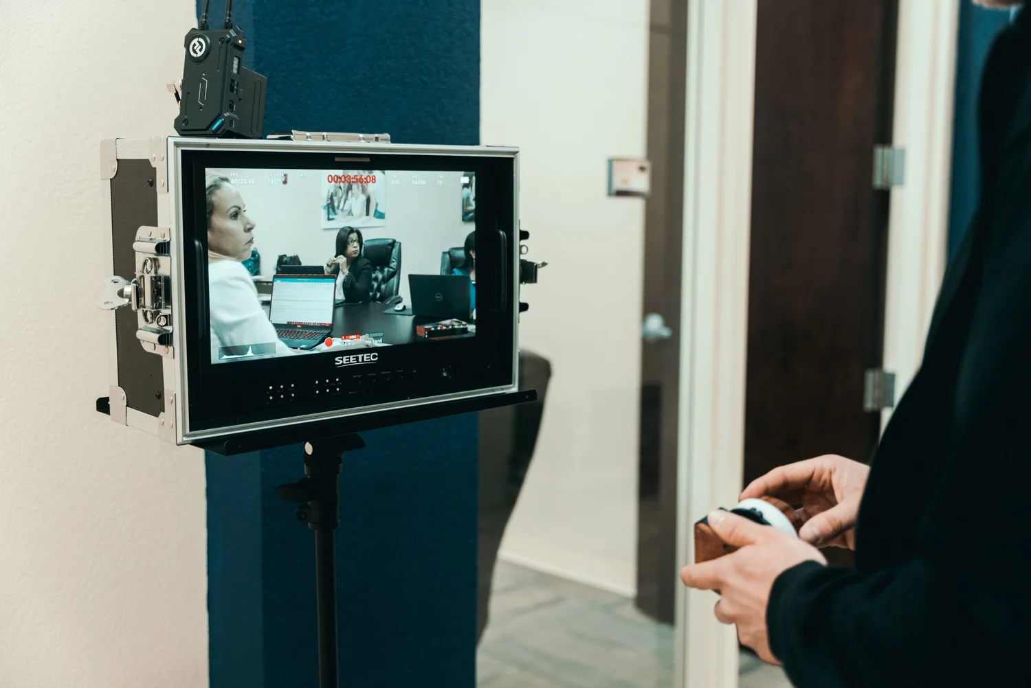
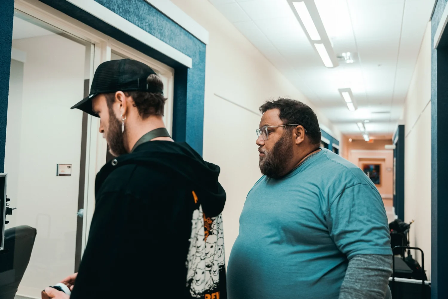
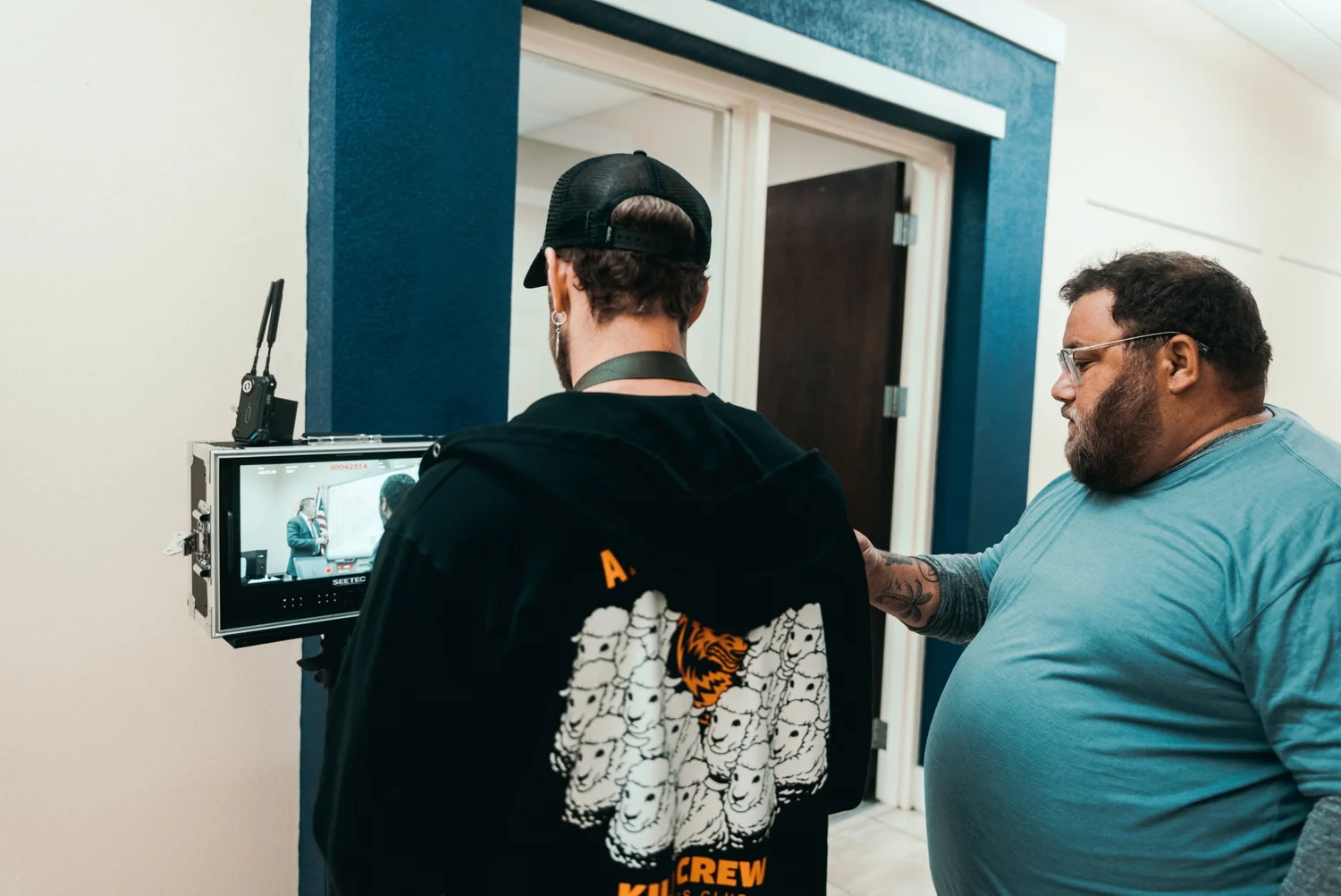
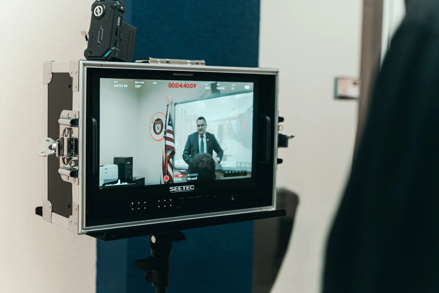
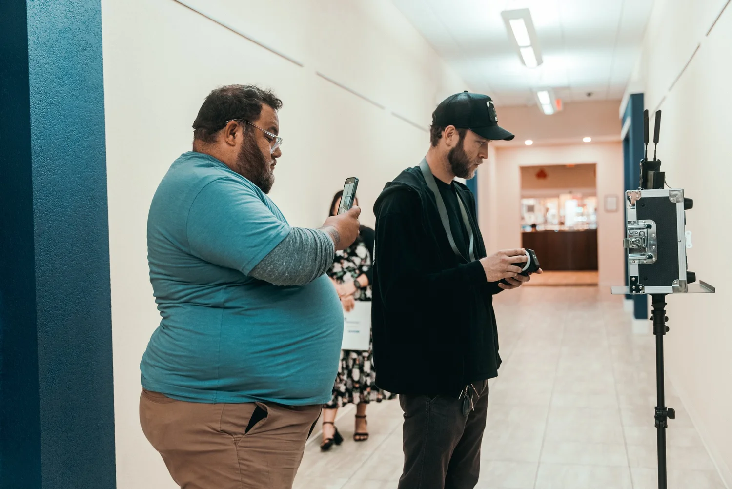
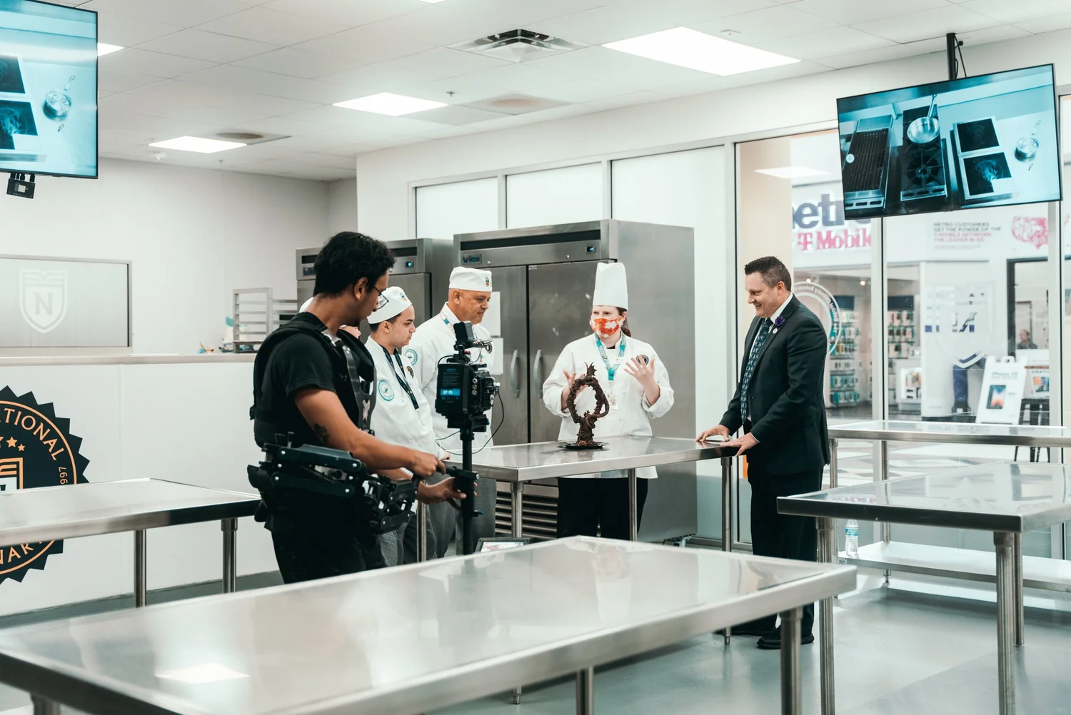
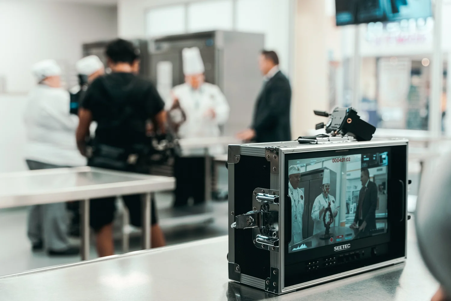
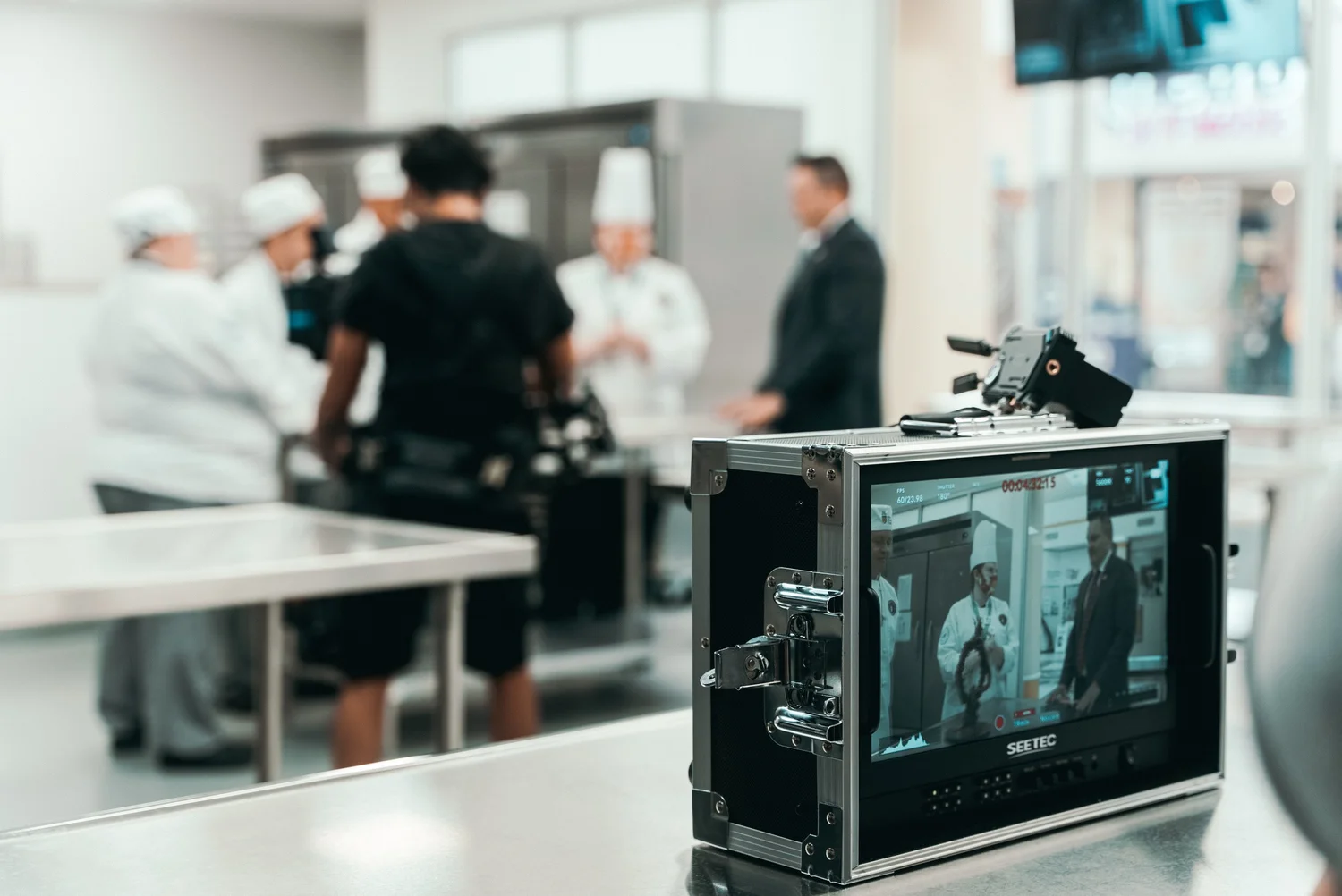
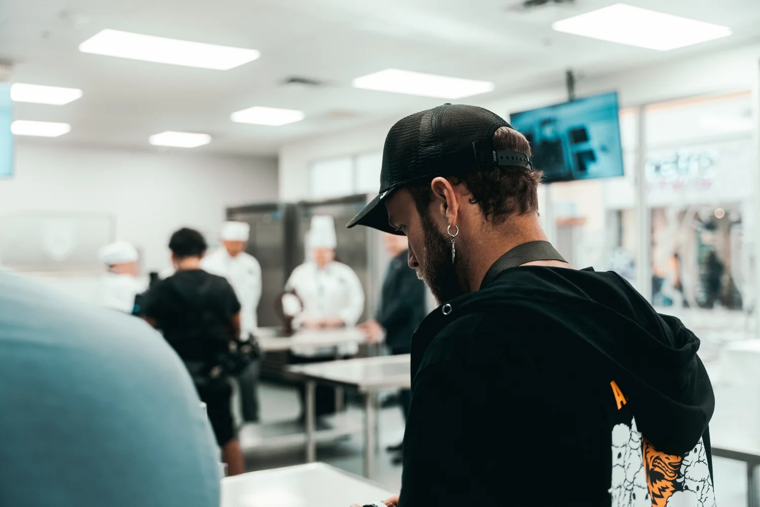
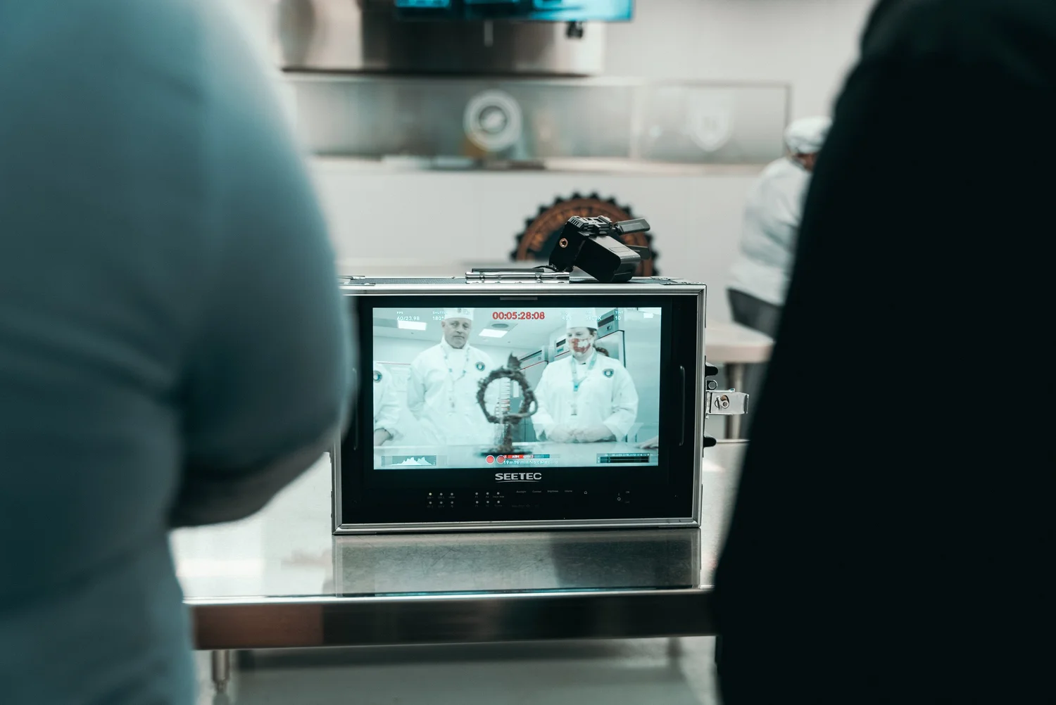
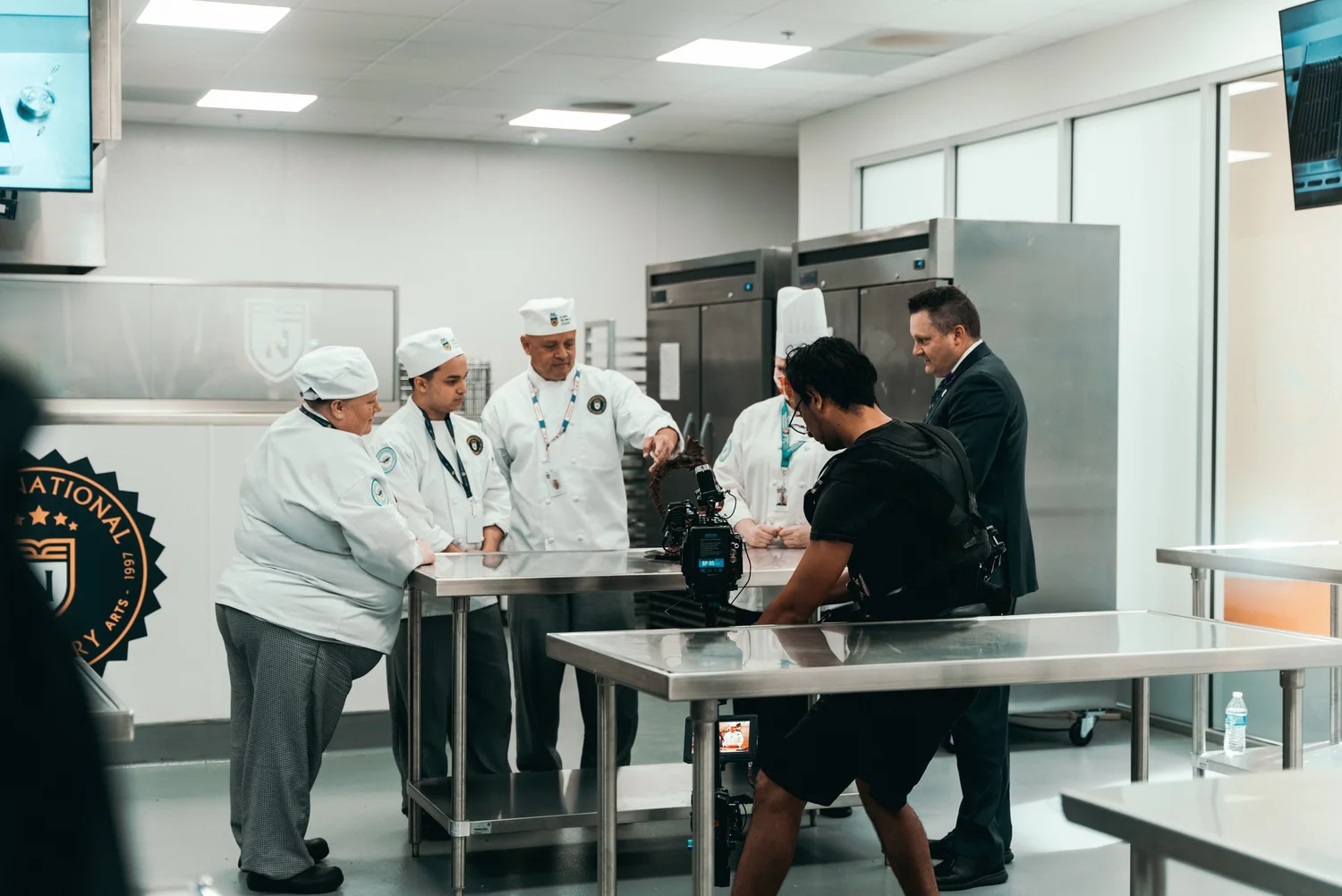
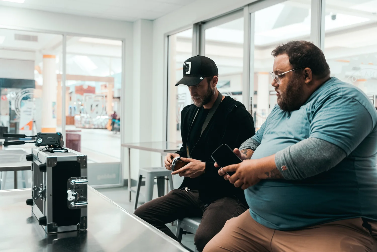
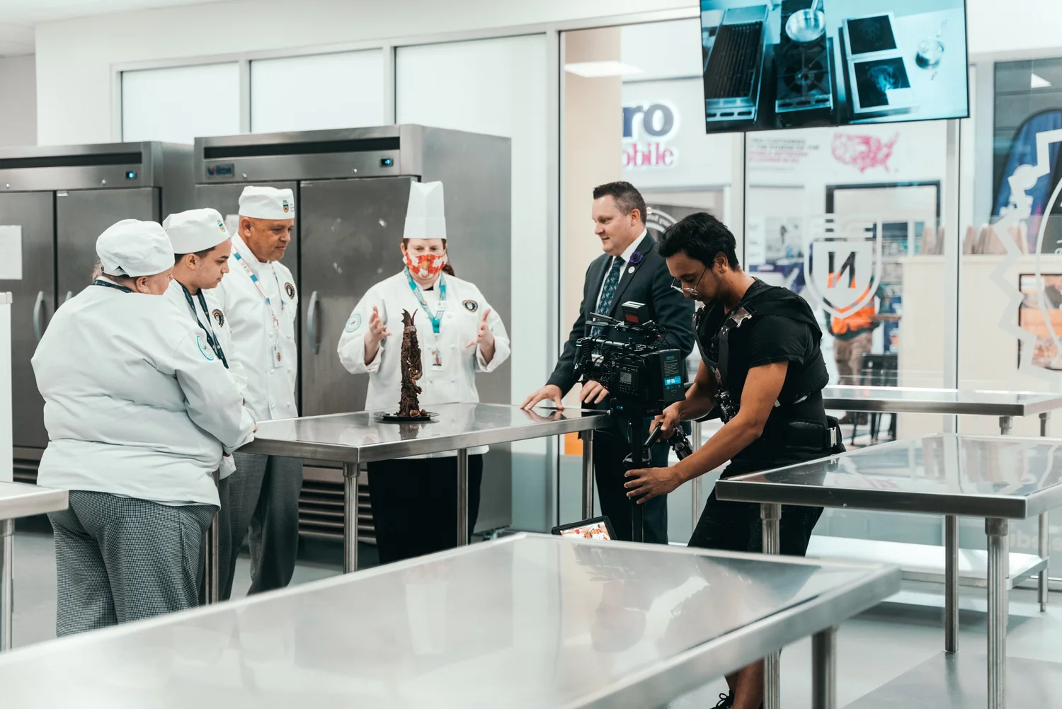
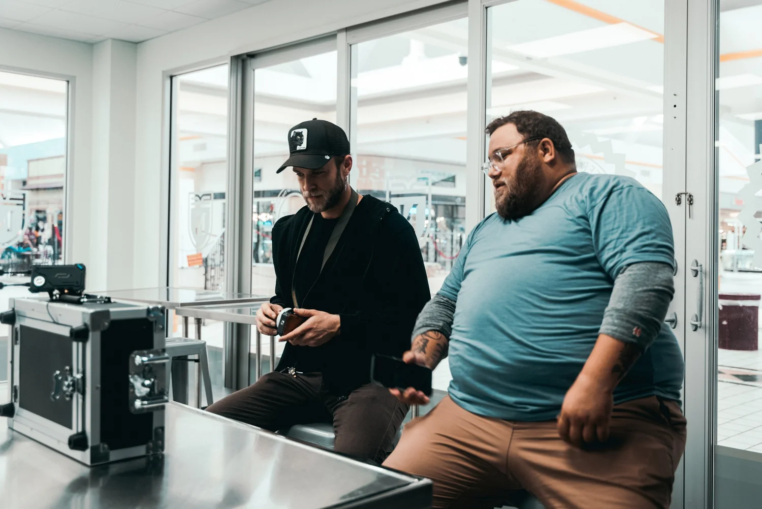
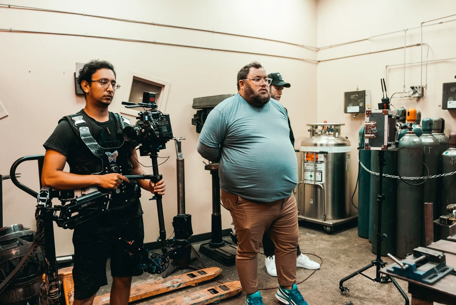
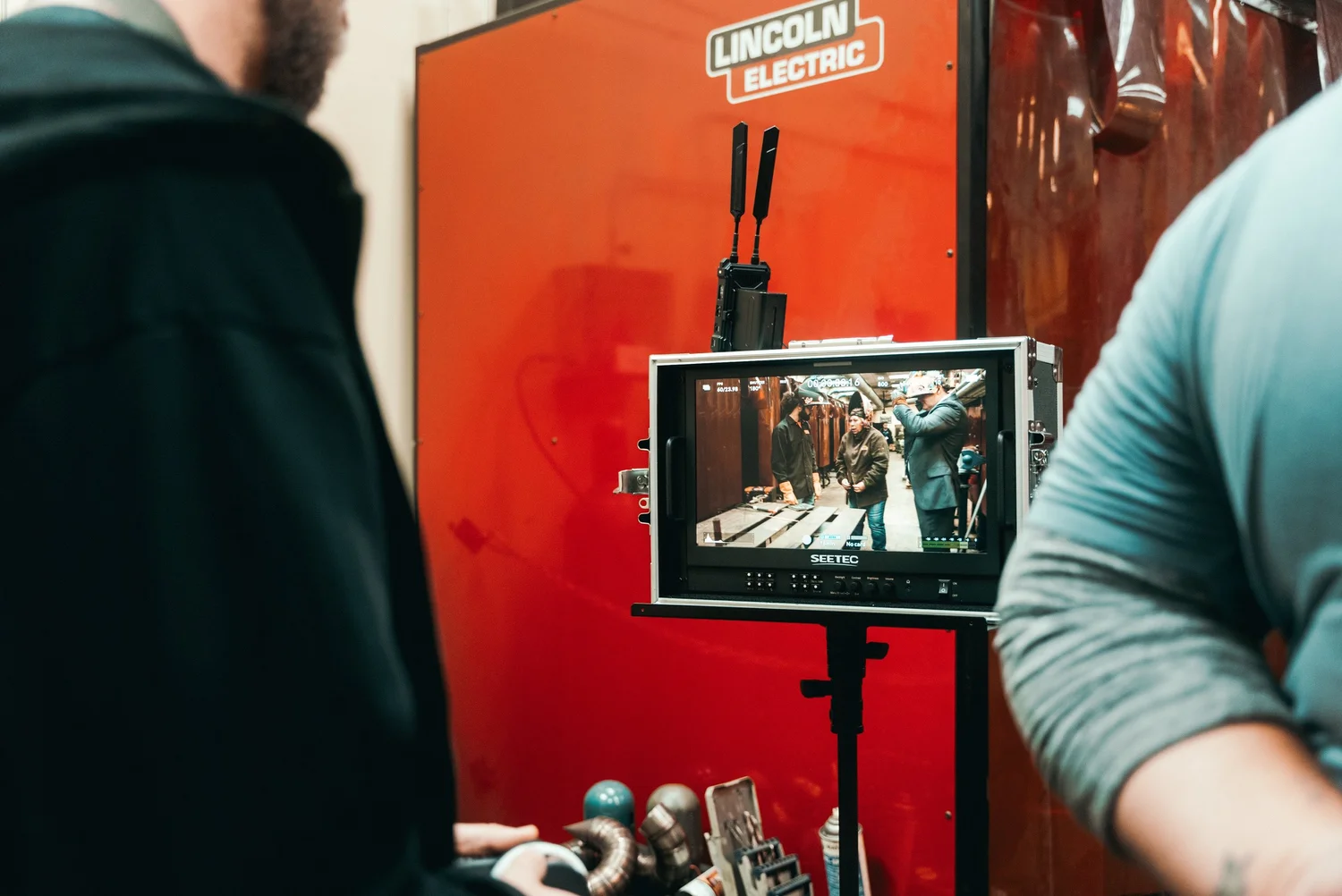
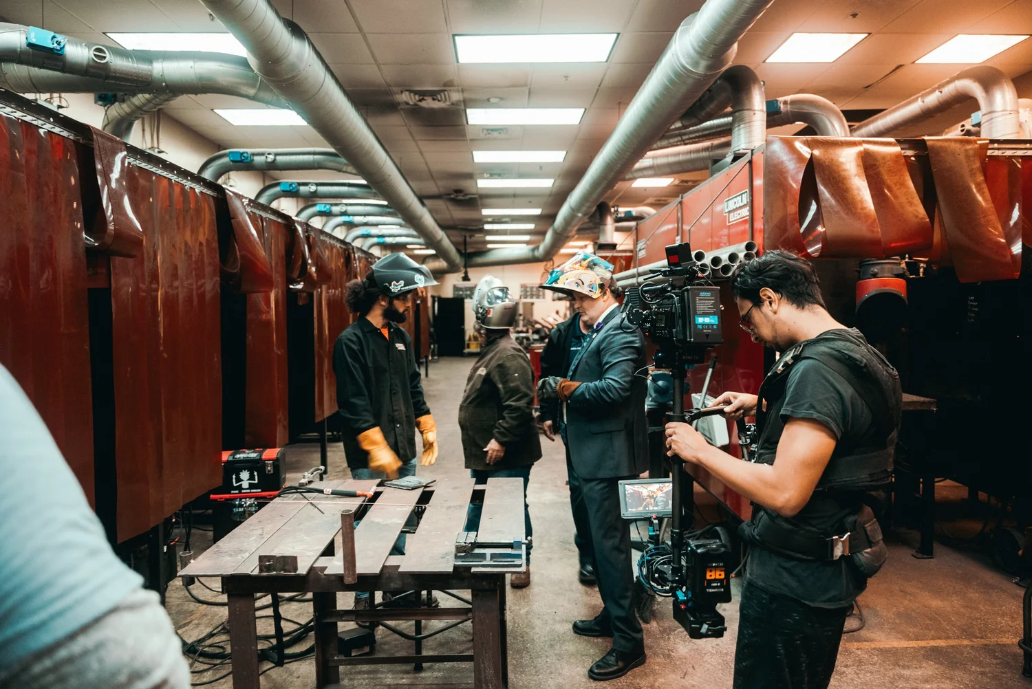
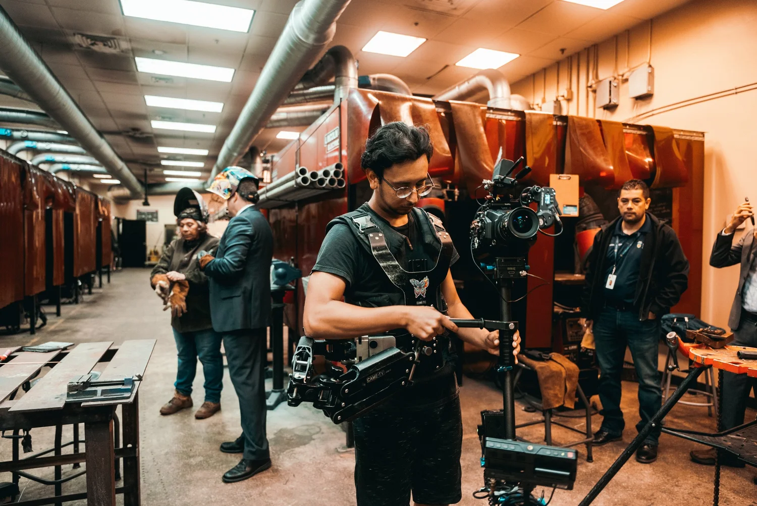
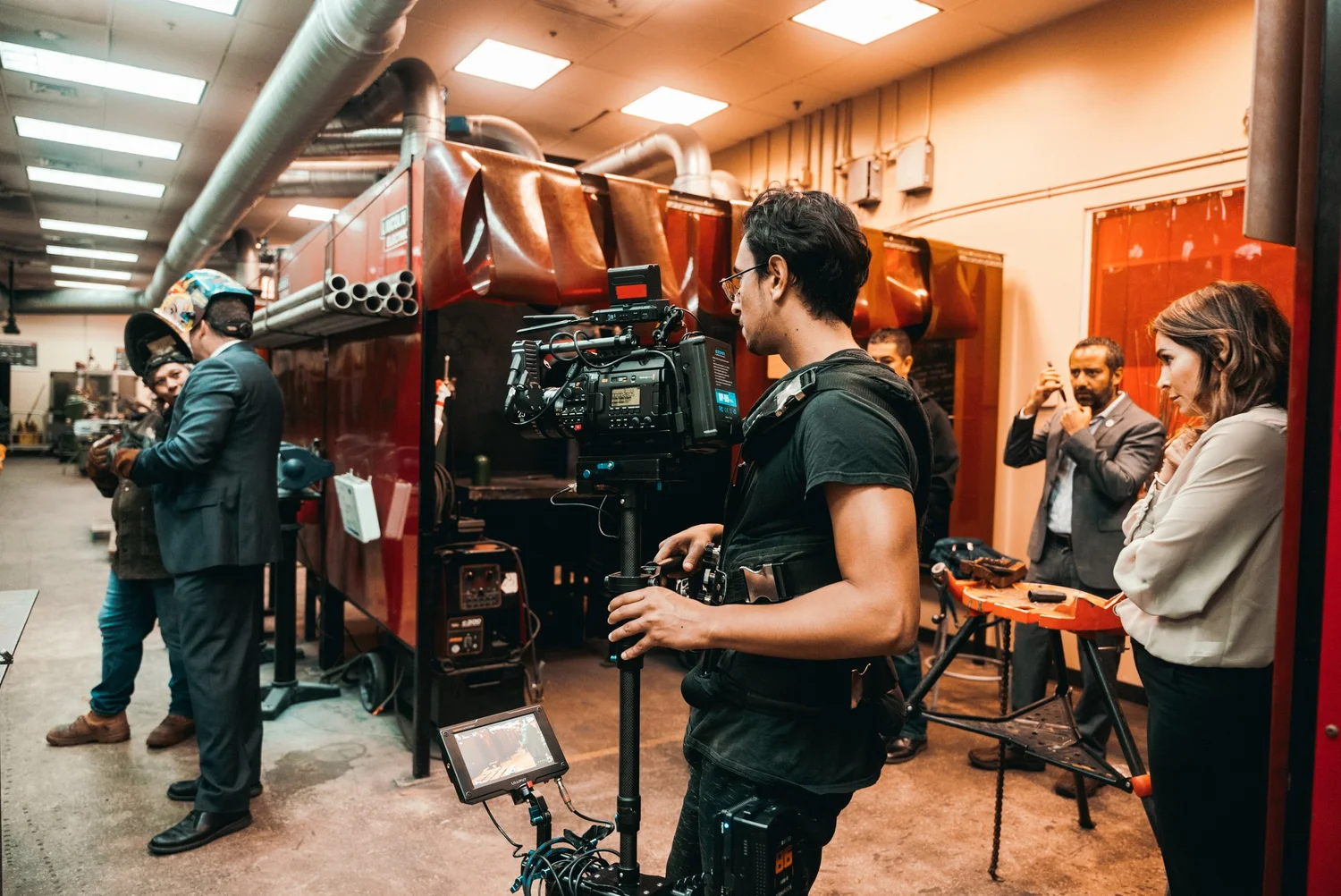
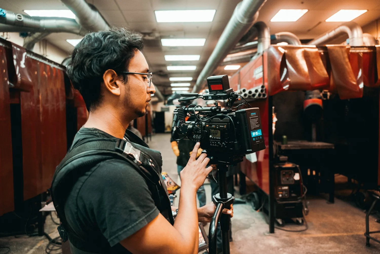
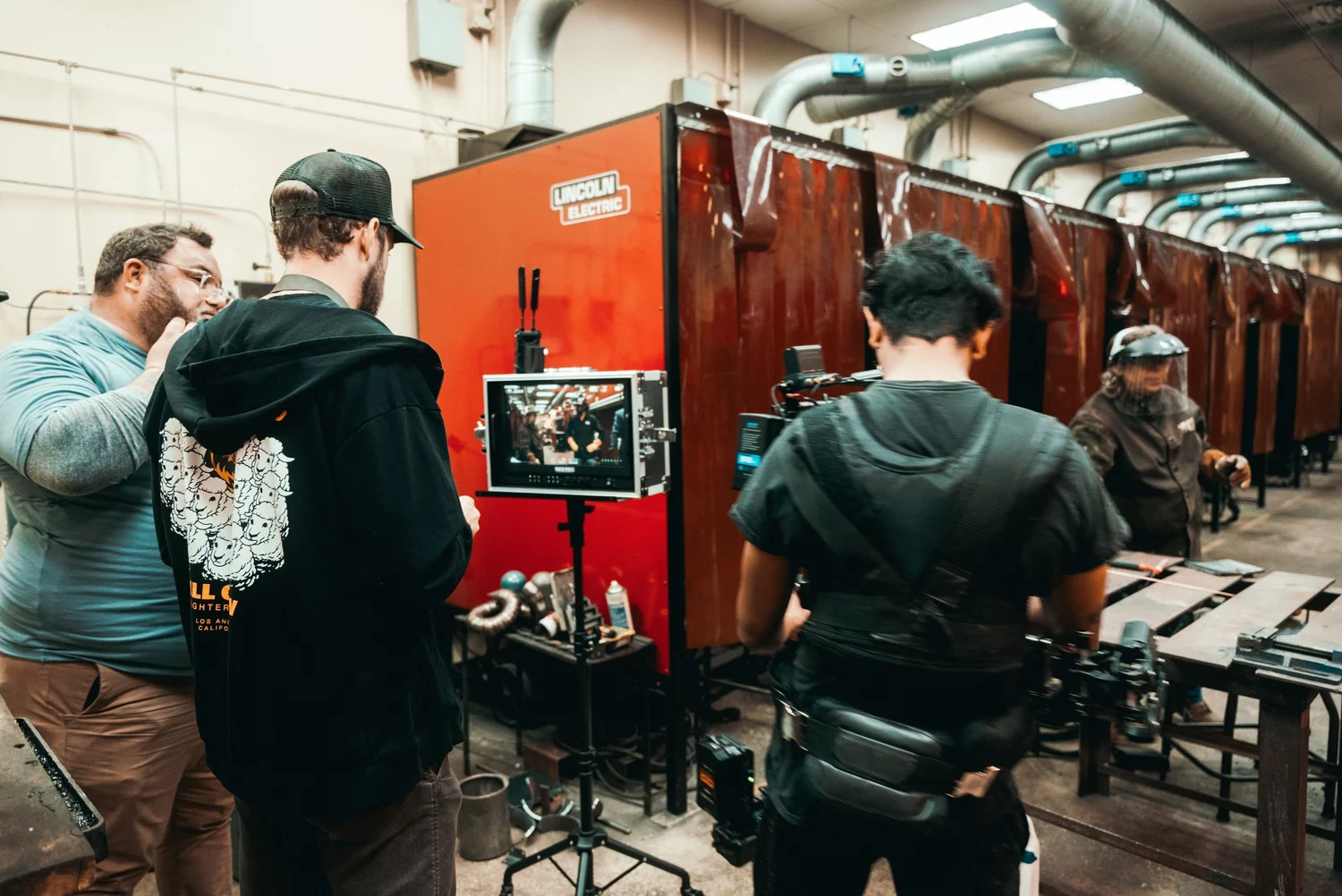
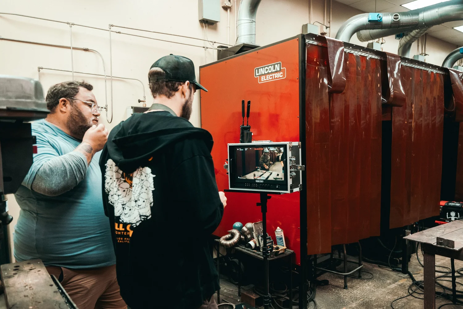
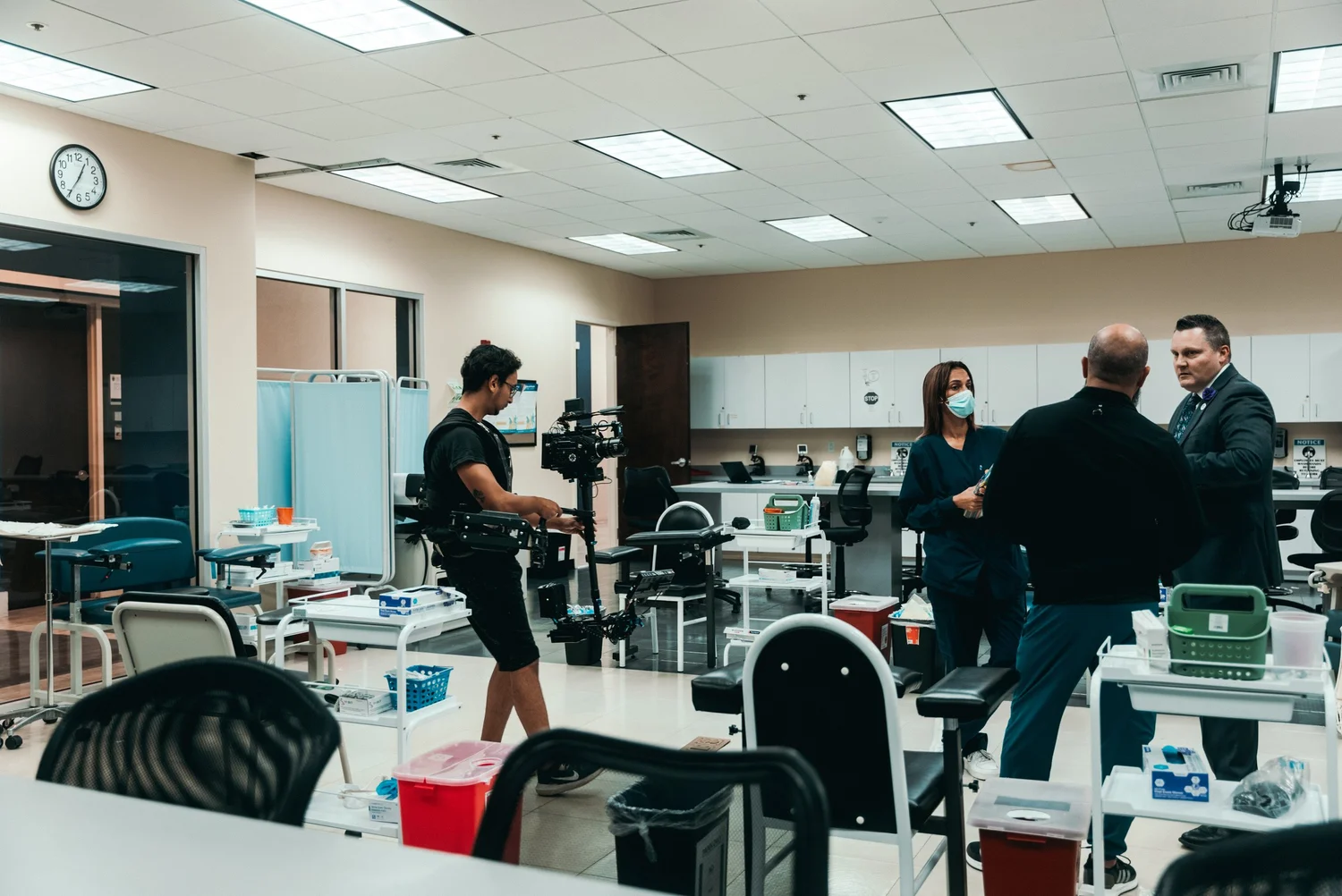
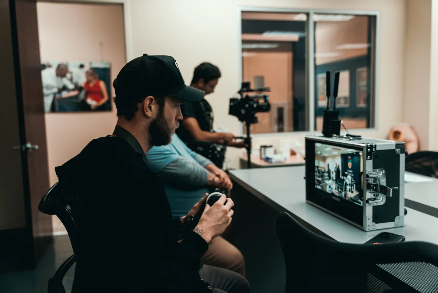
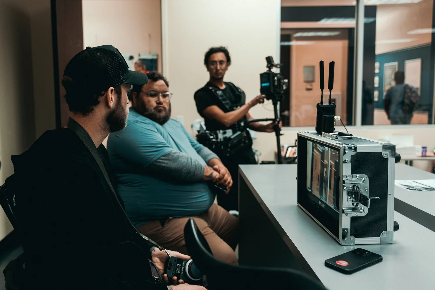
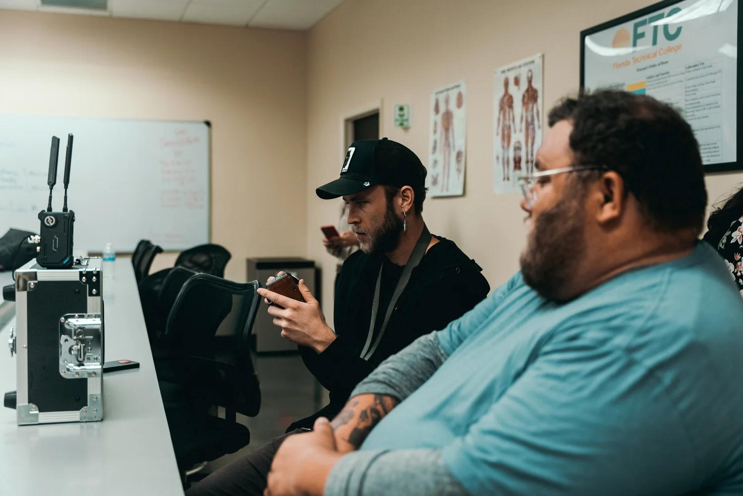
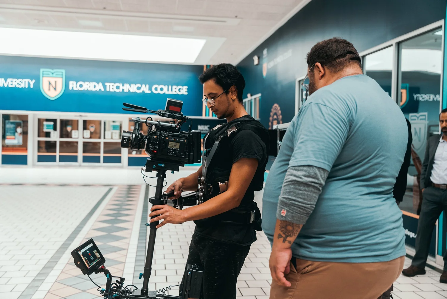
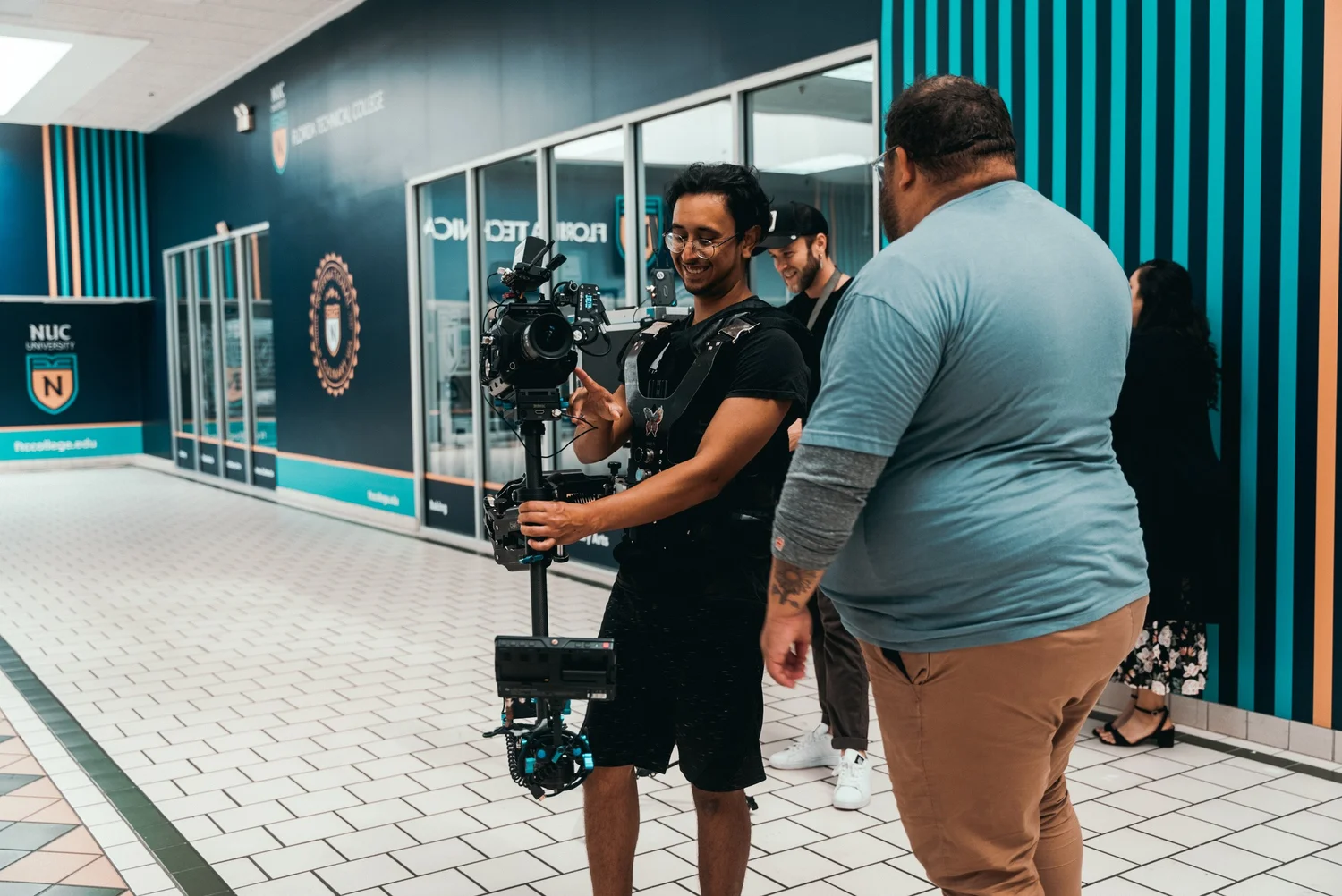
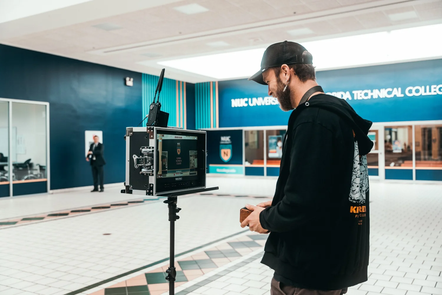
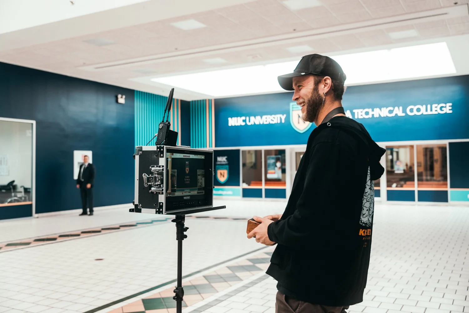
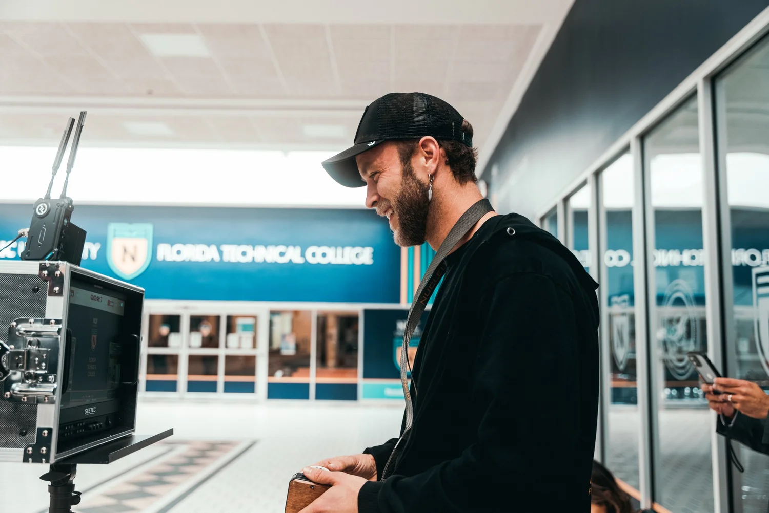
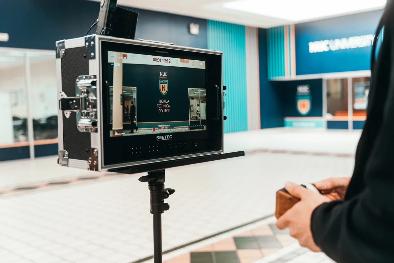
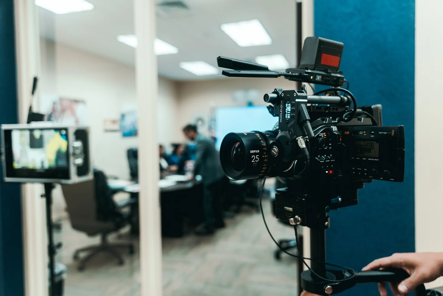
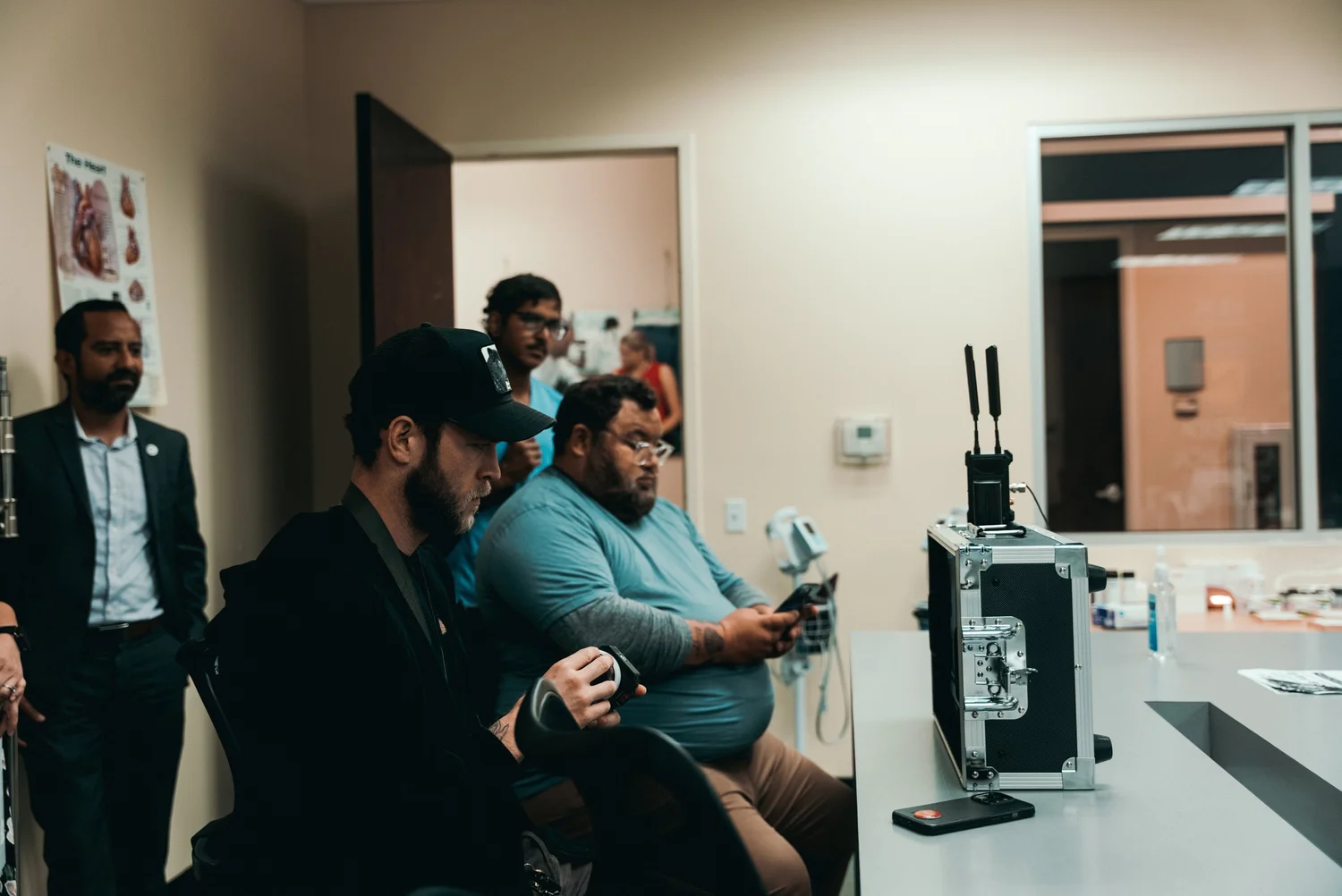
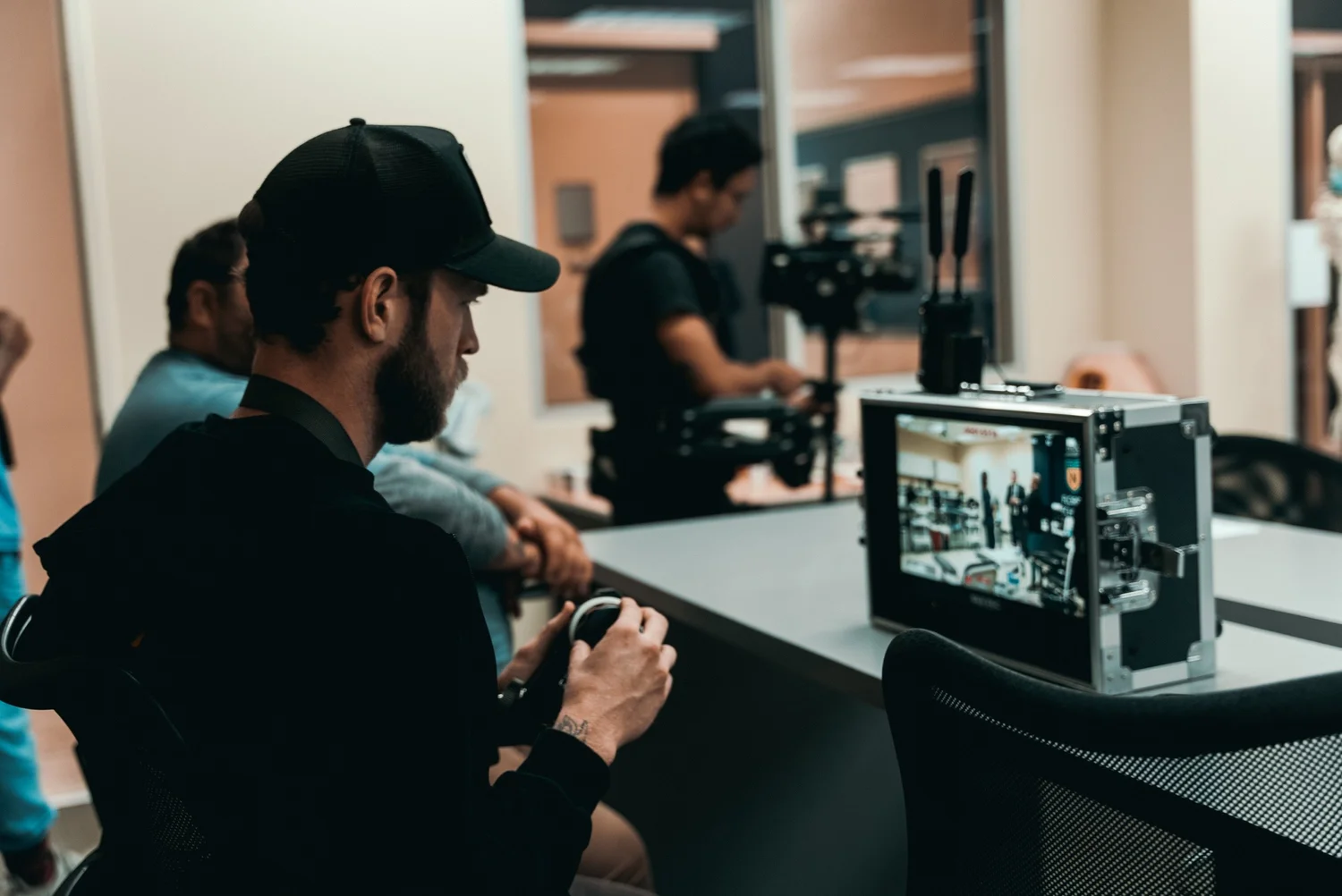
A behind the scenes look at this week on set


, and uniform.css sizes any
         main h1 at the page-title scale (.definitive-interior main h1), so
         one landed mid-read at 60px. The cap carries the page class to out-
         specify that rule, and covers the whole family at reading scale. */
      .blog-page .blg-wrap .blg-body h1, .blog-page .blg-wrap .blg-body h2,
      .blog-page .blg-wrap .blg-body h3, .blog-page .blg-wrap .blg-body h4 { margin: 2rem 0 0.75rem; font-family: "Playfair Display", Georgia, serif; font-weight: 400; line-height: 1.3; color: rgb(244 241 235 / 0.95); text-transform: none; letter-spacing: normal; max-width: none; }
      .blog-page .blg-wrap .blg-body h1, .blog-page .blg-wrap .blg-body h2 { font-size: clamp(1.15rem, 1rem + 0.8vw, 1.45rem); }
      .blog-page .blg-wrap .blg-body h3 { font-size: clamp(1.05rem, 0.95rem + 0.55vw, 1.3rem); }
      .blog-page .blg-wrap .blg-body h4 { font-size: clamp(1rem, 0.95rem + 0.3vw, 1.12rem); }
      /* A photo run is not a paragraph - it breaks out past the reading
         measure to ONE width token and packs like the photography archive.
         CSS columns balanced the run into three ragged stacks: a column ran
         long and dangled a photograph below the others, a wide frame overran
         the square its neighbours implied, and a hole opened where the last
         short column stopped. The rows are JUSTIFIED instead - solved at
         build time in galleryize.py, shipped as explicit flex rows.
         A cell's --a is its native aspect. flex-grow:var(--a) over a zero
         basis hands each photo in a row the width a_i x h out of the row's
         free space, so every photo in the row stands at the same height h
         and the last one lands exactly on the right edge - flush left AND
         right, nothing cropped, no measurement on the page. */
      .blg-body { --blg-wide: min(68rem, 92vw); --blg-gap: 0.62rem; }
      .blg-gallery { width: var(--blg-wide); margin: 2rem 0 2.2rem; margin-inline: calc(50% - var(--blg-wide) / 2); display: flex; flex-direction: column; gap: var(--blg-gap); }
      .blg-row { display: flex; column-gap: var(--blg-gap); width: var(--rw, 100%); margin-inline: auto; }
      .blg-nb { display: none; }
      .blg-gallery .blg-cell { flex-grow: var(--a, 1); flex-shrink: 1; flex-basis: 0; min-width: 0; aspect-ratio: var(--a, 1.5); margin: 0; padding: 0; overflow: hidden; border-radius: 0.3rem; background: #0b0d12; cursor: pointer; opacity: 0; transform: translateY(18px); transition: opacity 620ms cubic-bezier(0.22, 0.61, 0.21, 1), transform 740ms cubic-bezier(0.22, 0.61, 0.21, 1); }
      .blg-gallery .blg-cell.is-in { opacity: 1; transform: none; }
      .blg-gallery .blg-cell img { display: block; width: 100%; height: 100%; object-fit: cover; margin: 0; border-radius: 0; opacity: 0.86; transition: transform 760ms cubic-bezier(0.22, 0.61, 0.21, 1), opacity 420ms ease; }
      .blg-gallery .blg-cell:hover img, .blg-gallery .blg-cell:focus-visible img { opacity: 1; transform: scale(1.02); }
      .blg-gallery .blg-cell:focus-visible { outline: 1px solid var(--kls-accent, #fb5607); outline-offset: 2px; }
      /* the run measures itself against the article COLUMN, so the index
         rail simply narrows it - no second width rule for the railed page */
      @supports (container-type: inline-size) {
        .blg-wrap { container-type: inline-size; }
        .blg-body { --blg-wide: min(68rem, 100cqw); }
      }
      /* The phone keeps the grid - 2-up rows out of the same packer at a
         smaller row height, never one full-screen photograph per screen.
         The desktop rows dissolve (display:contents) and the build-time
         narrow breaks drive the lines instead, so one set of photographs
         serves both plans. */
      @media (max-width: 760px) {
        .blg-body { --blg-gap: 0.5rem; }
        .blg-gallery { flex-direction: row; flex-wrap: wrap; column-gap: var(--blg-gap); row-gap: 0; margin-bottom: 1.8rem; }
        .blg-row { display: contents; }
        .blg-nb { display: block; flex: 0 0 100%; height: var(--blg-gap); }
      }
      @media (prefers-reduced-motion: reduce) { .blg-gallery .blg-cell { opacity: 1; transform: none; transition: none; } }
      /* A short line stranded between two photo runs read as a fragment
         someone forgot to delete. It is the author's own beat - so it is set
         as one: centred, given air on both sides, a step up in scale. The
         builder finds it; not a word of it is moved or rewritten. */
      .blg-body .blg-beat { margin: clamp(2.4rem, 5.5vh, 3.6rem) auto; max-width: 34rem; text-align: center; }
      .blg-body .blg-beat p, .blg-body .blg-beat div { margin-left: auto; margin-right: auto; }
      /* Squarespace put white-space:pre-wrap INLINE on these paragraphs, so
         the source indent after each  printed as a real leading space
         and every line after the first sat 3px right of centre. pre-line
         keeps the author's line breaks and drops the indentation; it has to
         out-rank an inline style, hence the !important, and it is scoped to
         the beat alone. No character of the copy changes. */
      .blg-body .blg-beat p { margin-top: 0; margin-bottom: 0.4rem; white-space: pre-line !important; font-family: "Playfair Display", Georgia, serif; font-size: clamp(1.2rem, 1rem + 1vw, 1.65rem); line-height: 1.4; color: rgb(244 241 235 / 0.94); }
      .blg-body .blg-beat p:last-child { margin-bottom: 0; }
      /* end blg-gallery */


    Skip to content


          ← All Posts
          Oct 24, 2022·1 min read
          A behind the scenes look at this week on set

DSC00679.jpg
DSC00681.jpg
DSC00683.jpg
DSC00688.jpg
DSC00690.jpg
DSC00692.jpg
DSC00696.jpg
DSC00697.jpg
DSC00700.jpg
DSC00702.jpg
DSC00706.jpg
DSC00710.jpg
DSC00714.jpg
DSC00717.jpg
DSC00718.jpg
DSC00720.jpg
DSC00723.jpg
DSC00729.jpg
DSC00737.jpg
DSC00740.jpg
DSC00741.jpg
DSC00743.jpg
DSC00744.jpg
DSC00745.jpg
DSC00747.jpg
DSC00750.jpg
DSC00753.jpg
DSC00764.jpg
DSC00766.jpg
DSC00769.jpg
DSC00770.jpg
DSC00773.jpg
DSC00780.jpg
DSC00781.jpg
DSC00782.jpg
DSC00819.jpg
DSC00822.jpg
DSC00824.jpg
DSC00826.jpg
DSC00828.jpg
DSC00830.jpg
DSC00837.jpg
DSC00846.jpg
DSC00849.jpg
DSC00852.jpg
DSC00856.jpg
DSC00861.jpg
http://www.kyleloftusstudios.com
← Back to the Blog

Latest Posts

Keep reading

Jul 28, 2026CDC Fest 2026 Recap Video | Contemporary Dance Choreography Festival Orlando Jan 6, 2026Create the Work You Want to Attract Oct 23, 2025Behind the Scenes of Our Multi-Day USG Corporate Event in Orlando, Florida: Oct 23, 2025How We Pulled Off Two Music Videos in Two Days — And Why Pre-Production Makes or Breaks a Music Video Jul 3, 2025Why We Don’t Bet Everything on a Single Hero Video And How We Help Brands Like Tempra Win with High-Quality, High-Quantity Content Jul 3, 2025Why High-End Photography Isn’t Enough Anymore (And What Your Brand Actually Needs) Jun 26, 2025Launching TEMPRA: How Strategic, Story-Driven Content Powers Successful Brand Launch Campaigns Jun 9, 2025Elevate Your E-Commerce Brand with High-Quality Video and Photo Production: A Look Behind Our Recent Success with Faster Way to Fat Loss May 17, 2025Behind the Lens: Capturing Scroll-Stopping Summer Photography for Two Brands in One Day May 8, 2025Crafting Emotional Connections: Behind the Scenes of Jeremiah's Italian Ice 'Hop Away Treats' Campaign May 7, 2025How We Captured a High-Impact Summer Campaign for Lasio and Blessed Bananas — and What Your Brand Can Learn From It Apr 23, 2025Behind the Scenes of Jeremiah’s Hop Away Happiness Campaign: How We Brought Real Frozen Treats to Life On Camera Mar 25, 2025How We Helped Eat Prima Revamp Their Brand and Position Themselves as a Premium Luxury Product Mar 25, 2025Pushing Creative Limits: How We Bring Fresh, Bold Ideas to Jeremiah’s Monthly Campaigns Mar 11, 2025How We Helped Faster Way to Fat Loss Capture Content in the Most Cost-Effective Way Possible Feb 1, 2025A Behind the Scenes Look Our Production with Jeremiah’s Italian Ice and Skittles Feb 1, 2025Lasio x Blessed Bananas Commercial Prod BTS 1-13-25 Jan 15, 2025Ready to Elevate Your Brand in 2025? Let’s Create Magic Together! Dec 26, 2024Finding Meaning in Motion: Why We Love Working with Mission-Driven Brands Nov 28, 2024Why Finding the Right Media Team is Crucial for Your Brand’s Success Nov 28, 2024Brands on a Mission: Why We Love Working with Grind with Gratitude Nov 21, 2024Behind the Scenes: Capturing the Spirit of Faster Way to Fat Loss Nov 7, 2024Acre Partner Miami Mastermind Event Oct 28, 2024Join Us Behind the Scenes for the Jeremiah’s Italian Ice Live Life to the Coolest Campaign 2024 Oct 26, 2024Hybrid Athlete Jake Schum x Centric Brand Partnership Campaign Oct 7, 2024Centric x Jake Schum Commercial Production BTS 9-30-24 Sep 4, 2024Jeremiahs Italian Ice Live Life to the Coolest Campaign Commercial Videos & Behind the Scenes Gallery Jun 30, 2024Jeremiah’s Italian Ice Product Production Behind the Scenes Sneak Peak May 28, 2024Wizard Cyber Commercial Production BTS Sneak Peak May 27, 2024Social Media Skits Production BTS Sneak Peak 5-24-24 May 14, 2024Gatorade Commercial Campaign at GSSI Facility May 8, 2024Axiorii Exercise Library Tampa Production 2 Behind the Scenes Pass May 8, 2024Axiorii Exercise Production in Boca Raton BTS Pass Apr 30, 2024Introducing ZZZ Tape: Revolutionizing Sleep Quality and Wellness Mar 26, 2024Jetfuel Commercial Photoshoot Mar 26, 2024Jetfuel Commercial Production Behind the Scenes Sneak Peak Feb 1, 2024Beyond Theme Parks: Photographers Reveal 11 Beautiful Places in Orlando Everyone Should Check Out Dec 29, 2023Elevate Your Brand to New Heights The Transformative Power of Professional Videography Dec 29, 2023My 7 Year Transformation: From A Struggling Freelancer to Speaking to a Room Full of Aspiring Filmmakers Nov 4, 2023Yo Creo Music Video Production BTS
All 466 posts →